In today's digital age, mobile devices have become an integral part of our lives. The way we consume information, shop, and interact with businesses has shifted dramatically towards mobile platforms. This paradigm shift has necessitated a new approach to web design known as mobile-first design.
The mobile-first design prioritizes the creation of websites and applications specifically for mobile devices. Rather than starting with a desktop-first approach and then scaling down for smaller screens, designers and developers begin by crafting the core experience for mobile users. This fundamental shift in design philosophy has numerous advantages and requires a unique set of strategies and techniques.
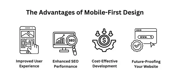
Advantages of Mobile-First Design
This strategy prioritizes the mobile user experience, leading to numerous benefits that can significantly impact your online presence.
1. Improved User Experience
By prioritizing mobile devices, designers can create more intuitive and user-friendly interfaces. Smaller screens necessitate a focus on essential content and streamlined navigation, reducing cognitive load and improving overall user satisfaction. Additionally, mobile-first designs often load faster, leading to reduced bounce rates and increased engagement.
Faster Load Times: Mobile-first designs are optimized for smaller screens and lower bandwidths, resulting in significantly faster load times. This enhances user satisfaction and reduces bounce rates.
Simplified Navigation: Mobile-first designs often focus on a streamlined navigation structure, making it easier for users to find the information they need quickly.
Optimized Content: Content is carefully curated and prioritized for mobile devices, ensuring that the most important information is easily accessible.
2. Enhanced SEO Performance
Google's mobile-first indexing means that the mobile version of your website is the primary factor in search engine rankings. A mobile-friendly website not only improves your search engine visibility but also leads to higher click-through rates and organic traffic. Furthermore, faster load times on mobile devices contribute to better search engine rankings.
Mobile-First Indexing: Google prioritizes mobile-friendly websites in search engine rankings. By adopting a mobile-first approach, you can improve your website's visibility and organic traffic.
Faster Page Speed: Faster load times on mobile devices contribute to better search engine rankings.
3. Cost-Effective Development
Mobile-first design streamlines the development process by focusing on the core elements of a website or app. Developers can avoid unnecessary features and complexity that may be required for desktop versions, saving time and resources. Additionally, a well-designed mobile-first website or app is easier to maintain and update across different screen sizes, reducing long-term costs.
Streamlined Development Process: By focusing on the core elements of a website or app for mobile devices, developers can create a more efficient and cost-effective development process.
Reduced Maintenance Costs: A well-designed mobile-first website or app is easier to maintain and update across different screen sizes.
4. Future-Proofing Your Website
The mobile-first approach ensures that your website or app is adaptable to future technological advancements. As new devices and platforms emerge, a mobile-first design can be easily scaled and optimized to provide a seamless user experience. Moreover, by prioritizing accessibility and user experience on mobile devices, you lay the foundation for a more inclusive and future-ready digital presence.
- Adaptability to Emerging Technologies: Mobile-first designs are more adaptable to future technological advancements, such as wearable devices and augmented reality, as they prioritize a core user experience.

Tips and Methods for Mobile-First Design
1. Prioritize Content
Identify the most crucial information that needs to be easily accessible on mobile devices. Prioritize this content and present it in a clear and concise manner, avoiding unnecessary clutter.
Identify Core Content: Determine the most critical information that needs to be accessible on mobile devices.
Optimize Content for Mobile: Use clear and concise language, break up text into smaller paragraphs, and use headings to improve readability.
2. Simplify Navigation
Keep the navigation structure simple and intuitive, avoiding complex menus that can be overwhelming on smaller screens. Use clear and concise labels for navigation elements, making it easy for users to find what they need.
Keep it Simple: Avoid complex navigation menus and opt for a straightforward, intuitive structure.
Use Clear and Concise Labels: Make sure navigation labels are easy to understand and visually appealing.
3. Optimize Images
Compress image files to reduce load times and improve performance on mobile devices. Use responsive images that automatically adjust to different screen sizes, ensuring optimal display quality.
Compress Images: Reduce image file sizes to improve load times.
Use Responsive Images: Images should automatically adjust to fit different screen sizes.
4. Design for Touch
Ensure that all interactive elements, such as buttons and links, are large enough to be easily tapped with a finger. Consider incorporating touch gestures like swiping and pinching to enhance the user experience.
Large Touch Targets: Ensure that buttons and links are large enough to be easily tapped.
Consider Touch Gestures: Incorporate gestures like swiping and pinching to enhance the user experience.
5. Test Across Devices
Thoroughly test your website or app on a variety of devices and screen sizes to identify and fix any issues that may arise. Utilize emulators and simulators to efficiently test your design on different platforms.
Thorough Testing: Test your website or app on a variety of devices and screen sizes to identify and fix any issues.
Use Emulators and Simulators: These tools can help you test your design on different devices without physically owning them.
6. Consider Accessibility
Adhere to Web Content Accessibility Guidelines (WCAG) to make your website accessible to users with disabilities. Ensure that your website or app can be used by screen readers and other assistive technologies.
WCAG Guidelines: Adhere to Web Content Accessibility Guidelines (WCAG) to make your website accessible to users with disabilities.
Screen Reader Compatibility: Ensure that your website or app can be used by screen readers.
7. Embrace Progressive Enhancement
Start with a basic, functional design for mobile devices and then gradually add features and complexity for larger screens. This approach ensures a solid foundation for mobile users while providing a richer experience for desktop users.
- Gradual Enhancement: Start with a basic, functional design for mobile devices and then gradually add features and complexity for larger screens.
8. Utilize Responsive Design Frameworks
Leverage popular responsive design frameworks like Bootstrap and Foundation to accelerate the development process. These frameworks provide pre-built components and responsive layouts, saving time and effort.
- Bootstrap and Foundation: These frameworks provide pre-built components and responsive layouts to accelerate the development process.
Mobile-First Design with Sketch, Figma, and Adobe XD
In the realm of mobile-first design, the choice of design tool significantly influences the efficiency and quality of the design process. Sketch, Figma, and Adobe XD are three popular options that offer distinct advantages and cater to different design workflows.
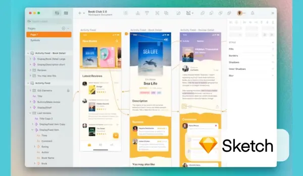
Sketch: The Veteran's Choice

Sketch has been a long-standing favorite among designers, particularly for its powerful vector editing capabilities and extensive plugin ecosystem. When it comes to mobile-first design, Sketch excels in the following areas:
Precise Vector Editing: Sketch's precision tools allow designers to create pixel-perfect designs, essential for mobile interfaces.
Symbol Libraries: Reusable symbols streamline the design process, especially for consistent UI elements across multiple screens.
Plugin Ecosystem: A vast array of plugins extends Sketch's functionality, enabling advanced features like automated design systems and prototyping.
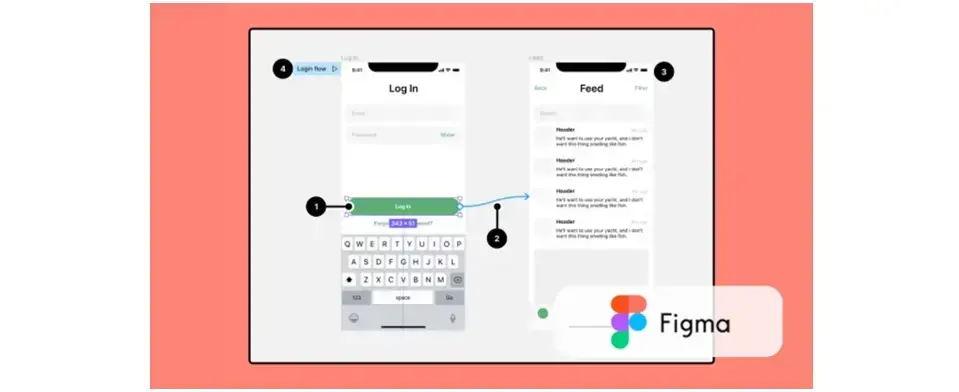
Figma: The Collaborative Powerhouse

Figma has rapidly gained popularity due to its cloud-based nature and real-time collaboration features. Figma's auto-layout feature simplifies the creation of responsive designs. It's an excellent choice for mobile-first design, offering:
Real-time Collaboration: Multiple designers can work on the same design file simultaneously, facilitating efficient team workflows.
Prototyping: Powerful prototyping tools allow designers to create interactive prototypes, simulating the user experience on mobile devices.
Animation: You can easily add micro-interactions, transitions, and complex animations to enhance the user experience.
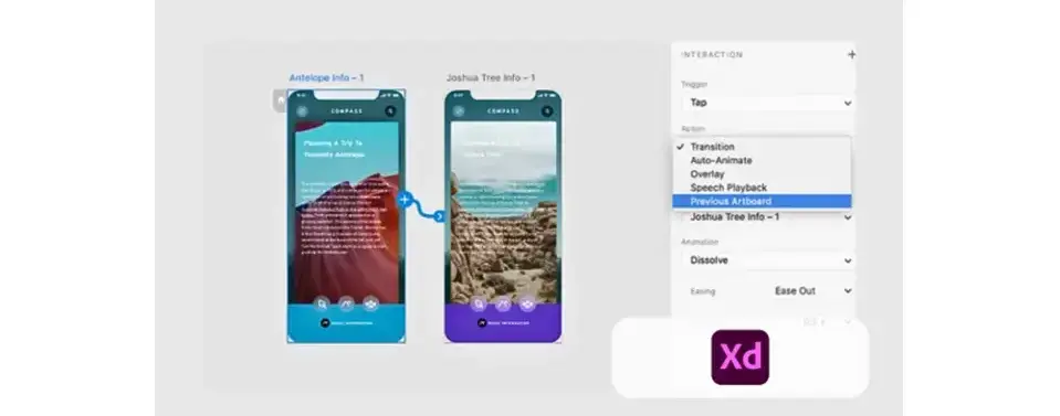
Adobe XD: The All-in-One Solution

As part of the Adobe Creative Cloud suite, Adobe XD integrates seamlessly with other Adobe tools, making it a compelling option for designers familiar with the Adobe ecosystem. Its key features for mobile-first design include:
Design System Creation: Easily create and manage design systems, ensuring consistency across multiple screens and projects.
Time-Based Animations: Add dynamic interactions and micro-animations to mobile designs, enhancing user engagement.
Integration with Other Adobe Tools: Seamlessly transfer assets and design elements between Adobe XD and other Adobe tools like Photoshop and Illustrator.
The Best Tool for Mobile-First Design
The optimal choice depends on your specific needs and preferences. If you prioritize precision and a large plugin ecosystem, Sketch is a solid option. For real-time collaboration and powerful prototyping, Figma is a great choice. If you're already part of the Adobe Creative Cloud ecosystem and value design system creation, Adobe XD is a compelling option.
The optimal choice depends on various factors, including your team's preferences, project requirements, and budget. Consider the following:
Team Collaboration: If real-time collaboration is a top priority, Figma is an excellent choice, as it allows multiple designers to work on the same file simultaneously.
Design System Creation: If you're building a large-scale design system, Adobe XD's robust design system features can streamline the process.
Plugin Ecosystem: If you need advanced customization and automation, Sketch's extensive plugin ecosystem offers a wide range of options.
Budget: Sketch and Adobe XD require a license, while Figma offers a generous free plan for personal and small team use.
Ultimately, the best tool is the one that empowers you to create exceptional mobile-first designs efficiently and effectively.
Sketch, Figma, and Adobe XD Comparative Analysis
| Feature | Sketch | Figma | Adobe XD |
|---|---|---|---|
| Platform | Mac, Web app | Web-based | Mac, Windows |
| Vector Editing | Excellent | Good | Good |
| Collaboration | Good | Excellent | Good |
| Prototyping | Good | Excellent | Excellent |
| Design Systems | Good | Excellent | Excellent |
| Plugin Ecosystem | Extensive | Growing | Limited |
Conclusion
Mobile-first design is no longer a trend; it's a necessity for businesses that want to thrive in the digital age. By prioritizing the mobile user experience, you can create websites and apps that are not only user-friendly but also effective in driving conversions and building brand loyalty.
By following the tips and methods outlined in this guide, you can successfully implement a mobile-first design strategy and ensure that your digital presence is optimized for the future.
Frequently Asked Questions
Can I afford a website builder?
Yes. Besides paid website builders, there are also free ones; however, they come with fewer options.
Is a website on WordPress safe?
Websites on WordPress are safe, however to avoid hacking keep your website up to date.
Do artists still need a website?
Yes. With people online more than ever, and online searches at an all-time high, having an artist website is crucial. Artists can use their website as a professional hub to showcase their work, connect with audiences, and sell their art directly.
How is the website maintenance carried out?
On a daily basis, software, hardware, vulnerability, MariaDB, CloudLinux paths and cPanel updates are carried out on our servers without a reboot. However, if we have to carry out any maintenance that includes some downtime, we schedule in advance and update our status page

Audee Mirza is a graphic designer and WordPress developer at audeemirza.com who resides in Surabaya, Indonesia. She's also the author of Graphic Identity Blog, a professional logo designer, and often creates vector illustrations for clients and marketplaces. She enjoys good typography design and all kinds of animation.
View all posts by Audee Mirza


