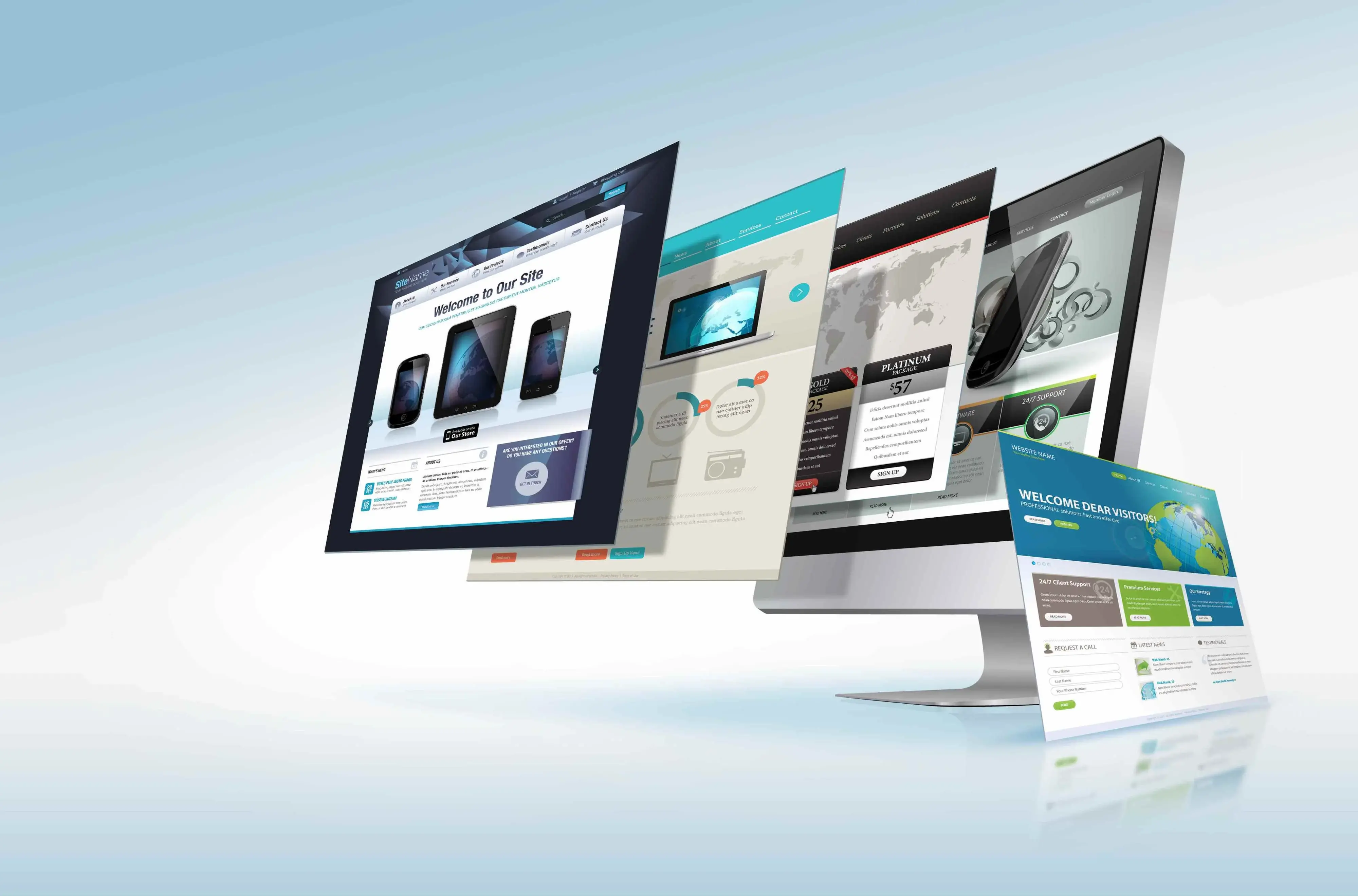
Visual hierarchy is an important concept in web design that can help you create effective, user-friendly layouts. It’s the arrangement of elements on a page to emphasize certain items and draw attention to them. By understanding the principles of visual hierarchy, you will be able to organize your website content in such a way that it leads users through your site easily and efficiently.
In this guide, we will discuss what visual hierarchy is and how it works as well as provide tips for creating effective layouts with visual hierarchy in mind. We’ll also look at some examples of websites that use it well so you can walk away with a clear idea of how to implement it for yourself.
Let’s get started!
Elements of Visual Hierarchy

Image source: Unsplash
Visual hierarchy is based on the idea that certain elements are more important than others. When applied to web design, this means that some elements should be highlighted and emphasized in order to draw attention. To do this effectively, there are several elements you need to consider:
Size and Position of Elements
The size and position of elements on the page can have a huge impact on how much attention they draw. Generally speaking, larger elements tend to be perceived as more important than smaller ones, so when you’re designing your layout, make sure to give bigger elements more prominence. Additionally, try placing important elements higher up on the page or in the center to draw attention to them.
Contrast and Color
Utilizing high contrasting colors and elements, such as black text on a white background, will make them more readable and draw attention. Similarly, using varying hues for distinct design components can create visual interest while guiding viewers’ eyes across your website. It is also essential to remember that intentional use of color can evoke emotions - so be sure to select shades that wholly align with your site's message.
Typography
Typography is an amazing tool to generate visual appeal and direct the reader's gaze. By utilizing various fonts, sizes, and weights of typefaces, you can craft a sense of hierarchy that will allow certain pieces of information to stand out from the rest. Larger font types with bolder presentation are more noticeable than small and plain text; this creates greater emphasis on certain key points for your audience.
Images and Graphics
Visuals and graphics are a powerful tool to establish visual hierarchy, with more prominent images claiming the viewer's attention. By incorporating delightful visuals into your website you can create an engaging interface that will direct the user’s eye along with passing on meaningful information. Ensure all of your imagery is aligned with the main message of your website for maximum impact.
So now that you have a handle on the aspects that make up a successful visual hierarchy, let's now look at some key techniques to keep in mind when designing your own website layout.
Techniques for Creating Visual Hierarchy
Image source: Unsplash
Effective web layouts always maintain balance and proportion. The overall design is well-balanced with equal weight being given to each element on the page. Additionally, all components should be arranged in a way that clearly establishes which elements are more important than others.
Here are some techniques you can use to create successful visual hierarchies:
Use of White Space
By incorporating an element of white space, or negative space, throughout web pages and designs, you can provide a sense of equilibrium that will draw attention to the essential elements. Similarly, this technique also allows for a greater level of organization which assists with user understanding when exploring the layout.
Grouping Related Elements
Grouping related components like navigation links or relevant content can foster a sense of organization and allow users to quickly determine what they are searching for. This method also creates continuity while guiding the user's gaze as they explore your website. It also gives you the opportunity to highlight certain sections and introduce them as more important than others.
Creating a Focal Point
Drawing the viewer's eye to your page can be achieved by having a striking focal point, such as an attention-grabbing image or call-to-action button. Moreover, this method of intentional visual design serves not only to guide the eyes but also creates more engagement and interest in the content itself.
Using Grid-based Layouts
Grids can help provide visual structure and organization, making it easier for users to comprehend the page's layout and locate what they need. Through grid-based design, you can develop a sense of relative importance between elements on a page and guide visitors through your content with ease.
By understanding and applying these techniques, you can create an effective visual hierarchy that will both engage and direct your visitors as they explore your website.
But how can you put this information into practice? That's what we'll explore next.
Best Practices for Visual Hierarchy
When creating visual hierarchy in web design, it's important to keep the following best practices in mind:
Keeping the User's Goals in Mind
To ensure usability, the visual hierarchy of your website should be crafted with the user in mind. When designing, always think from their perspective and consider what they want to accomplish by visiting your site: Is it an easy-to-find answer or a specific task? By customizing the interface according to users' needs and goals you will optimize their experience on your page — creating a real win-win situation.
Consistency in Design
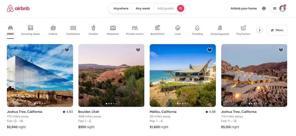
Establishing consistency in design, for instance relying on a unified layout and color palette, can assist users with navigating your website. Additionally, it helps to cultivate an atmosphere of confidence and trustworthiness among visitors. Consistency breeds familiarity which is invaluable towards creating a successful online experience.
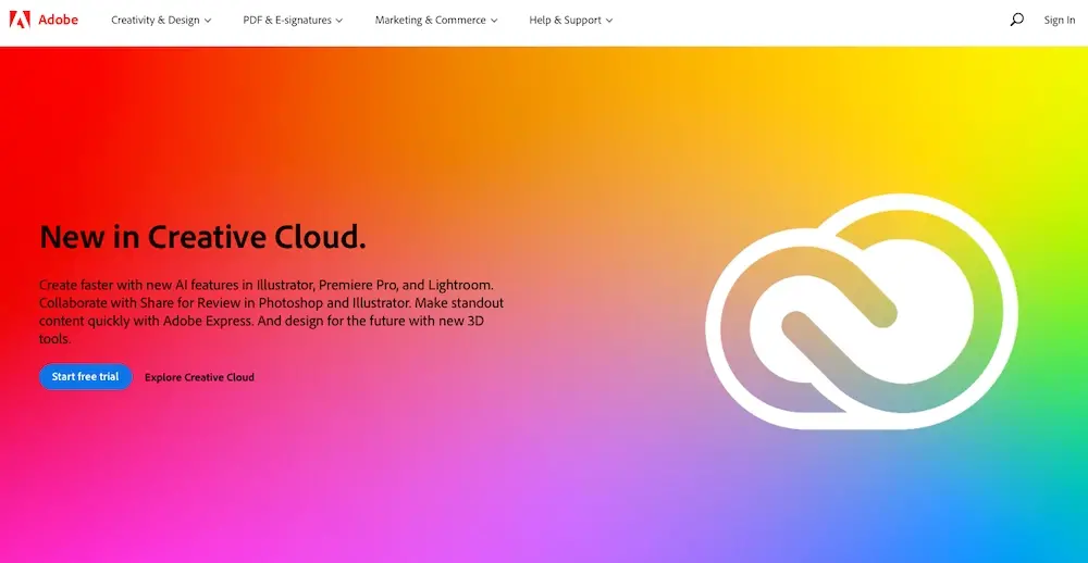
This level of consistency is on full display on the Adobe website. From their homepage to each individual page, Adobe has maintained a unified color palette and design along with their signature logo.
Avoiding Clutter
An important factor in keeping the hierarchy of your website clean and organized is to be mindful of how much content you are displaying. Too many elements can create a cluttered and overwhelming page, so be sure to keep only important elements on the page and always be careful to avoid overloading users with too much information.

You can see this put into practice on a website like Apple, which uses negative space to minimize clutter and visually direct the user’s attention to the most important elements.
Using Visual Cues
Visual cues such as arrows, shapes, and icons can be used to direct users to the more important pieces of content on your page. This not only helps to create a cohesive and functional layout, but also draws attention to the key information that you want users to focus on.
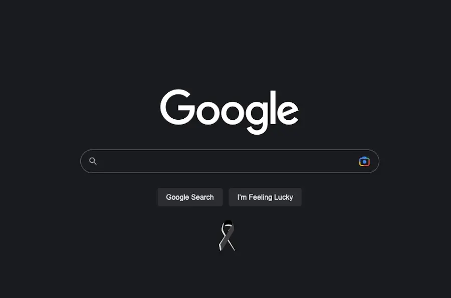
These visual cues are used extensively in the Google homepage. By using shapes and icons they have been able to direct users’ attention to the most important elements and make navigating their page easier.
Progressive Disclosure
Progressive disclosure of information can make it easier for users to find what they're looking for by only showing them the information they need when they need it. This technique can also be used to create a sense of organization and make it easier for users to understand the layout of the page.
A good example of progressive disclosure is seen in the navigation menu of most websites. This allows users to access different pages and dig deeper into the website without feeling overwhelmed by an abundance of options.
Using Motion and Animation
Motion and animation can be used to add movement to your website and make it more engaging for visitors. This technique can also be used to draw attention to specific parts of the page and to guide users through key content. However, be sure to keep animation light, subtle, and purposeful — too much animation can be distracting and confusing.
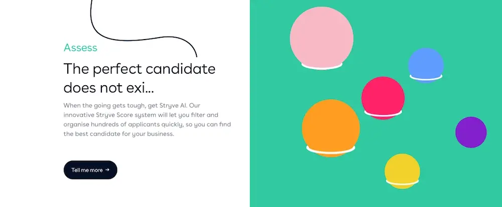
You can see animation used in this way really well on the Stryve website, which aims to guide the visitor from one section to the next.
By using these strategies, you can create a visual hierarchy that is both cohesive and effective.
Start Putting Visual Hierarchy to Use
Visual hierarchy should be a priority in your web design process. By keeping the user's goals in mind and utilizing techniques like progressive disclosure, consistency, visual cues, and animation, you can create a hierarchy that is both engaging and effective.
With this info in mind, it's time to start putting it into practice. You can begin by evaluating your current website design and look for opportunities to create a better user experience. Once you have a plan in place, start implementing those changes and watch as your website becomes more intuitive and easier to navigate.
Of course, investing in high-quality web hosting can go a long way toward ensuring a good user experience as well. Verpex offers a wide range of hosting solutions to fit any budget and provides the tools you need to create an engaging website that's both speedy and secure.
And with a bit of effort and a few simple strategies, you can create a hierarchy that will make your website even more successful.
Frequently Asked Questions
How do I choose a design for my website?
One of the most important things when creating a website for your art is the design. Even though your pieces of art might be amazing, people will leave if your site is hard to navigate. This is why it’s important that the site is easy on the eyes and easy to navigate.
What type of design should my fitness blog have?
When you’re a beginner, don’t go crazy with the design of the site. The most important thing is to have a site that looks professional, easy to read, and fast.
How to design a podcast website?
When using a CMS, designing your website will be quick and easy. You can add a template you’ve created or pick one of the pre-made templates that the CMS features in its library.
Why should I create a website?
There are many reasons why you should create a website if you’re an artist. You can use it to create a place where people can learn about you, talk about your art, or show off your work.

Brenda Barron is a freelance writer and editor living in southern California. With over a decade of experience crafting prose for businesses of all sizes, she has a solid understanding of what it takes to capture a reader's attention.
View all posts by Brenda Barron


