Is your website letting you down? Are you struggling to convert website visitors into customers? If so, you're not alone. Many business owners run into the same issues and it's often the result of making the same mistakes when it comes to web design over and over again.
But it doesn't have to be this way.
In this blog post, we'll take a look at some of the most common design errors that can hurt your conversion rates. Armed with this information, you can make the necessary changes to improve your website's performance. So what are you waiting for?
Let's get started!
1. Not Having a Clear Purpose or Goal

The first step to designing an effective website is to have a clear purpose or goal for your site. What do you want your website to achieve? Here are a few examples:
Generate leads
Sell products or services
Provide information about your company or brand
Build awareness for your brand or business
If you don't have a clear purpose for your website, it will be difficult to design a site that is effective. Not sure what your website's purpose should be? Take a look at your competitors' websites and see what they are doing. This can give you some ideas about what you should be doing.
Now let's take a look at the above website goals in more detail:
Generate Leads
If your goal is to generate leads, your website should be designed with that in mind. Include forms on your website where visitors can sign up for more information. Make it easy for them to find your contact information.
Sell Products or Services
If you want to sell products or services on your website, the design should be focused on conversion. Include calls-to-action (CTAs) throughout and make it easy for visitors to add items to their shopping cart and checkout. Use images and videos to show off your products or services.
Provide Information
If you want your website to provide information about your company or brand, make sure the content is well-written and easy to find. Use headings and subheadings to organize your content. Include images and videos to break up the text and make the site more visually appealing.
Build Awareness
Finally, if your goal is to build awareness for your brand or business, make sure your design makes brand consistency the top priority. Use strong visuals and high-quality content to grab attention. Use social media buttons so visitors can share your content. Include a blog on your website so you can regularly produce new content. And utilize a consistent color scheme and layout to keep your brand clear in visitors’ minds.
Whatever the case may be, it's important that you know what you want your website to do before you start designing it. Otherwise, you'll likely end up with a website that doesn't quite meet your needs.
2. Making Your Website Too Complicated

Simplicity is key when it comes to web design. A complicated website will only serve to frustrate and confuse visitors, which will ultimately hurt your conversion rates.
Focus on making your website easy to navigate and use. Organize your content in a way that makes sense and clearly label each page so visitors know what they'll find when they click-through.
Here are a few ways to prioritize ease-of-use and the user experience:
Use a Simple, Easy-To-Understand Navigation Menu
Make sure your navigation menu is simple and easy to understand. Use drop-down menus sparingly and only include the most important pages in your navigation.
Use Clear And Concise Headings and Subheadings
Use headings and subheadings to organize your content in an easy-to-read format. This will make it easier for visitors to find the information they're looking for without getting overwhelmed by too much text.
Use Bullet Points to List Important Information
If you have a lot of information to include on your website, use bullet points to list it out. This will make it easier for visitors to scan the text and find the most important points.
Include Images and Videos to Break Up the Text
Images and videos are a great way to break up text and make your website more visually appealing. They can also be used to explain complicated concepts or provide step-by-step instructions.
Make Sure Your CTA Buttons Are Visible and Easy to Find
If you want visitors to take action on your website, your CTA buttons need to be clearly identified and visible at all times. Place them above the fold so visitors don't have to scroll down to find them. Use contrasting colors to make them stand out from the rest of the page.
Ensure Your Forms Are Short And Easy to Fill Out
If you're including forms on your website, make sure they're short and easy to fill out. Include as few fields as possible and make sure the labels are clear.
3. Not Optimizing Your Website for Mobile

In today's day and age, it's absolutely essential to have a mobile-friendly website. With more and more people using their smartphones and tablets to access the internet, you can't afford to ignore this growing market. There’s really no excuse, especially since mobile Google searches surpassed desktop searches all the way back in 2016.
Make sure your website is responsive and looks great on all devices. Otherwise, you could be missing out on a lot of potential leads and customers.
Here's a quick checklist to ensure your site is mobile-optimized:
The text should be easy to read on all screen sizes
Your website should be responsive and adjust to different screen sizes
Images should be optimized for mobile device screen sizes and compressed for quick loading.
The layout should be easy to navigate on a small screen
Buttons and links should be large enough to tap with a finger
Forms should be short and easy to fill out on a mobile device
4. Ignoring Search Engine Optimization (SEO)
If you want your website to be successful, you need to make sure it's optimized for search engines. This means incorporating relevant keywords throughout your site, optimizing your title tags and meta descriptions, and creating quality content that will help you rank higher in search results.
SEO can be a complex and time-consuming process, but it's well worth the effort if you want to improve your website's visibility and draw more traffic.
If you're brand new to implementing SEO, you'll want to start out with the following:
Research relevant keywords and incorporate them throughout your site
Optimize your title tags and meta descriptions
Submit your website to directories and search engines
Create quality content that will help you rank higher in search results
5. Not Including Calls-to-Action (CTAs)

Every page on your website should have a clear call-to-action (CTA). A CTA is simply an instruction that tells visitors what you want them to do next.
For example, if you want visitors to sign up for your email list, your CTA might say "Enter your email address to subscribe."
If you want people to buy a product from your online store, your CTA might say "Add to cart."
Your CTAs should be clear, concise, and easy to follow. And they should be placed prominently on each page so visitors can't miss them.
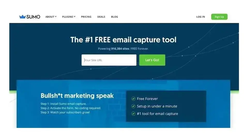
If your website is running on WordPress, you can quickly add CTAs by using a plugin like Bloom or SumoMe.
Here are a few places you might want to include CTAs on your website:
In the header or navigation menu
Above the fold on each page
In the sidebars
After blog posts or articles
In popups or lightboxes
6. Not Creating High-Quality Content
You need to create high-quality content that will help you attract and retain visitors if you want your website to be successful.
Your content should be well-written, informative, and relevant to your target audience. It should also be updated regularly to ensure it remains fresh and up-to-date. A few ways to improve your content include:
Making sure it's well-written and error-free
Including relevant keywords and phrases
Optimizing your title tags and meta descriptions
Creating catchy headlines that will grab attention
7. Not Analyzing Your Website's Data

If you're not regularly analyzing your website's data, you're missing out on valuable insights that could help you improve your site.
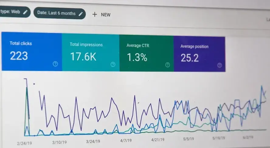
There are a number of free and paid tools you can use to track your website's traffic, such as Google Analytics and Clicky. These tools will show you how people are finding your site, what they're doing while they're there, and where they're going next.
You should also keep an eye on your website's conversion rate. This is the percentage of visitors who take a desired action on your site, such as signing up for your email list or buying a product from your online store.
If your conversion rate is low, it's a sign that something on your website isn't working and needs to be fixed.
There are a number of factors that can affect conversion rates, such as the design of your site, the copy on your pages, and the user experience. By analyzing your data, you can identify any areas that need improvement and make changes to boost your conversion rate.
This information can be extremely helpful in figuring out what's working well on your site and what needs to be improved.
8. Not Creating Landing Pages
When running any kind of paid advertising or marketing campaign, you need to create landing pages for those campaigns. A landing page is a standalone web page that's designed specifically for a particular campaign or offer.
For example, if you're running a Facebook ad campaign to promote a new product, you would send people to a landing page for that product rather than your homepage.
Don't Let These Common Web Design Mistakes Hold You Back
If you're making any of these common web design mistakes, it's time to make some changes. By fixing these issues, you can improve your website's design, user experience, and conversion rate.
What other common web design mistakes would you add to this list? Share your thoughts in the comments below.
And if you want to ensure your perfectly designed website is built on a solid platform, consider using Verpex web hosting. Our web hosting plans are optimized for speed and excellent performance.
Frequently Asked Questions
What type of design should my fitness blog have?
When you’re a beginner, don’t go crazy with the design of the site. The most important thing is to have a site that looks professional, easy to read, and fast.
How do I choose a design for my website?
One of the most important things when creating a website for your art is the design. Even though your pieces of art might be amazing, people will leave if your site is hard to navigate. This is why it’s important that the site is easy on the eyes and easy to navigate.
How to design a podcast website?
When using a CMS, designing your website will be quick and easy. You can add a template you’ve created or pick one of the pre-made templates that the CMS features in its library.
Are website builders easy to use?
One of the easiest ways to build a website is with a website builder. Using a website builder doesn't require any programming and coding skills.

Brenda Barron is a freelance writer and editor living in southern California. With over a decade of experience crafting prose for businesses of all sizes, she has a solid understanding of what it takes to capture a reader's attention.
View all posts by Brenda Barron


