For those in the business-to-business sector, designing a website requires balancing professionalism and credibility with straightforward accessibility. To ensure your B2B site meets all its objectives, here are essential elements to consider as well as inspiring examples from successful websites.
By following these recommendations, you can make sure that users get an enjoyable experience while learning about your organization's services and offerings.
What is B2B Web Design?
When it comes to web design, B2B (business-to-business) is the go-to for companies that want to sell products or services to other businesses. In contrast, B2C (business-to-consumer) focuses on creating sites tailored directly toward individual customers. With specialized strategies and tactics based on each company's needs, both types of designs are essential in today's digital world.
B2B web design is a unique strategy that caters to its target audience's distinct requirements and ambitions, which are usually dissimilar from other consumer-facing websites. An effective B2B website should be professional, authoritative, and informative to encourage potential leads as well as form relationships with customers.
Design Elements for B2B Websites
When crafting a B2B website, specific components can generate an air of professionalism and credibility for visitors. Take the following elements into consideration to perfect yours:
Navigation and User Experience
Successful B2B websites heavily depend on intuitive navigation. With an organized and easy-to-understand layout, visitors can quickly locate the information they seek – whether it be product details, case studies, or contact info. Menus should remain uncluttered; drop-down menus and submenus should only be used when practical.
Overall, making sure that your website is designed in a way that ensures ease of use for all users is key to effectively reaching out to potential customers.
Content Organization and Layout
For a B2B website to be successful, it should have an organized and polished design that emphasizes readability. Utilize large fonts, headings, and subheadings strategically so that readers can quickly scan the page. Also, remember to include white space between sections of content for clarity.
Use of White Space and Minimalism
Speaking of white space, it can be used effectively to create a sense of calm and professionalism. This means using negative space to create visual interest and emphasis, as well as using minimalistic design elements like simple typography and clean layouts.
Professional Imagery and Videos
Images and videos can be used to create a sense of credibility and trustworthiness. This means using high-quality images and videos that are relevant to the company and its offerings.
Use of Color
Colors are incredibly powerful tools when it comes to crafting a distinct brand identity, directing the reader's attention to key areas of your website, and creating visual excitement. Moreover, consistency with the color palette across all web pages is essential for achieving these goals. Utilize colors strategically by highlighting certain aspects that you want your audience to notice!
Use of Typography
Your company can cultivate a sense of professionalism and authenticity through savvy typography. Utilize neat and up-to-date typefaces that are simple to read and match the business' complete brand persona.
By incorporating these design elements, B2B companies can create a website that is professional, trustworthy, and user-friendly, which will help generate leads and build trust with potential customers. But you will need to abide by a certain set of best practices for best results.
Best Practices for B2B Website Design
Creating a successful B2B website requires a combination of elements and best practices that prioritize the needs of the target audience. Here are some key best practices to keep in mind when designing:
Create a Consistent Brand Identity
Consistency is crucial for establishing trust and confidence with potential customers. For this reason, it's critical to maintain the same color palette, fonts, images, and messaging across your website in order to accurately represent your brand identity. The language you use should also be reflective of the overall tone that you wish to portray as a company - so make sure all elements are cohesive!
Prioritize the Needs of the Target Audience
An effective B2B website should be created with the customer's needs and desires in mind. Every element of the site must align with its goals, struggles, and preferences. Through crafting an experience tailored to them, we can ensure that visitors are left feeling satisfied after interacting with your page.
Make it Easy for Visitors to Contact You
Providing clear and easy-to-find contact information is essential for B2B websites. This includes a contact form, email address, and phone number prominently displayed on the website.
Use Calls-to-Action Effectively
Crafting effective calls-to-action (CTAs) is vital for any B2B website design. These CTAs should be prominently displayed and urge visitors to take a desired action, such as completing a contact form or scheduling an informative demo. Utilizing clear wording with an unmistakable message will drive conversions and benefit your business in the long run.
Optimize for Search Engines
If you want your B2B website to succeed, optimization for search engines is key. To ensure maximum visibility in SERPs, incorporate relevant keywords and meta tags into the web page's content as well as alt tags.
Make Sure the Website is Mobile-Friendly
With an ever-increasing number of people browsing the web from their mobile devices, it has become more essential than ever to ensure that B2B websites are optimized for mobile. A great way to do this is by designing your website with a responsive layout – so you can be sure your site looks outstanding on any size screen.
Speed Optimization
Search engines like websites that load quickly, and your users will appreciate it too. To help ensure a better website speed for your B2B company, take advantage of helpful optimization practices such as compressing images, utilizing a Content Delivery Network (CDN), and minimizing the number of redirects.
Use of Testimonials and Reviews
By showcasing glowing testimonials from your current customers on your B2B website, you can easily boost trust and confidence among prospective clients. It's essential that these reviews are visible and easy to locate so they can make an impact.
Use of Live Chat
Introducing a live chat feature to your B2B website is an invaluable asset that can quickly answer any queries from prospective customers, while also fostering trust and authority.
Case Studies of Effective B2B Website Design in Action
To get a better understanding of what effective B2B website design looks like in practice, let's look at a few examples:
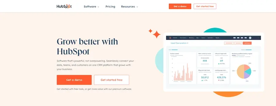
If you're looking for a model B2B website, look no further than HubSpot. Their site is visually stunning and evokes the brand's identity with every page. It's built with customers in mind; easy to navigate, contact information is always within reach, and powerful calls-to-action are all around. Utilizing this design will help businesses capitalize on their customer base as well as draw potential buyers into their sales funnel.

With its professional, well-trusted, and user-friendly B2B web design, Salesforce's website truly stands out. As a company that provides customer relationship management software solutions, its site is designed to ensure maximum consistency in brand identity while making it simple for the consumer to navigate around. Plus, with clear contact information and multiple calls-to-action throughout the pages of the website easily accessible too, it makes this an ideal choice for optimized conversions.
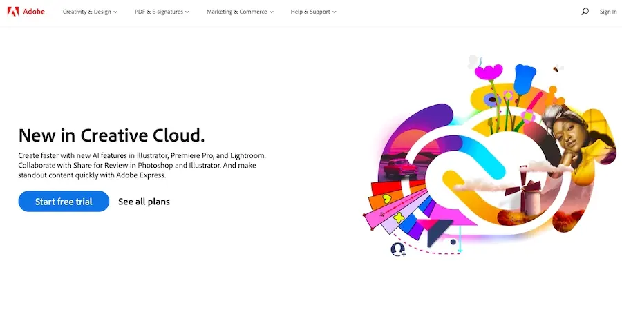
Adobe offers a comprehensive suite of creative software solutions, and its website demonstrates exemplary B2B web design. The website exudes professionalism, trustworthiness, and user-friendliness - all while maintaining consistency in branding identity. Navigation is effortless thanks to optimization for streamlined conversions; contact information is readily available with calls-to-action sprinkled throughout the page for maximum exposure and conversion rate success.
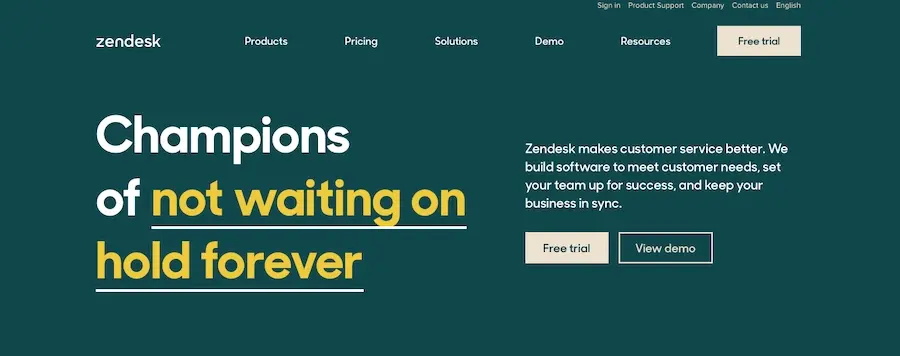
Zendesk exemplifies the gold standard for B2B web design through its sophisticated, organized website. With a well-defined brand identity and an intuitive user journey, it's easy to understand why this site leaves such a lasting impression on visitors. Moreover, Zendesk has incorporated interactive elements like demos and customer reviews that encourage engagement beyond simple navigation - further strengthening trust between customers and the company itself.

Whether you're looking for reliable file hosting and collaboration software or an easy-to-navigate website to power your business, Dropbox has you covered. Their B2B web design is a perfect balance of professional yet user-friendly, with a clear brand identity in its visuals that makes it inviting to any visitor. It's also optimized for conversions with contact information readily available as well as calls-to-action included on each page.
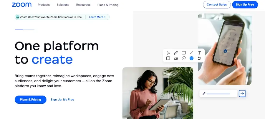
Zoom is a leader in the B2B web design industry for its professional, trustworthy, and user-friendly website. The site's consistent branding identity makes navigation easy while the strategic placement of calls-to-action is optimized to convert visitors into customers. Moreover, Zoom offers an array of resources such as tutorials and webinars that provide valuable insights about their products and services so users can make informed decisions.
Through these examples, we can observe how B2B websites are developed to exude professionalism and trustworthiness along with a stress-free user experience. Additionally, they include the optimization needed for conversions. By incorporating this article's advice on best practices and design elements into your website, you as a B2B business should be more than capable of generating leads while retaining customers in the long run.
Put These B2B Website Design Principles to Work
Developing a website that is up-to-date, professional, and optimized for conversions is essential for any B2B business's online presence. By incorporating key design elements such as mobile optimization, speed optimization, and clear calls to action with consistent branding throughout your site you will be able to attract the right leads while converting them into customers.
And remember whether you're building a B2B website (or any other, for that matter), you'll need excellent web hosting to ensure a successful online presence. With Verpex's web hosting plans, you can get reliable and secure hosting for your website that will ensure your message reaches your customers when they need it the most. Whether you need shared hosting or a managed server, we’ve got you covered.
Frequently Asked Questions
How do I choose a design for my website?
One of the most important things when creating a website for your art is the design. Even though your pieces of art might be amazing, people will leave if your site is hard to navigate. This is why it’s important that the site is easy on the eyes and easy to navigate.
What type of design should my fitness blog have?
When you’re a beginner, don’t go crazy with the design of the site. The most important thing is to have a site that looks professional, easy to read, and fast.
How much does it cost to create a restaurant website?
For an essential restaurant website, it will cost you from $3000 to $10,000 on average if you hire a web design agency. However, if you decide to use a CMS and build it yourself, the cost will be much lower.
Are website builders easy to use?
One of the easiest ways to build a website is with a website builder. Using a website builder doesn't require any programming and coding skills.

Brenda Barron is a freelance writer and editor living in southern California. With over a decade of experience crafting prose for businesses of all sizes, she has a solid understanding of what it takes to capture a reader's attention.
View all posts by Brenda Barron


