Images are, without any doubt, very important when talking about web development. Eye-catching images with cool effects are the key to impressing your visitors and getting the “Wow” reaction.
A lot of tricks exist to style images but in this post, we will see how to style them without a ton of code, using CSS effects. We will consider only the <img> element and a few lines of CSS code. No extra elements and No pseudo element!
Overlay CSS effect
Let’s start with an overlay effect. Hover the below and you will get a nice transition that removes a dark overlay from the image.
The code used to achieve this effect is nothing but an <img> element and the below CSS code:
img {
   --w: 100px; /* half the image size */

  outline: var(--w) solid #0005;
  outline-offset: calc(-1*var(--w));
  transition: 0.6s;
}
img:hover {
  --w: 0px;
}
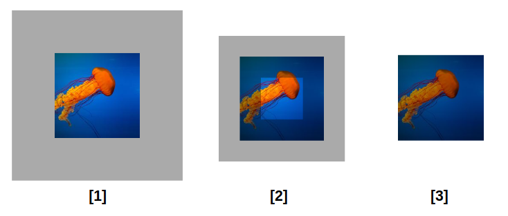
You are probably wondering how the outline is creating such an effect? Find below an illustration to understand the magic behind this trick

Initially, we add an outline with a semi-transparent color to get the result shown in step (1). Then we add a negative outline-offset to create an overlap. When using the same value for the width and the offset of the outline, we get the overlay shown in step (3).
In the code, I am using a CSS variable to define the offset and the width. That variable needs to be equal to 0 to hide the outline hence no more overlay. For this reason, I am making that variable 0 on hover to create the fading effect.
On modern browsers, the effect also applies to rounded images:
Image CSS frames
In this section, we will see a few examples of fancy frames and decorations that we can add to our image without using any extra elements. We will also animate those frames to create a cool effect.
Let’s start with the first example. On hover, a square frame is moving from the back to cover the image. An effect made using only the <img> tag!
The CSS code is as follow:
img {
  --color: #8A9B0F; /* the border color */
  --border: 10px;   /* the border thickness*/
  --offset: 20px;   /* control the offset*/
  --gap: 5px;       /* the gap on hover */

  /* internal variables */
  --_c: var(--color) var(--border), #0000 0 calc(100% - var(--border)),var(--color) 0;
  --_o: calc(3*var(--offset));
  /* */
  padding:
    calc(var(--gap) + var(--border))
    calc(var(--gap) + var(--border) + var(--offset))
    calc(var(--gap) + var(--border) + var(--offset))
    calc(var(--gap) + var(--border));
  background:
    linear-gradient(      var(--_c)) var(--_o) var(--_o),
    linear-gradient(90deg,var(--_c)) var(--_o) var(--_o);
  background-size: calc(100% - var(--_o)) calc(100% - var(--_o));
  background-repeat: no-repeat;
  filter: grayscale(.4);
  transition: .5s;
  cursor: pointer;
}
img:hover {
   background-position: 0px 0px;
   background-size: calc(100% - var(--offset)) calc(100% - var(--offset));
   filter: grayscale(0);
}
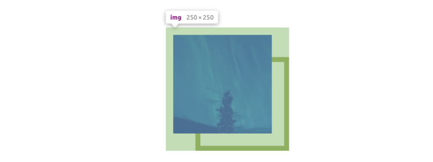
The code may look complex but I am using CSS variables to make things easy to adjust so you don’t have to worry about all the calculations. This said it’s good to understand how it’s working.

The above figure illustrates the padding area around our image. To add our frame without extra elements we need padding to create an area around the image. Then we use gradients to draw inside that area.
Our square frame is a combination of two gradients like below. I am using different colors to better see each gradient.

Combining padding and gradient is the key to creating such kind of decoration. The padding will control the area and the gradient will draw in that area. We add to this some animation and we get a cool hover effect. Let’s not forget CSS variables that allow us to control everything easily.
Let’s take another idea of frame animation
The code of this effect is similar to the previous one. Optimized with CSS variables to make it easy to control without changing the main code or digging into complex calculations
img {
  --color: #FA6900; /* the color of the border */
  --border: 10px;   /* the thickness of the border */
  --offset: 30px;   /* control the movement of the border */
  --gap: 5px;       /* the gap on hover */

  border-radius: 50%;
  cursor: pointer;
  padding: calc(var(--border) + var(--gap));
  border: var(--offset) solid #0000;
  --_m: radial-gradient(50% 50%, #000 calc(100% - var(--offset)),#0000 calc(100% - var(--border)));
  -webkit-mask: var(--_m);
          mask: var(--_m);
  --_g: #0000 calc(99% - var(--border)), var(--color) calc(100% - var(--border)) 99%,#0000;
  --_s: var(--offset);
  --_r: 100% 100% at;
  background:
    radial-gradient(var(--_r) 0    0   ,var(--_g)) calc(100% + var(--_s)) calc(100% + var(--_s)),
    radial-gradient(var(--_r) 100% 0   ,var(--_g)) calc(0%   - var(--_s)) calc(100% + var(--_s)),
    radial-gradient(var(--_r) 0    100%,var(--_g)) calc(100% + var(--_s)) calc(0%   - var(--_s)),
    radial-gradient(var(--_r) 100% 100%,var(--_g)) calc(0%   - var(--_s)) calc(0%   - var(--_s));
  background-size: 50% 50%;
  background-repeat: no-repeat;
  transition: .4s;
}
img:hover {
  --_s: 0px
}
I am using the same technique: padding, and a few gradients for the frame. I am also adding a transparent border to create more space. You may ask “why not use only padding for this task?”. I am using both padding and border because this will make some of the internal calculations easy but the main idea remains the same. A transparent border or padding will both define the area where I will draw with gradients
I am also using masking to create the fading effect. To better understand what’s happening, here is a demo without the mask.
We have 4 quarters of a circle each one made with a gradient and placed at the edge of the area created with padding and border. On hover, we move them to the center to create the full circle around our image.
Below is an illustration of the mask:
On hover, you can see the quarters of a circle moving from the red area to the transparent one. Initially, they are hidden under that red circle and when they move to the center we can see them. This is what the mask is doing. The red area will be an “invisible” part from where the gradients will appear.
Until now, we saw how using the same technique we were able to create 2 different frames with cool animation. Thanks to gradients, padding, and masking we have a lot of possibilities.
Even without animations, we can still get some fancy decorations.
Here is an example of images turned into old-style stamps
img {
  --r: 10px; /* control the radius of the circles */
  padding: calc(2*var(--r));
  filter: grayscale(.4);
  background:
    radial-gradient(var(--r),#0000 98%,#fff) round
      calc(-1.5*var(--r)) calc(-1.5*var(--r)) /calc(3*var(--r)) calc(3*var(--r)),
    linear-gradient(#fff 0 0)  no-repeat
      50%/calc(100% - 3*var(--r)) calc(100% - 3*var(--r));
  margin: auto;
}
Another one where the images are made inside a wall frame:
img {
  --s: 15px; /* control the size of the frame */

  padding: var(--s);
  --_g: #aa6342 90deg,#0000 0;
  --_d: var(--s) calc(2*var(--s)) no-repeat space;
  background:
    conic-gradient(from 45deg  at 0%  ,var(--_g)) 100%/var(--_d),
    conic-gradient(from 225deg at 100%,var(--_g)) 0   /var(--_d),
    linear-gradient(#c69781 var(--s),#aa6342 0 calc(100% - var(--s)),#944b29 0);
  box-shadow: 2px 2px 4px #0009;
  outline: 2px solid #f2f2f2;
  outline-offset: calc(-1*var(--s));
  margin: auto;
}
Masking CSS effect
In this section, we will focus on masking to create more stunning effects. Masking is a technique that allows us to hide/cut some part of an element using either an image or a gradient. We can also animate different mask layers to achieve a cool hover effect.
Let’s start with a first effect where on hover we group two semi-circles to create a full circle
The CSS code is the following:
img {
  --m:
    radial-gradient(circle farthest-side at right,#000 99%,#0000)
      0 100%/46% 92% no-repeat,
    radial-gradient(circle farthest-side at left ,#000 99%,#0000)
      100% 0/46% 92% no-repeat;
  -webkit-mask: var(--m);
          mask: var(--m);
  filter: grayscale(.5);
  transition: .3s linear;
  cursor: pointer;
}
img:hover {
  -webkit-mask-position: 7.5% 50%,92.5% 50%;
          mask-position: 7.5% 50%,92.5% 50%;
  filter: grayscale(0);
}
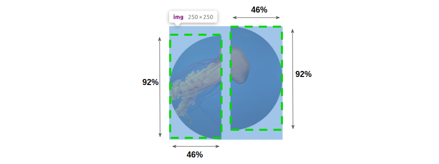
We are defining the mask property using two radial gradients that we move on hover. You can notice that each mask layer is having a height less than 100% (92%) and a width less than 50% (46%). This will make them far from each other initially

On hover, we move them to the center to get the full circle

Using the above technique, we can get many hover effects by simply using different gradient configurations.
Here is an idea where small squares are creating a bigger one on hover:
img {
  --m:
    linear-gradient(#000 0 0) 0    0   /45% 45% no-repeat,
    linear-gradient(#000 0 0) 0    100%/45% 45% no-repeat,
    linear-gradient(#000 0 0) 100% 0   /45% 45% no-repeat,
    linear-gradient(#000 0 0) 100% 100%/45% 45% no-repeat;
  -webkit-mask: var(--m);
          mask: var(--m);
  filter: grayscale(.5);
  transition: .3s linear;
  cursor: pointer;
}
img:hover {
  -webkit-mask-position: 10% 10%,10% 90%,90% 10%,90% 90%;
          mask-position: 10% 10%,10% 90%,90% 10%,90% 90%;
  filter: grayscale(0);
}
And another one with triangle shapes.
img {
  --g:#0000 ,#000 .5deg 90deg,#0000 91deg;
  --m:
    conic-gradient(from 45deg ,var(--g)) 20px 0  no-repeat,
    conic-gradient(from 135deg,var(--g)) 0 20px  no-repeat,
    conic-gradient(from 225deg,var(--g)) -20px 0 no-repeat,
    conic-gradient(from 315deg,var(--g)) 0 -20px no-repeat;
  -webkit-mask: var(--m);
          mask: var(--m);
  transition: .3s linear;
  filter: grayscale(.5);
  cursor: pointer;
}
img:hover {
  -webkit-mask-position: 0 0;
          mask-position: 0 0;
  filter: grayscale(0);
}
Conclusion
Through different examples, we saw how we can turn a simple image into a fancy one. Using modern CSS techniques, we don't need a ton of code and a lot of <div> to create cool effects. By using only the <img> element, we keep our code clean, compact and we have better performance.
References
In case you are not familiar with the CSS techniques I used, Here are a few links that can help you better understand them.
Background properties (same logic apply to mask properties)
Frequently Asked Questions
Do I need to know how to code to use WordPress?
Definitely not. There’s no need to learn coding, since most WordPress users aren’t developers. There’s many plugins and themes you can use to customize your website without coding.
How web hosting can affect SEO?
If you choose a web hosting company that isn’t that good, your site will load more slowly for visitors. Besides providing a bad user experience for your visitors, search engines also penalize slow sites, which makes your rankings in results go down.
How much does web hosting cost?
Comparing prices is usually simple in other industries. However, when it comes to web hosting, it can be quite confusing since when you’re comparing the prices, you need to consider all of the features that the plans offer and compare them as well. The cost of web hosting varies depending on the plan you get and the web hosting provider you get it from, so make sure that you have a good understanding of the structure of pricing.
What are the best web builder tools?
Some of the best web builder tools are Wix, Squarespace, Weebly, Webnode, Webflow, Jimdo, Duda, GoDaddy Websites, Strikingly, Site123, Webstarts, and much more!

Temani Afif is an expert web developer, a content creator, and a CSS addict. He is the mastermind behind CSS Loaders, CSS Generators, CSS Tip and a lot of CSS stuff.
View all posts by Temani Afif


