Flexbox, short for Flexible Box Layout, is a CSS feature that makes it easier to build flexible and responsive layouts. It lets items inside a container automatically adjust their size and position based on the space available.
To use Flexbox, you start by defining a flex container. This means setting a parent element to display: flex;, which turns all its direct children into flex items. Once that’s done, those children stop following the normal document flow and start following Flexbox rules instead.
By default, block elements stack vertically and inline elements sit side by side, but a flex container overrides that. Its children will now align according to Flexbox behavior, usually in a horizontal row unless told otherwise.
.container { display: flex; }
Once you've set up your container, the child elements (the flex items) line up in a row and stretch to fill the space.
<div class="container">
  <div class="item">Item 1</div>
  <div class="item">Item 2</div>
  <div class="item">Item 3</div>
</div>
After adding some basic styling to the items, here’s a screenshot showing how setting 'display: flex' on the container changes their layout:

Controlling the Layout of Flex Items
Once you've created a flex container, the real power of Flexbox comes from how you control the positioning of the items inside it. Flexbox gives you a set of CSS properties that let you change the direction, alignment, spacing, and wrapping behavior of your layout with just a few lines of code. Let’s walk through the main properties you’ll use to control how flex items behave inside a container.
flex-direction: Arranging Items
The 'flex-direction' property defines the direction the flex items are laid out in the container. By default, items are placed in a row from left to right (just like regular text in most languages). But Flexbox lets you easily switch to vertical layouts or even reverse the order of items.
.container {
  display: flex;
  flex-direction: row-reverse;
}

Here are other available options you can use with the flex-direction property: row (default) – Items are placed from left to right, in the same direction as text flows in most languages.
row-reverse– Items are placed from right to left, reversing their order.column– Items are stacked from top to bottom, like a vertical list.column-reverse– Items are stacked from bottom to top, reversing their order.justify-content:Controlling Horizontal Spacing
Once your items are in a row (which is the default with Flexbox), you'll often want to control how they’re spaced out across the container. That’s where 'justify-content' comes in.
It decides how the items are spread out along the main axis — which is horizontal when you're using 'flex-direction: row' (the default). Think of it like how you'd arrange a row of buttons: all squished to the left, centered, spaced out evenly, etc.
Here’s a basic setup:
''' .container { display: flex; justify-content: center; / Try changing this! / }
Let’s break this down with a practical example so it makes more sense. Imagine you’re building a toolbar with three buttons: "Save", "Edit", and "Delete". Here’s the full code — just copy and paste it into CodePen or your editor and experiment.
And you have the following styling:
body { font-family: sans-serif; background: #f5f5f5; padding: 40px; text-align: center; }
.container { display: flex; justify-content: center; / Try different values here! / background: white; padding: 20px; border: 2px dashed #ccc; border-radius: 8px; max-width: 600px; margin: 0 auto; }
.item { background: #4CAF50; color: white; border: none; padding: 10px 20px; margin: 0 10px; font-size: 16px; border-radius: 4px; cursor: pointer; }
You will get the following output:

Swap out the value in .container to see how each one behaves:
flex-start(default) – Buttons align to the left.
flex-end– Buttons shift to the right.
center– Buttons sit in the center.
space-between– Buttons stretch across the row with equal space between them, but no space on the edges.
space-around– Equal space around each button (edges get half the space).
space-evenly– Equal space between all items and the edges, which is super balanced.
With just one property, you can center elements easily, evenly distribute items without margin hacks, and build layouts that adapt nicely to different screen sizes.
align-items: Controlling Vertical Alignment
So, you’ve got your items laid out in a row using Flexbox — but what if you want to control how they sit vertically inside the container? That’s where align-items comes in.
While justify-content deals with horizontal spacing (the main axis), align-items controls alignment along the cross axis — which is vertical by default (when you're using 'flex-direction: row').
This is useful when your container has some height, or your items are of different heights and you want to align them properly — top, bottom, center, stretched, or based on text baseline.
Here’s the syntax:
.container {
  display: flex;
  align-items: center; /* Try different values here! */
}
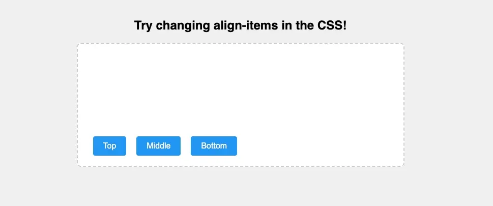
Let’s say you’re designing a row of buttons inside a container that’s taller than the buttons themselves. You want to control whether they hug the top, sit in the middle, or align to the bottom.
<div class="container">
  <button class="item">Top</button>
  <button class="item">Middle</button>
  <button class="item">Bottom</button>
</div>
You can apply this styling to see how it works: body {
  font-family: sans-serif;
  background: #f0f0f0;
  padding: 40px;
  text-align: center;
}

.container {
  display: flex;
  align-items: flex-end; /* Try: flex-start, flex-end, center, stretch, baseline */
  background: white;
  padding: 20px;
  height: 200px;
  border: 2px dashed #ccc;
  border-radius: 8px;
  max-width: 600px;
  margin: 0 auto;
}

.item {
  background: #2196F3;
  color: white;
  border: none;
  padding: 10px 20px;
  font-size: 16px;
  border-radius: 4px;
  margin: 0 10px;
  align-self: auto; /* This can override align-items on a per-item basis */
}

Swap out the value in .container' to see how the vertical alignment changes:
stretch (default) – Items stretch to fill the container height (if no fixed height is set on them).
flex-start– Items align to the top of the container.
flex-end– Items align to the bottom.
center– Items sit vertically in the middle.
baseline– Items align based on their text baseline (useful if buttons have different font sizes or labels).
This one property gives you total control over vertical alignment without messing with margins or position hacks. Pair it with 'justify-content' and you've got 90% of common layout needs covered.
flex-wrap: Handling Overflow
By default, Flexbox tries to keep all items in a single row, no matter how many there are. That’s fine when you’ve only got a few items — but as soon as the container gets too small, things start to squish or overflow.
That’s where flex-wrap comes in. This property tells the container whether flex items should wrap onto a new line when there’s not enough space to fit them all in one row.
Here’s the syntax:
.container {
  display: flex;
  flex-wrap: wrap; /* Try changing this! */
}


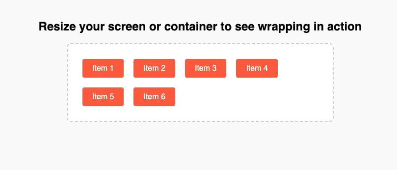
Let’s say you have a bunch of tags, pills, or buttons that should wrap to the next line instead of cramming into one. Here’s an example you can play with:
You can apply this styling to reproduce my output:
body {
  font-family: sans-serif;
  background: #f9f9f9;
  padding: 40px;
  text-align: center;
}

.container {
  display: flex;
  flex-wrap: wrap; /* Try: nowrap, wrap, wrap-reverse */
  background: white;
  padding: 20px;
  border: 2px dashed #ccc;
  border-radius: 8px;
  max-width: 500px;
  margin: 0 auto;
}

.item {
  background: #FF5722;
  color: white;
  padding: 10px 20px;
  margin: 10px;
  border-radius: 4px;
  flex: 0 0 auto; /* Prevents items from shrinking or growing */
}

You can change the value in .container to see different behavior:
nowrap (default)– All items stay on one line, even if they overflow.
wrap– Items automatically wrap to a new line when there’s not enough space.
wrap-reverse– Same as 'wrap' but the new lines appear above the previous ones instead of below.
Controlling Individual Items
Flexbox doesn’t just let you control the layout as a whole — you can also control how each individual item behaves inside the container. These properties let you decide which items grow, which ones shrink, and how big they start off.
flex-grow: Let Items Expand
This property controls how much an item should grow when there’s extra space in the container.
By default, items don’t grow — they stay their original size. But if you want them to stretch and share the extra space, flex-grow is the way to go.
.item {
  flex-grow: 1; /* All items grow equally */
}
Note: If you set flex-grow: 1 on multiple items, they’ll share the extra space equally. If you give one item a higher value (like 2 or 3), it will grow more than the others. Setting it to 0 means the item won’t grow at all — which is the default behavior.
flex-shrink: Control Shrinking
The flex-shrink property controls how flex items shrink when there isn't enough space in the container. By default, all items shrink equally, but you can set different values to prioritize which items shrink more or less.
.item {
  flex-shrink: 0; /* Prevents items from shrinking */
}
A value of 0 means the item won’t shrink at all. 1 is the default and allows normal shrinking. Higher values make the item shrink more aggressively when space gets tight.
flex-basis: Setting Default Sizes
The flex-basis property defines the default size of a flex item before any growing or shrinking occurs. It determines how much space an item takes up initially before the 'flex-grow' and 'flex-shrink' properties are applied.
'''
.item {
flex-basis: 100px;
}
### align-self: Aligning a Single Item
The align-self property allows individual flex items to override the alignment set by align-items. This is useful when you want a specific item to behave differently from the rest. .item:nth-child(2) { align-self: flex-end; }

How to Prevent Flex Items from Stretching
One last thing before we wrap up — and it's a question a lot of people search for when working with Flexbox: “How do I stop flex items from stretching?”
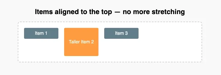
By default, Flexbox aligns items using align-items: stretch. That means if your container has a fixed height (or enough height from content), the flex items will stretch to match it — even if you didn’t ask them to.
Sometimes that’s fine, but in many cases, you want the items to keep their natural height and stay aligned at the top, center, or bottom instead.
To prevent items from stretching, you can control their vertical alignment using align-items on the container — or 'align-self' on a specific item.
Here’s a simple example: '''
You can style it with this:
''' body { font-family: sans-serif; background: #f9f9f9; padding: 40px; text-align: center; }
.container { display: flex; align-items: flex-start; / Prevents stretching, aligns items to the top / gap: 20px; background: white; padding: 20px; border: 2px dashed #ccc; border-radius: 8px; max-width: 600px; margin: 0 auto; }
.item { background: #607D8B; color: white; padding: 10px; border-radius: 4px; min-width: 100px; max-width: 200px; text-align: center; }
.tall { padding: 40px 10px; / Just to simulate one item being taller / background: #FF9800; } '''

Other options:
- Use
align-items: center, flex-start, orflex-enddepending on where you want the items to sit vertically.
- You can also control a single item’s alignment using
align-self.
- To stop items from expanding too much, set limits with
min-widthandmax-width.
This is a small tweak, but it makes a huge difference when you're building clean, consistent layouts — especially when items vary in size or content length.
Wrapping Up
Flexbox takes the headache out of building layouts in CSS. Once you understand how containers and items behave — and how to control spacing, alignment, and wrapping — you can create responsive designs with minimal code.

Joel Olawanle is a Software Engineer and Technical Writer with over three years of experience helping companies communicate their products effectively through technical articles.
View all posts by Joel Olawanle


