In today's world, many people with disabilities cannot easily access the web because of the barriers they face, like bad UX or design and lack of attention from developers in making the website accessible before deploying which can be very frustrating.
Over 1 billion people currently experience disability. This corresponds to about 15% of the world's population with significant difficulties in functioning, often requiring health care services. The sad part is this number keeps increasing every year.
In this article, we will look into what accessibility is, why it is important, and the different ways you can make your website accessible to anyone.
What is Web Accessibility?
According to the W3C, Web accessibility means that websites, tools, and technologies are designed and developed so that everyone, including people with disabilities, can use them.
The inventor of the web, Tim Berners-Lee stated that:
"The power of the Web is in its universality. Access by everyone regardless of disability is an essential aspect". — Tim Berners-Lee, W3C Director and inventor of the World Wide Web.
The different kinds of disabilities that affect the way people use the web include:
Auditory - deafness or hard of hearing.
Cognitive - conditions like dyslexia or dementia.
Physical - conditions like amputation, paralysis, arthritis.
Speech - conditions like stuttering or muteness.
Visual - partial or permanent loss of vision or inability to see.
Remember, developing accessible websites is not only for people with disabilities. It can benefit other people too, for example:
People with temporary disability - broken arm or eye injuries.
People with situational limitations - Noisy environment, bright sunlight.
People who use very slow internet connection or expensive bandwidth.
People who use mobile phones, smartwatches, smart TVs, etc.
For the people in this category to use the web, they have to use assistive technologies like screen readers, screen magnification, voice over, captions, and speech recognition tools. But this is impossible if the website they are trying to access is not built with accessibility in mind.
Why is Web Accessibility Important?
The web is an essential part of our daily lives, and we use it every day for accessing information. That is why it is necessary to make it inclusive so everyone can have equal access to the web. But that's not the case today. A lot of websites are inaccessible to their users. The United Nations recognizes access to information on the web as a Basic Human Right.
Web accessibility is also good for business, and it overlaps with other best practices such as Usability, Search Engine Optimization (SEO), Mobile web design. Case studies show that accessible websites have better search results, reduced maintenance costs, and increased audience reach, among other benefits.
In many countries, Web accessibility has been incorporated into the law. It is required to comply with the Web accessibility guidelines(WCAG); otherwise, you risk penalties of getting legal action for non-compliance.
12 Ways Improving Accessibility can Impact your Website
Let’s look into some quick ways of adding accessibility wins to your website.
1. Include Alternative Text(Alt) for Images.
Alt Text is one important way of making content on your site accessible. The alt attribute is a way of describing an image to help ensure people who use assistive technologies such as screen readers don't miss out on information. It also helps show the context of an image displayed incorrectly or when it fails to load.
Here’s how to add alt text to your images:
<img src="support.png" alt="Meet Our Customer Superheroes" />
These are examples of images using the alt text attribute, and you can even hover over the images to see the description.
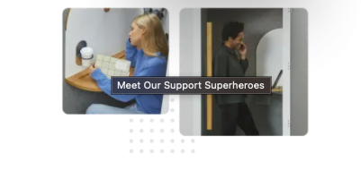
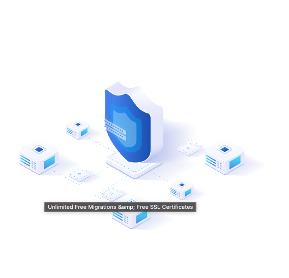
The Alt Text is displayed as you move the mouse cursor over the image
2. Add Video Captions and Transcripts to Media.
There is a lot of video content on the web. Sadly, not many of them include captions. Adding captions to your videos allows users with auditory disabilities to experience the videos by reading the captions on them. Additionally, adding a transcript to a video can help anyone browse through the content without watching the actual video and increases search engine rankings by making your content indexed by search engine crawlers.
Here are some tools that can handle transcription for you, so you don't do it yourself
3. Use Headings Correctly to Structure your Content.
Headings help organize the content of a page. It’s best to always nest headings by their ranking (or level). The most important heading is the <h1>, and the least important is the <h6>. Make sure that you don't skip any heading, and they all follow the same structure. Well-structured headings make your content easier to understand and are helpful for labelling page landmarks.
4. Ensure all Interactive Element is Keyboard Accessible.
Many users rely on keyboard-only navigation, which could be because they have some form of temporary or permanent motor disability that prevents them from using the mouse or users that prefer using keyboards shortcuts to be more productive. Ensuring you keep all elements on the website keyboard accessible is super important, and it creates a better experience for everyone.
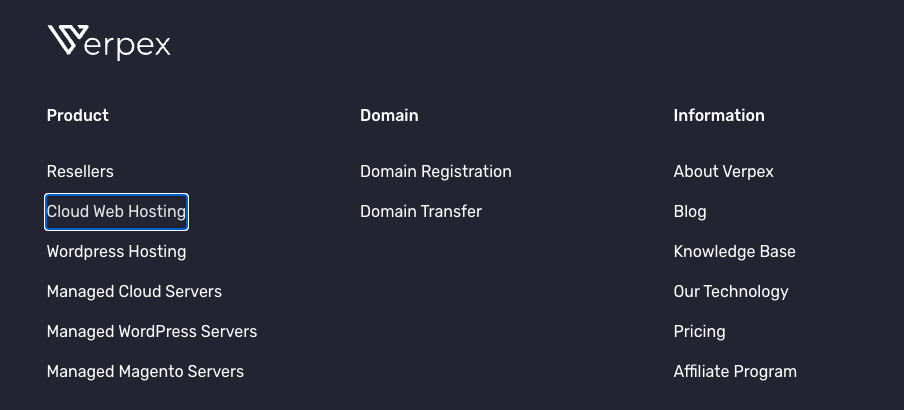
Verpex Footer Navigation with the Keyboard
5. Always Label your Form Element.
Your form should always use the label element. The for attribute of the label must exactly match the id of the form input element. In specific situations, it may be acceptable to hide <label> elements visually, but in most cases, labels are needed to help all users and screen readers understand the required input.
<form>
	<label for="name">Name</label>
	<input type="text" name="name" id="name">
	<label for="email">Email</label>
	<input type="email" name="email" id="email">
</form>
6. Identify Page Language and Language Changes.
Always indicate the primary language of every page by using the lang HTML attribute. Use the lang attribute on specific elements when the element's language differs from the rest of the page.
<html lang="en">
  ...
</html>

---

<section lang="fr">
	...
</section>
7. Use Semantic HTML to Convey Meaning and Structure.
Another tip is to use semantic HTML to mark up your website. There are a lot of semantic HTML tags like section, aside, article, but most people default to using divs for everything. Using semantic markup creates meaningful and accessible content for assistive technologies to interpret.
A typical example is when people use a div element instead of a button element. They already lose the accessible benefits of using a semantic element by doing this.
8. Ensure all Elements have a Proper Color Contrast.
Most users perceive colors differently. Some people find it difficult to understand content when a particular color combination is used. Also, take into account some users coming to your site might have colour blindness.
Here's an example, the image below contains an element with a background matching the text color, and it isn't easy to see what is written.
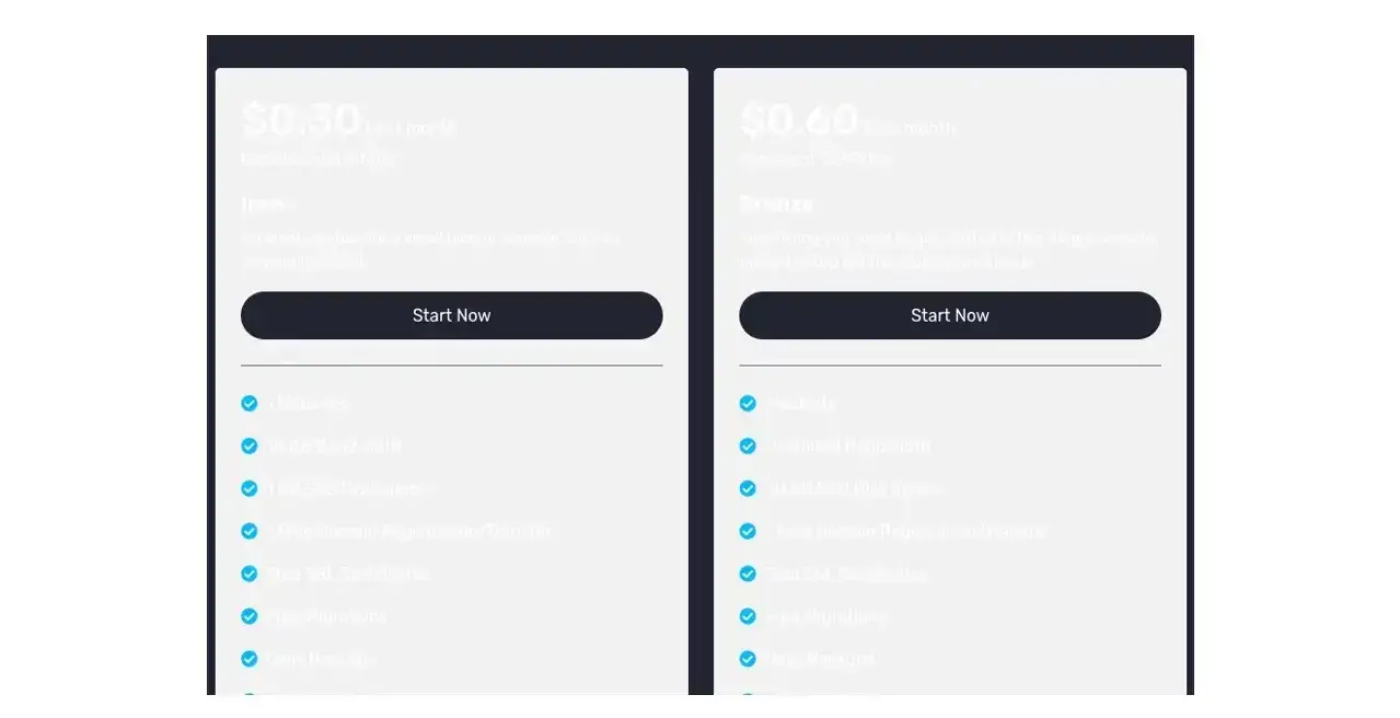
Poor Contrast for background and foreground text
On the other hand, setting the background to a darker shade than what is used for the foreground gives a clearer contrast and makes the element more visible and easy to read.
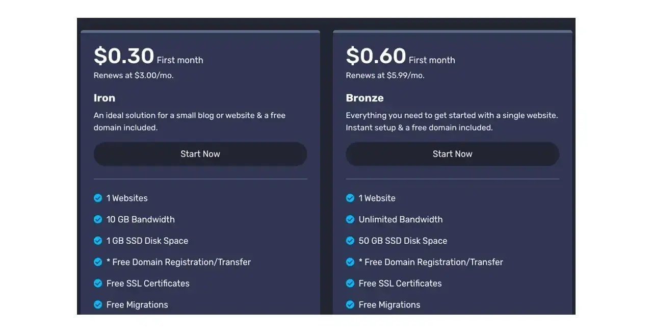
Proper Contrast for foreground text and background
It is essential to check that the colors you use have proper contrast. The minimum contrast ratio recommended by the WebAIM guidelines is 4:5:1 and AA(Minimum) for all text.
These are some free tools available to help you check color contrast:
9. Include Skip Navigation Links.
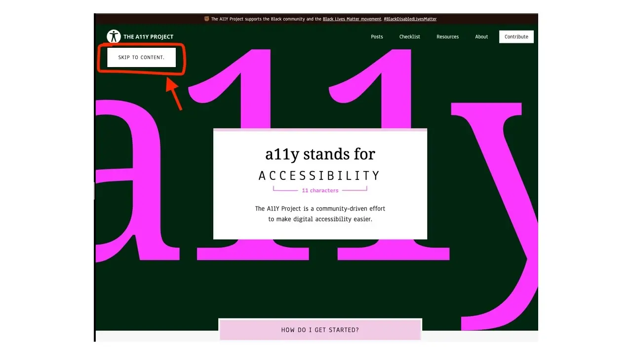
It can be a bit of a hassle for people using keyboard navigation to tab through a website with many navigation links. To help make this less hectic, the W3C recommends including a skip navigation link at the beginning of the page that then takes you to the page's main content area. Here's an example on the a11y project website.
10. Ensure CMS Supports Accessibility.
When using a CMS (Content Management System) like WordPress or Drupal, ensure they have accessibility features built-in and choose a theme/template that is accessible. For example, check if it's possible to add alt text to images, if you can add close captioning to video players, or if you can install plugins to help you audit your site for accessibility.
11. Use Descriptive Names for Hyperlinks.
Make sure you add meaningful descriptions to hyperlinks. Instead of adding click here or read more. It’s better to describe where the link is taking you to help users and screen readers understand the content of the information that will be presented when the link is clicked.
<a href="https://verpex.com/">Click here for more</a>
This is a better link, because it has a descriptive name and gives the user context to what it is about.
<a href="https://verpex.com/">Cloud and Web Hosting Service</a>
12. Avoid Using Tables for Layout
It would help if you only used tables for arranging data and figures. You should not use them for layout or anything else, and it's best to avoid using them entirely. When you use tables to display data, it's easy for your users or assistive technology like screen readers to understand the data being shown, but when you use it for layout, it becomes difficult for screen readers to navigate your site.
To learn how to organize structural markup on tables and make them accessible, check this guide by WebAIM.
Summary
From what we've learned in this article, we know that accessibility is vital, and making your site inclusive and accessible to everyone should be of top priority. Remember, you should bake accessibility into the development process, and it shouldn't be an afterthought.
Frequently Asked Questions
Why should I create a website?
There are many reasons why you should create a website if you’re an artist. You can use it to create a place where people can learn about you, talk about your art, or show off your work.
Can you migrate my existing website over?
Yes, and without issue. Regardless of how many websites you’re managing, we’ll bring all of them under the Verpex wing free of charge. Just send us the details of your websites when you’ve signed up to get started.
Can I host multiple websites?
Yes. Some packages even give you unlimited domains. However, the more you host, the slower your speeds will be.
Will cloud hosted websites be backed up?
Yes, Verpex performs daily backups of all sites hosted.
How do I choose a design for my website?
One of the most important things when creating a website for your art is the design. Even though your pieces of art might be amazing, people will leave if your site is hard to navigate. This is why it’s important that the site is easy on the eyes and easy to navigate.

Gift Egwuenu is a developer and content creator based in the Netherlands, She has worked in tech for over 4 years with experience in web development. Her work and focus are on helping people navigate the tech industry by sharing her work and experience in web development, career advice, and developer lifestyle videos.
View all posts by Gift Egwuenu


