The role played by nonprofit organizations in solving social issues and advancing communities is monumental. They can really delve into broader problems and raise money to fund solutions. However, any good nonprofit requires a website to reach a larger public base and raise funds while also promoting their mission. However, designing an effective website that articulates the organization's objectives can be difficult.
So if you’re wanting to create a website that captivates and propels your audience, read on.
This article dives into the qualities of successful nonprofit web design, in addition to offering expert advice and real-world examples.
Elements of Effective Nonprofit Website Design

Image source: Unsplash
The following elements are essential for a nonprofit website to be effective:
Navigation and Usability
A website should have an effortless navigation structure, making it simple for visitors to access the information they need. By having a consistent and organized navigation system, users will be able to understand your company’s mission statement easily as well as gain a clear idea of how they can become active in its initiatives.
Usability comes into play here as well. Making sure your website is accessible and user-friendly on any device, including desktops, smartphones, and tablets is essential. After all, a higher percentage of people are accessing websites via mobile devices than ever, so who knows might want to contribute to your initiative while on the go?
And making sure that users can access the page with the information they’re looking for in just three clicks is a good rule to live by, too. You should never make site visitors have to work for the information they’re seeking – especially if you’re hoping they’ll open their wallets at some point.
Information Architecture
Presenting organizational information in a systematic and coherent manner, with the most crucial points at the forefront of your homepage, is a must. Not only does this aid visitors to comprehend what your organization stands for and how they can be an active part of it, but it will also allow them to easily navigate their way around the website.
To ensure your website’s information architecture is effective, make sure to design a content hierarchy and create breadcrumb trails for easy navigation.
Content Creation
The content on a nonprofit website should be well-written, engaging, and informative. It should also be regularly updated to keep visitors informed about the organization's activities and accomplishments. Content should include a mission statement, donation button, call-to-action buttons, and other interactive elements.
To ensure success, it is imperative to craft a well-structured content strategy. This requires planning and optimizing the content on your website as well as creating a calendar for keeping track of any new or updated material. By doing this, you can create an efficient system that will save time in the long run and garner more attention from visitors.
Visual Design
The visual design of a nonprofit website should be aesthetically pleasing and professional. It should also be consistent with the organization's branding and mission. Effective visual design should include professionally designed graphics and visuals, such as an appropriate color palette and fonts.
Additionally, the design of the website should be optimized for different devices, since many visitors will visit a website from a variety of sources.
Accessibility and Responsive Design
The website should be accessible to people with disabilities and optimized for viewing on different devices, including desktops, laptops, tablets, and smartphones. This means that the website should be built using responsive design techniques so that it automatically adjusts to different screen sizes and resolutions. This will ensure a consistent experience regardless of the device used.
It also means your site should abide by the WCAG 2 guidelines for creating accessible websites. These guidelines point to things like color and font choices, use of ALT text, making content screen-reader accessible, and more.
By taking these elements into consideration, you can create a website that is attractive, user-friendly, and effective in conveying your organization's message to the public. With such a website, you can be sure that it will engage and attract visitors, leading to increased donations and volunteers.
Best Practices for Nonprofit Website Design

Image source: Unsplash
If you're going to be building a nonprofit website, it's important to follow some key best practices. The following can help nonprofit organizations create an effective website that lives up to its mission statement (and looks good while doing it):
Keep the Website Up-to-Date
Regularly updating the website with new content and information helps keep visitors informed and engaged. Additionally, it's important to make sure that the content is accurate and up-to-date. So if there are major industry changes, be sure to make updates as soon as possible.
Create a Clear Call-to-Action
A clear call-to-action, such as a "Donate Now" button, helps visitors understand the ways they can support the organization. It should be prominently displayed on the homepage and other pages.
Create a Donation Page
Having a dedicated donation page makes it easy for visitors to make a contribution. This page should clearly explain how donations can be made and what the benefits of donating are.
Make the Website Mobile-Friendly
Optimizing the website for mobile devices ensures that it can be easily viewed and used on the go. This will help maximize the website’s reach and engagement.
Include Testimonials and Impact Stories
Testimonials and impact stories demonstrate the impact of the organization's work and can be used to encourage visitors to donate or volunteer. Include stories and photos on the website to show the real-life impact of your organization's work and place them prominently on the homepage to draw visitors in.
Use of Storytelling
Using storytelling to communicate the organization's mission and impact can be an effective way to engage visitors and inspire them to get involved. This can also be used to share stories about the organization’s successes and make visitors feel connected to the cause.
Incorporating Social Proof
Incorporating social proof such as press coverage, and partnerships, can help establish credibility and trust with visitors. It also serves as a way to build relationships with influencers and other organizations.
These best practices can help nonprofit organizations create an effective website that engages visitors, builds trust, and encourages donations and volunteers. By taking the time to design a website that follows these best practices, nonprofit organizations can ensure that it conveys their message effectively to the public and maximizes its impact.
But sometimes it's best to see these best practices put into action. That's what we'll showcase next.
Case Studies
The following are examples of successful nonprofit websites and an analysis of their design.
American Red Cross
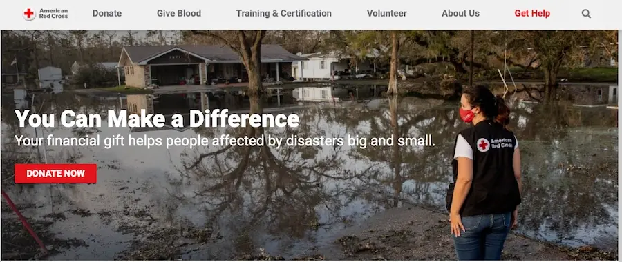
The American Red Cross website strives to create an engaging and informative user experience. It prominently features visuals, including photos and videos, that capture the impact of their work. The website also includes a clear call-to-action on the homepage, with a "Donate Now" button, and has a dedicated donation page as well. This site is mobile-friendly, too, making it easier for visitors to access the content on the go.
Nature Conservancy
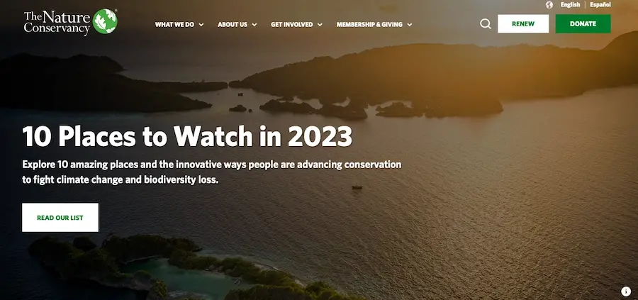
The Nature Conservancy website has a modern design that stands out among other nonprofit websites. It incorporates subdued visuals and interactive elements that help engage visitors. Additionally, the website features impact stories and media coverage to establish credibility and encourage donations. The website also has a dedicated donation page, as well as a clear call-to-action on the homepage.
Charity: Water
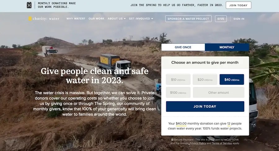
Charity: Water is another non-profit organization with an amazing mission - to provide clean and safe drinking water to people living in developing countries. The website's design is visually pleasing, with a clean and modern aesthetic. The homepage prominently features a full-width video that tells the organization's story and the impact of their work. The navigation is clear and easy to use, with a prominent "Join Today" button, which prompts visitors to select a dollar amount to donate monthly. The website is also optimized for mobile viewing, making it easy to browse and donate on the go.
Kiva
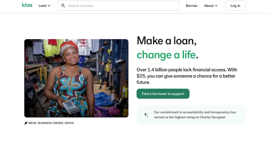
Lastly, there’s Kiva, which is a nonprofit organization that allows people to make loans to entrepreneurs in developing countries. The website's design is simple and easy to navigate. The homepage prominently features a call-to--action to "Find a borrower to support" and a search bar to quickly find a specific loan to fund. The website also has a clear "About Us" section and a section for "Success Stories" to showcase the impact of their loans. The website is also optimized for mobile viewing, making it easy to browse and end on the go.l
These case studies demonstrate how nonprofit organizations can use best practices to create successful websites. By following the principles outlined in this article, nonprofit organizations can design a website that effectively communicates their mission and engages visitors. An effective nonprofit website can help increase donations, volunteers, and overall impact.
It can also help increase the organization’s visibility and reach a broader audience. With the right design and strategy, nonprofit organizations can create an effective website that anyone can be proud of.
Building an Effective Nonprofit Website Design
Nonprofit websites play a crucial role in communicating the organization's mission and inspiring others to get involved. By understanding the elements of effective design, best practices, and case studies, nonprofit organizations can create a website that effectively engages and inspires their audience.
It's important to keep the website up-to-date and make it mobile-friendly, use storytelling and social proof, and have clear calls-to-action and donation pages.
And you should consider web hosting as well. Thankfully, that’s where we can be of help. At Verpex, we are an ideal solution for nonprofit organizations looking for cost-effective, reliable, and secure hosting services. And whether you need a hosting plan for WordPress or a managed server, we’ve got you covered.
Frequently Asked Questions
How to design a podcast website?
When using a CMS, designing your website will be quick and easy. You can add a template you’ve created or pick one of the pre-made templates that the CMS features in its library.
How do I choose a design for my website?
One of the most important things when creating a website for your art is the design. Even though your pieces of art might be amazing, people will leave if your site is hard to navigate. This is why it’s important that the site is easy on the eyes and easy to navigate.
What type of design should my fitness blog have?
When you’re a beginner, don’t go crazy with the design of the site. The most important thing is to have a site that looks professional, easy to read, and fast.
Are website builders easy to use?
One of the easiest ways to build a website is with a website builder. Using a website builder doesn't require any programming and coding skills.

Brenda Barron is a freelance writer and editor living in southern California. With over a decade of experience crafting prose for businesses of all sizes, she has a solid understanding of what it takes to capture a reader's attention.
View all posts by Brenda Barron


