Do you struggle with XAML in .NET MAUI? If so, don't worry - you're not alone. The good news is that today we will develop a Sign Up UI based on a Dribble Design. I will teach you some tricks to make UI design with XAML in .NET MAUI, which will become your favorite skill!
To help you better understand the topic, we will divide this article into the following subtopics:
- Visual structure to replicate
- Step-by-step of the code
- Viewing the results
Let 's start!
Visual structure to replicate
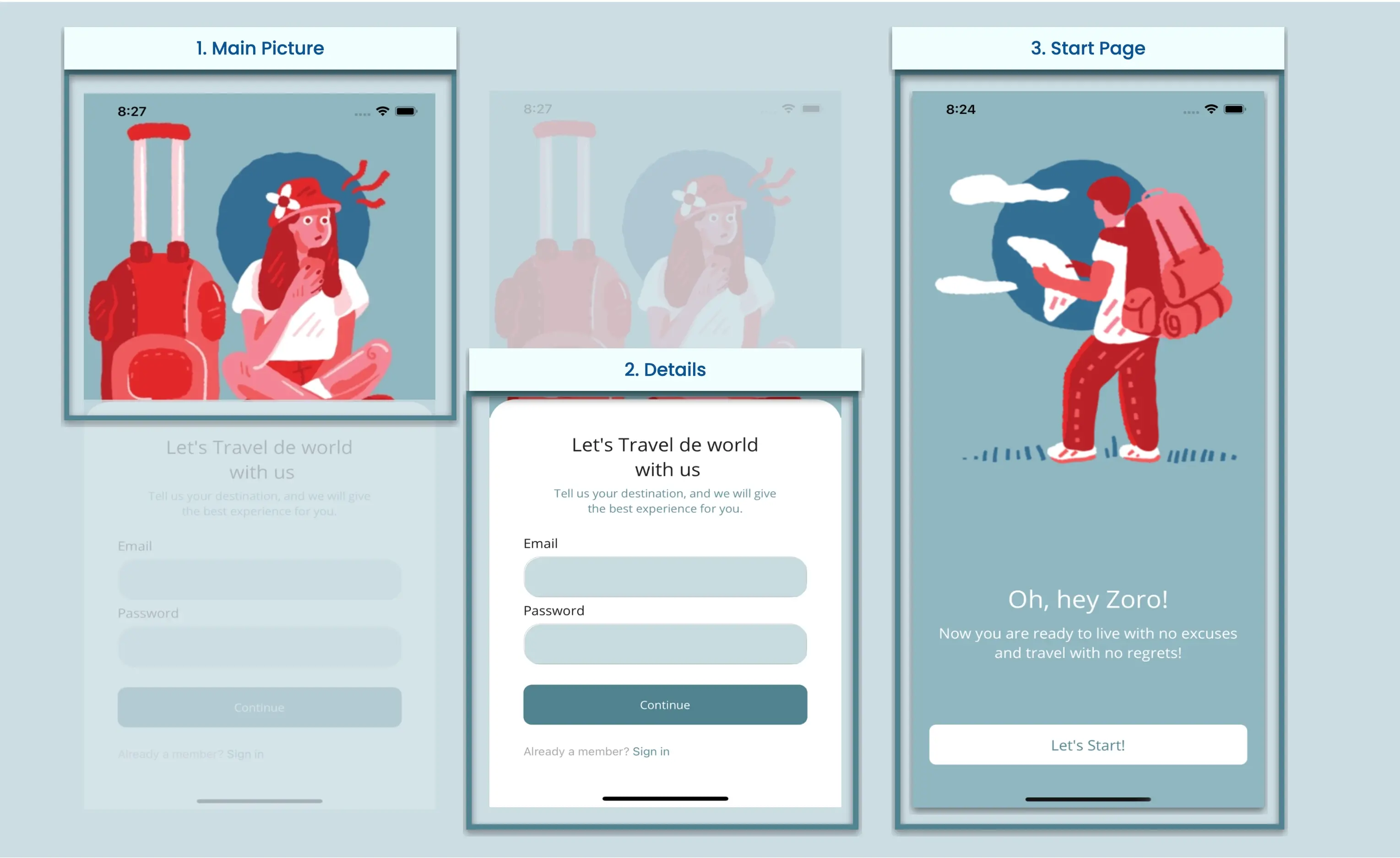
Here you can see the UI that we will replicate. It is important to have a clear idea of where to start when building the XAML. I recommend creating a small visual structure that will help you to identify the "blocks" of elements to be developed. For this reason, I have divided the UI into blocks, which are listed in the order in which we will replicate them:
Step-by-step of the code
Now, let's see the development of each block:
1. Main Page

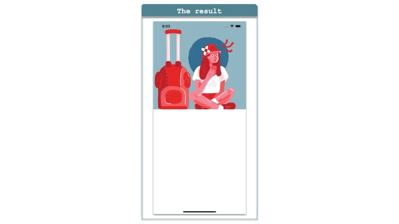
To get started, we'll create a new page called MainPage.xaml. Before adding the main image, we need to add the main layout that will contain all the elements of the page. To do this, we will use the Grid. It provides good performance and is easy to use because it allows us to position elements using rows and columns
⚠ If you want to know more information about Grid, you can enter to this article.
<Grid RowDefinitions="Auto,*">
      <!— Add all the elements of block one and two here. —>
</Grid>
Now, let’s add the main image, let's see how to do it in code:
<!-- Main Image-->
<Image Grid.Row="0" Source="cartoon1" Aspect="Fill" HeightRequest="410" Margin="0,-45,0,0"/>

<!-- Add here the code that will be explained in block two →
2. Details

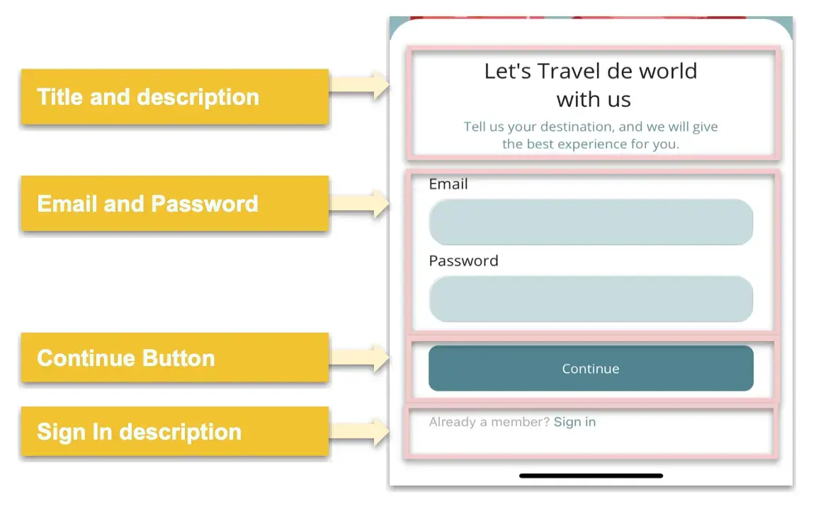
Let's move on to the second block. In this case, the UI needs to present various options for displaying information. Upon analyzing the elements that we will use to code this, we have the following:
Let's Start Coding
To achieve the rounded effects that overlap the image of the first block, we need to add a Frame. Before adding any elements, we will use a Grid to organize the elements that will be placed inside the Frame. See the example below:
<!-- White Container-->
<Frame Grid.Row="1" CornerRadius="31" TranslationY="-23" BorderColor="Transparent" VerticalOptions="FillAndExpand">

       <Grid RowDefinitions="Auto,Auto,Auto,Auto,Auto,Auto,Auto,Auto" Padding="20" RowSpacing="5">
             <!-- Add here the code explained for Title & description-->
             <!-- Add here the code explained for Email & password-->
             <!-- Add here the code explained for Continue Button-->
             <!-- Add here the code explained for Sign in description-->
       </Grid>
</Frame>
Now let's continue by adding the elements that this block contains:
Title and description
<!-- Title & description-->
<Label Grid.Row="0" Text="Let's Travel the world
 with us" FontSize="23" HorizontalTextAlignment="Center"/>

<Label Grid.Row="1" Text="Tell us your destination, and we will give
the best experience for you." Margin="0,0,0,18"  TextColor="#63909c" HorizontalTextAlignment="Center"/>`

<!-- Add here the code that will be explained in next code block -->
Email and password
For both the email and password descriptions, we will use a Label. To insert the data, we will use an Entry.
💡 Quick tip As you may have noticed, these entries have rounded corners. To achieve this, Borders for .NET MAUI were used! As you can see below:
<!-- Email Information-->
<Label Grid.Row="2" Text="Email" FontSize="16" FontAttributes="Bold"/>
<Border Grid.Row="3" StrokeShape="RoundRectangle 20,20,20,20">
       <Entry BackgroundColor="#c7dbe0" TextColor="#578794" HeightRequest="50"/>
</Border>
<!-- Password Information-->
<Label Grid.Row="4" Text="Password" FontSize="16" FontAttributes="Bold"/>
<Border Grid.Row="5" StrokeShape="RoundRectangle 20,20,20,20">
       <Entry BackgroundColor="#c7dbe0" TextColor="#578794" IsPassword="True" HeightRequest="50"/>
</Border>

<!-- Add here the code that will be explained in next code block -->
⚠ If you want to know more information about Borders, you can enter to the article Applying borders in .NET MAUI.
Continue Button
Let's continue with the Continue Button. This is a simple button with a blue background and rounded edges as highlight properties.
<!-- Continue Button-->
<Button Grid.Row="6" Text="Continue" FontAttributes="Bold" TextColor="White" Margin="0,20" HeightRequest="50" CornerRadius="10" BackgroundColor="#508390"/>

<!-- Add here the code that will be explained in next code block →
Sign In description
To complete this page, we will add a description of the Sign In feature. One important aspect to highlight is that we are using the same Label to integrate different visual characteristics, which improves the performance of our app. Although another solution would be to define a Label for each style, this is not the optimal approach. To address this issue, we can use the FormattedString, as shown below:
<!-- Sign In Description-->
<Label Grid.Row="7" FontAttributes="Bold">
        <Label.FormattedText>
                        <FormattedString>
                            <Span Text="Already a member? " TextColor="#aaaaaa"/>
                            <Span Text="Sign in" TextColor="#63909c"/>
                        </FormattedString>
         </Label.FormattedText>
</Label>
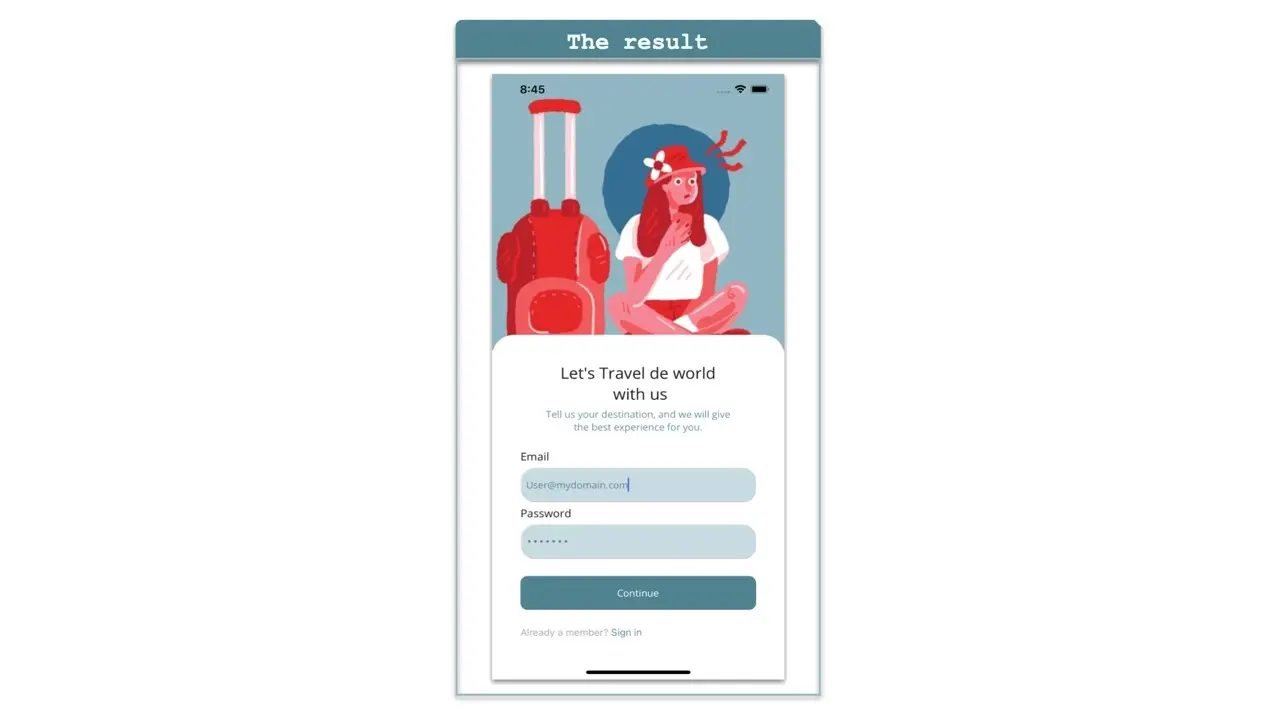
Now that we have the complete code for our second block, we can see a result like the following:
3. Start Page

We have reached the final block. To begin, let's create a file called StartPage.xaml.
Main Layout For the main layout, just like the previous page we will use a Grid, in this case with four rows and one column. Which will be as follows:
<Grid RowDefinitions="Auto,Auto,Auto,*" VerticalOptions="FillAndExpand" RowSpacing="10" Padding="20">
             <!-- Add here the code explained for Title & description-->
</Grid>
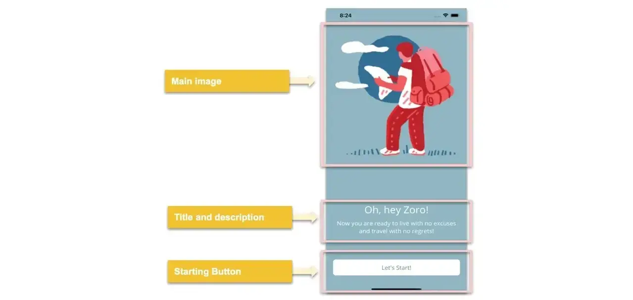
In this case, the UI needs to present various options for displaying information. Upon analyzing the elements that we will use to code this, we have the following:
Adding the elements
Main Image
<!-- Main Image-->
<Image Grid.Row="0" Source="travelboy" Aspect="AspectFit" HeightRequest="420"/>

<!-- Add here the code that will be explained in next code block -->
Title and description
<!--Title-->
<Label Grid.Row="1" Text="Oh, hey Zoro!" HorizontalTextAlignment="Center" FontSize="30" Padding="0,120,0,0" TextColor="White" />

<!--Description-->
<Label Grid.Row="2" Text="Now you are ready to live with no excuses and travel with no regrets!" FontSize="18" HorizontalTextAlignment="Center" TextColor="White"/>

<!-- Add here the code that will be explained in next code block -->
Starting Button
<!--Starting Button-->
<Button Grid.Row="3" Text="Let's Start!" FontAttributes="Bold" BackgroundColor="White" FontSize="18" HeightRequest="50" VerticalOptions="End" TextColor="#578894" HorizontalOptions="FillAndExpand"/>
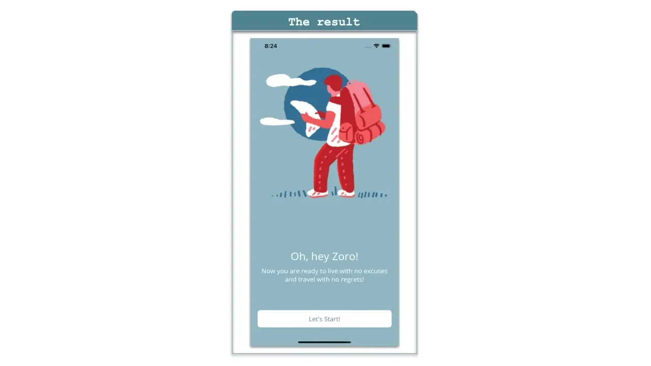
Now that we have the complete code for our last block, we can see a result like the following:
Did you see how fast and easy it was? We have finished building our UI, I hope you liked it and that from now on you will put all this knowledge into practice!💚💕
Learn firsthand how effective our hosting services are. With the most up-to-date reliability and security features, we guarantee that your website will be up and operating without any hitches.
Frequently Asked Questions
Do I need to know how to code to use WordPress?
Definitely not. There’s no need to learn coding, since most WordPress users aren’t developers. There’s many plugins and themes you can use to customize your website without coding.
What content management sytems use PHP?
All of the most popular content management systems are compatible with PHP including, WordPress, Joomla, Drupal, and Magento
Can I contact the PHP developers?
Not directly, however, over on PHP.net you’ll find an extensive range of patch update information, forums, and articles that will answer the majority of your technical questions.
How secure is PHP?
PHP has an excellent security reputation and the developers are constantly making updates. Plus, you’ll benefit from additional security measures for your site by opting for a managed hosting package.

I’m Leomaris Reyes, Microsoft MVP, Software Development Expert at Platzi, Software Engineer from Dominican Republic with more than 6 years of experience in Software Development. Xamarin Certified Mobile Developer.
View all posts by Leomaris Reyes


