For most designers, Auto Layout is their worst nightmare, while for others, it’s just a walk in the park. But love it or hate it, mastering Auto Layout is essential for creating responsive and scalable designs.
Instead of relying on endless manual tweaks, designers need a smarter approach that ensures flexibility and consistency across all devices. Auto Layout provides a structured way to design adaptable interfaces by defining rules that automatically adjust spacing, alignment, and sizing.
In this article, we’ll explain Auto Layout, how it works, and why it is essential for modern UI/UX design.
Understanding Auto-layout
Auto Layout is a design system that allows UI elements to be arranged dynamically based on predefined rules and constraints.
Instead of manually positioning each element, Auto Layout ensures that components adjust automatically to different screen sizes, orientations, and content variations. This makes it easier to create responsive and scalable designs without constant manual adjustments.
In a manual layout design, designers and developers position elements using fixed values, such as pixels or percentages. While this approach provides precise control, it becomes problematic when scaling across multiple screen sizes.
Any small change in content or screen size often requires designers to manually reposition and resize elements, leading to inefficiency and inconsistency.
Auto Layout, on the other hand, introduces constraints and relationships between elements, allowing them to adjust dynamically. Instead of setting fixed positions, designers define rules such as spacing, alignment, and resizing behavior.
This makes layouts more adaptive, reducing the need for repetitive adjustments and ensuring a smoother user experience across devices.
Platforms that Support Auto-layout
Auto Layout is widely implemented across various design and development platforms to simplify UI creation and ensure responsiveness. Some key platforms include:
Figma: Uses Auto Layout for flexible and dynamic UI designs, allowing components to resize based on content while maintaining consistent spacing and alignment.
iOS (SwiftUI & UIKit): In iOS development, Auto Layout is essential for building adaptive app interfaces, ensuring that UI elements adjust to different screen sizes and orientations.
Android (Jetpack Compose & XML Layouts): Android developers use Constraint Layout and Jetpack Compose to create flexible, dynamic layouts that adapt to various devices and screen resolutions.
Web Development: While not called "Auto Layout," web technologies like CSS Flexbox and Grid function similarly, enabling responsive web designs that adjust based on screen size and content.
Key Features of Auto-Layout

Below are the core features that make Auto Layout a powerful tool for designers and developers.
1. Constraints and Rules
At the heart of Auto Layout are constraints, which determine how UI elements behave in relation to each other. Constraints act like rules that define an element's position, size, and relationship to other components. Instead of manually placing each element, designers set rules such as:
Fixed spacing (e.g., an element must always be 20px away from another).
Proportional sizing (e.g., an element should take up 50% of the screen width).
Aspect ratio locking (e.g., maintaining a 16:9 ratio when resizing).
These constraints ensure that layouts remain adaptive and structured, regardless of screen size or content changes.
2. Alignment and Spacing
Auto Layout makes it easy to align elements consistently across a design. By defining alignment rules, designers can:
- Ensure buttons, text, and images are dynamically centered, left-aligned, or right-aligned.
- Maintain uniform gaps and padding between elements for a balanced layout.
- Create evenly distributed layouts without manually spacing each component.
This helps build clean, professional, and well-structured designs that maintain their look across different screen sizes and resolutions.
3. Resizing and Responsiveness
One of the biggest advantages of Auto Layout is its ability to handle dynamic resizing. Elements can be set to:
- Expand or shrink based on content (e.g., buttons growing to fit text).
- Stretch or stay fixed when a screen size changes.
- Rearrange themselves automatically in different screen orientations (portrait vs. landscape).
This ensures that a UI remains functional and visually appealing across devices like smartphones, tablets, and desktops without requiring manual adjustments.
4. Nested Auto Layouts
Auto Layout allows designers to nest layouts within layouts, making it possible to build hierarchical and modular designs. This means:
- You can group multiple elements into a container and apply Auto Layout to the entire group.
- Components within a nested layout can adapt independently while maintaining overall structure.
- Nested layouts simplify design updates, as changes to one component can automatically adjust the entire layout.
This feature is particularly useful for designing adaptive UI components, such as buttons, cards, and forms, ensuring that they scale and reposition smoothly.
How Auto Layout Works in Figma
While Auto Layout principles apply to various platforms, such as iOS, Android, and web development, our focus is on how they work within Figma. Here are the key features of Auto Layout:
Adding Auto Layout: You can apply Auto Layout to any frame or selection by selecting the element and clicking the "+ Auto Layout" button in the right-hand panel or using the shortcut Shift + A.
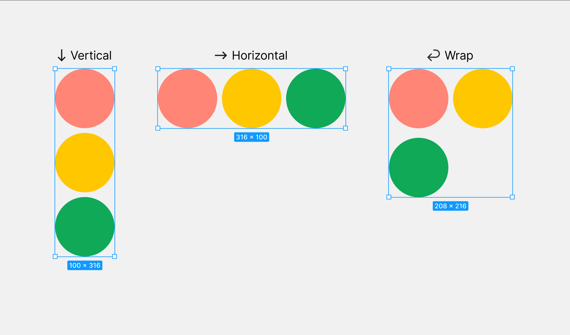
Defining Direction: Auto Layout supports both horizontal and vertical stacking. This means you can decide whether elements should be arranged in a row (horizontal) or column (vertical).
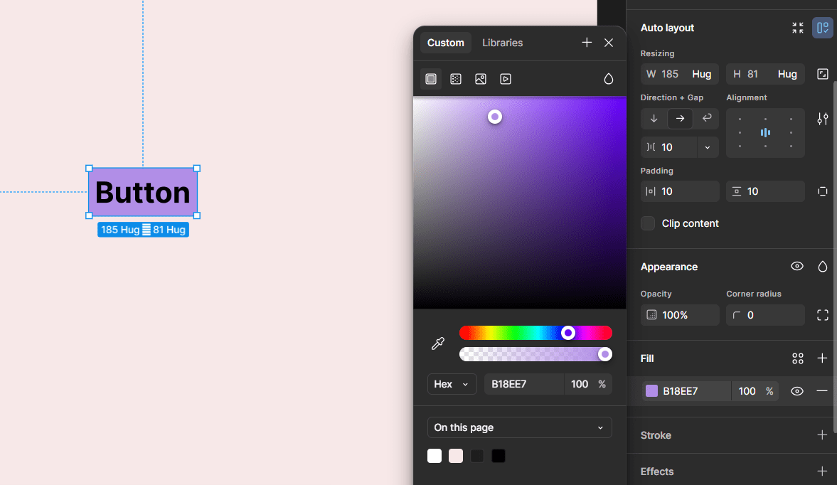
Spacing and Padding: You can define a fixed amount of space between child elements within the Auto Layout frame. You can also apply padding around the entire frame, ensuring proper spacing inside the container.
4: Resizing Options:
- Hug Contents: The frame adjusts dynamically based on the size of the inner elements.
- Fixed Size: The frame remains at a specified width and height, regardless of its content.
- Fill Container: The child elements stretch to fill the parent frame’s available space.
- Alignment and Distribution: Auto Layout allows precise control over alignment (left, right, center, top, bottom) and how elements are distributed within the frame. Now, let’s put Auto Layout into action by designing a fully responsive button.
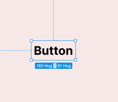
- Type your button text, select it, and press Shift + A to apply Auto Layout.

Auto Layout would immediately be added to your frame.
- Fill the frame with your desired background color.

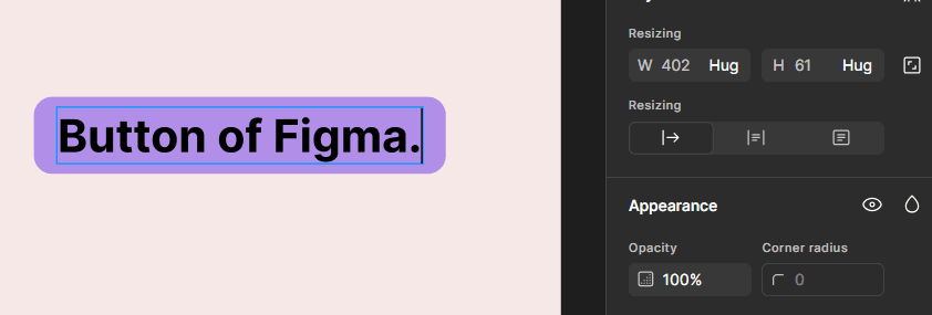
- Round the corners of your frame (e.g., a corner radius of 20).

- Then, adjust vertical and horizontal padding to achieve the right spacing.

- Test to see if your Auto Layout is functioning effectively. The width is supposed to expand with every new text in the frame.

Benefits of Using Auto-layout
Auto Layout is more than just a convenient feature; it’s a game-changer for UI/UX design and development. Here are the key benefits of using Auto Layout:
1. Saves Time in UI Design and Development
Manually positioning and resizing elements can be time-consuming, especially when designing for multiple screen sizes. Auto Layout eliminates the need for repetitive adjustments by automatically adapting elements based on constraints. This means:
- Designers can create responsive layouts faster.
- Developers spend less time adjusting UI components in code.
- Iterations and updates can be made quickly without redesigning entire layouts.
2. Ensures Consistency and Scalability
A well-structured design system relies on consistent spacing, alignment, and proportions. Auto Layout helps maintain this consistency by ensuring that elements:
- Follow predefined spacing and alignment rules.
- Scale proportionally across different screen sizes.
- Maintain uniform styling, making UI components more predictable.
This is especially useful for teams working on large-scale projects or multi-platform applications, where maintaining design uniformity is crucial.
3. Enhances Collaboration Between Designers and Developers
One of the biggest challenges in UI/UX projects is the gap between design and development. Auto Layout helps bridge this gap by:
- Making designs more developer-friendly, reducing the need for pixel-perfect manual adjustments.
- Allowing developers to understand how elements should behave instead of relying on static mockups.
- Enabling designers to create interactive prototypes that closely mimic the final product.
This leads to smoother handoffs, fewer misunderstandings, and a more efficient workflow between teams.
4. Reduces Manual Adjustments When Making Design Changes
When a UI design needs to be updated, manual tweaking can be frustrating and error-prone. Auto Layout minimizes this effort by:
- Automatically repositioning elements when content changes (e.g., a button resizing to fit longer text).
- Adjusting layouts dynamically when screen sizes or orientations change.
- Ensuring that updates don’t break the overall design structure.
This makes it easier to iterate quickly, test variations, and implement changes without disrupting the entire layout.
Conclusion
Auto Layout is a powerful tool for designers and developers. It makes UI design faster, more flexible, and effortlessly responsive. Whether you’re working in Figma, iOS, Android, or web development, mastering Auto Layout helps you create scalable, consistent, and dynamic interfaces without the hassle of manual adjustments.
By using constraints, alignment, spacing, and resizing, you can build adaptive layouts that work seamlessly across different screen sizes.
Once you get the hang of it, Auto Layout isn’t just a tool. It’s a superpower for creating polished, professional designs with ease.
Frequently Asked Questions
How can I create customizable layout options within my theme?
Use theme options or the Customizer API to allow users to customize layouts, colours and other design elements without directly editing code.
Can I use page builders to create layouts for my WooCommerce theme?
Use page builders, but choose one that is compatible and optimized for WooCommerce.
Are WordPress-free themes safe?
People often think that free themes have low quality. However, free WordPress themes actually have high quality and are free to use.
How can I ensure my theme adheres to the latest WordPress coding standards?
Use the WordPress Coding Standards, regularly check code with linters and static analysis tools, and follow the best practices outlined in the WordPress Theme Developer Handbook.

Joel Olawanle is a Software Engineer and Technical Writer with over three years of experience helping companies communicate their products effectively through technical articles.
View all posts by Joel Olawanle


