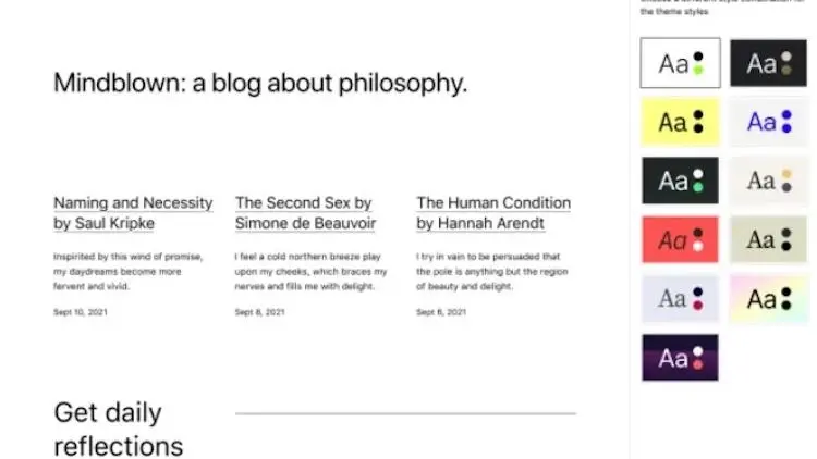
Those familiar with the CMS WordPress and community likely know that each year, they release a new default theme to the public. Often, this new theme is intended to showcase some of the latest features built into the core installation in the simplest, most stripped-down way possible.
And this year's offering is no different in that regard. Twenty Twenty-Three is designed to be a modern, visually appealing theme that draws on the latest design trends while still being fully responsive and accessible. As you would expect from WordPress' default offering, it is incredibly lightweight and minimal yet offers a decent amount of flexibility to those looking to spice things up.
So you can get familiar with Twenty Twenty-Three in a hurry, we're highlighting some of the new default theme's best features so you don't have to dip into documentation yourself. Instead, you can learn about the theme here and quickly decide if it's going to be a good option for any site moves you want to make.
With this in mind, let's get down to business.
5 Twenty Twenty-Three WordPress Theme Features to Keep an Eye On
Here are some of the standout features that make the Twenty Twenty-Three WordPress theme stand out from the rest.
1. Page Layouts
The first feature of Twenty Twenty-Three we'll discuss is its page layouts. To put it simply, the page layouts for this theme are absolutely bare bones this time around. Streamlined is an understatement. To get the most out of this theme, you'll need to custom-craft your pages using blocks, images, and other elements.
That said, Twenty Twenty-Three does come with a few premade page layouts so you don't have to start from scratch every time. These include basic options like full width or two columns for both post archives and single posts. It also makes full use of block patterns to streamline the design process.
2. Color Palettes
We all know that colors play an important role in creating a website's atmosphere and aesthetics, so Twenty Twenty-Three provides some helpful options to get you started. The theme comes with a new default color palette that's subdued, earthy, and bright -- all at once.
It features varying shades of green along with gray, white, and black, making for a subtle color scheme well-suited to many types of sites. Of course, you can build out custom color palettes as well, especially when we get into the style variation possibilities, but more on that later.
3. Global Styles
The Twenty Twenty-Three WordPress theme also offers an array of global style options, such as custom fonts and line heights. This is a great way to help your site look unique while still adhering to the same design principles and overall aesthetic. For example, you can choose from one of the 12 different font families that come with the theme, and then modify the font weight and sizes to suit your needs.
You can also customize the color options for heading elements, body text, and buttons. This is a great way to give your site an individualized look while still adhering to design principles that keep it looking professional.
4. Style Variations
By far the most notable feature of this new default theme is the style variations offered along with it. These style variations let you quickly switch between a handful of pre-made website design options and drastically alter your site's look in just a few clicks.
These variations were developed by the WordPress community and each showcase some of the different things you can accomplish within the new theme. The team indicated they selected these style variations based on which ones they thought would fit together nicely in a cohesive collection rather than picking individual favorites.
Let's take a look at each of these new style variations now in more detail:
1. Pitch
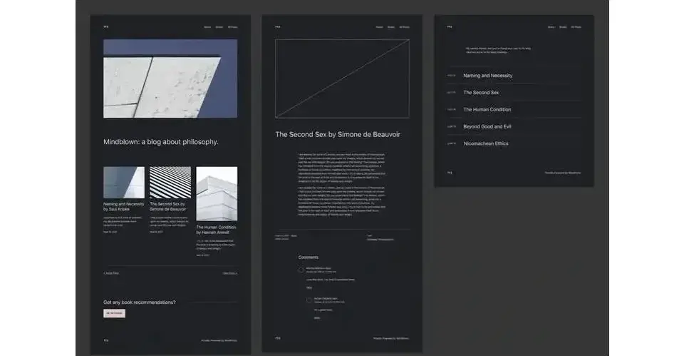
A classic and minimal design that lets the content do the talking. It's essentially a dark mode version of the default theme.
2. Canary
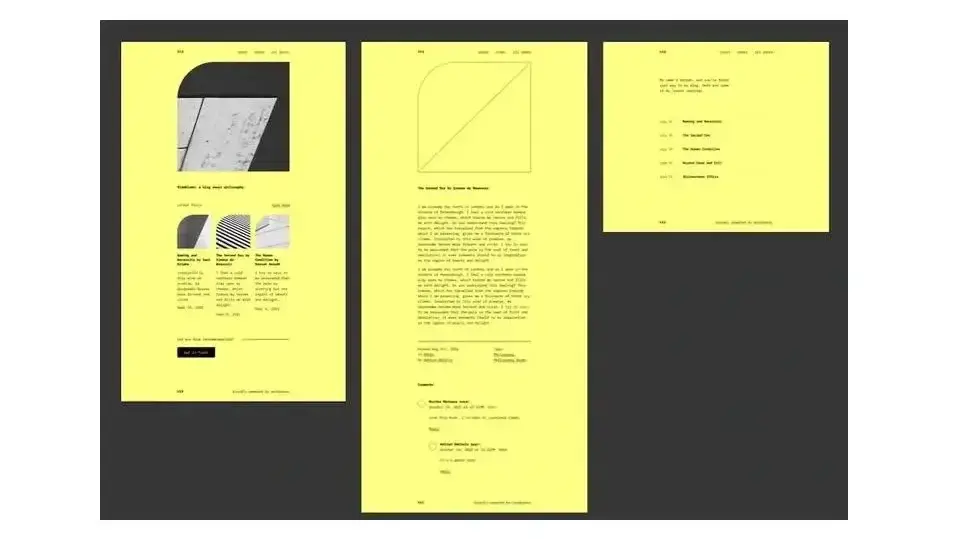
Though formally unnamed, this style variation is going by the moniker, "Canary" due to its canary yellow background. This option is ideal for sites that want to lean into some more visual flair while only using a single type size.
3. Electric
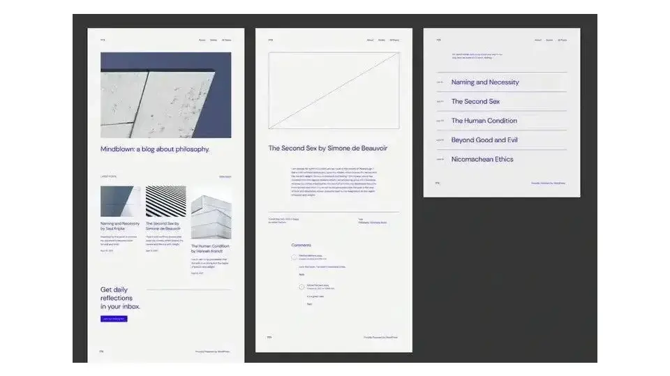
This one also doesn't have a formal name but it's going by "Electric" at the moment. Perhaps because of the electric blue text? This variation emphasizes bold text color on top of a subtle gray background, breathing life into the site's typography.
4. Pilgrimage
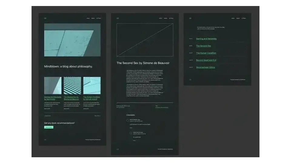
The Pilgrimage variation offers another dark mode option with a grayscale and green color palette. It also includes a dot pattern background for added interest as well as subtle green gradient buttons to clearly draw the eye.
5. Marigold
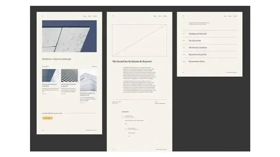
This style variation is a bit more standard in its presentation but sometimes that's exactly what you need. It relies on serif fonts to add a touch of sophistication, however.
6. Block out
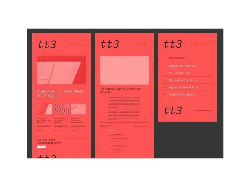
This is such an interesting-to-look-at style variation! Block out uses really interesting typographic choices that add a distinctive style. Plus, this variation gets its name from the fact that images are blocked out a bit from view by using a similar color as the background for both shadows and highlights. It creates a unique effect.
7. Pumpkin Spice
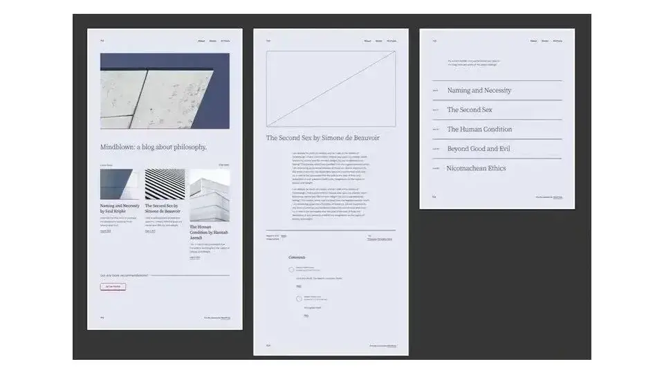
This variation also doesn't have an official name but it goes by "Pumpkin Spice" for now. The variation is minimal, of course, but it does include a border around the page and elements, as well as eye-catching button styles.
8. Sherbet
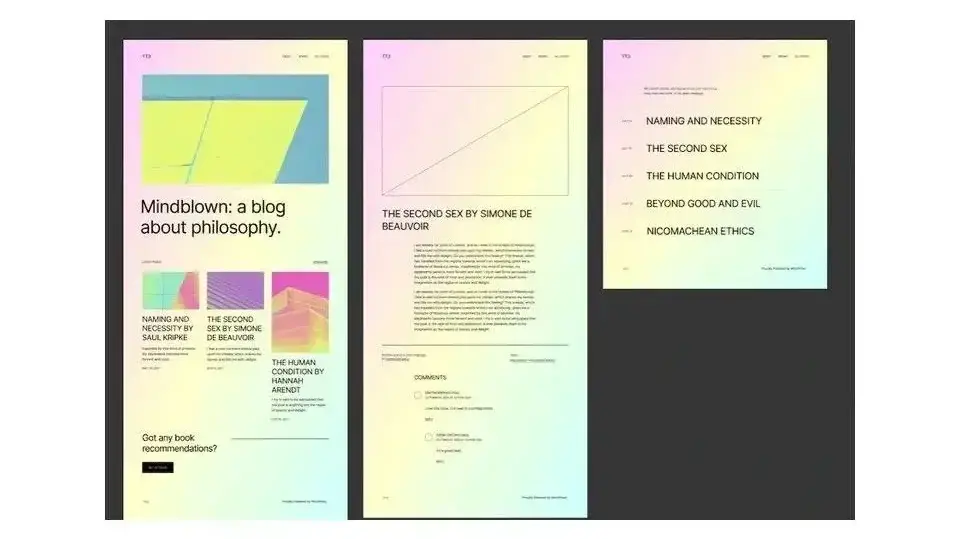
If you're looking for something fun, then this sherbet-colored style variation is the one for you. This variation offers small flourishes, like a gradient background and super colorful image overlays.
9. Aubergine
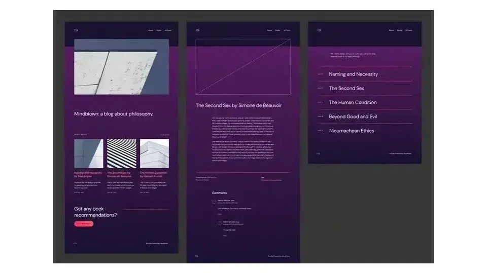
Named for its purple hue, the Aubergine style variation features a split-color background as well as contrasting pink buttons and lines. It's a style that's easy on the eyes while still being visually interesting. This style variation has a story to tell.
10. Grapes
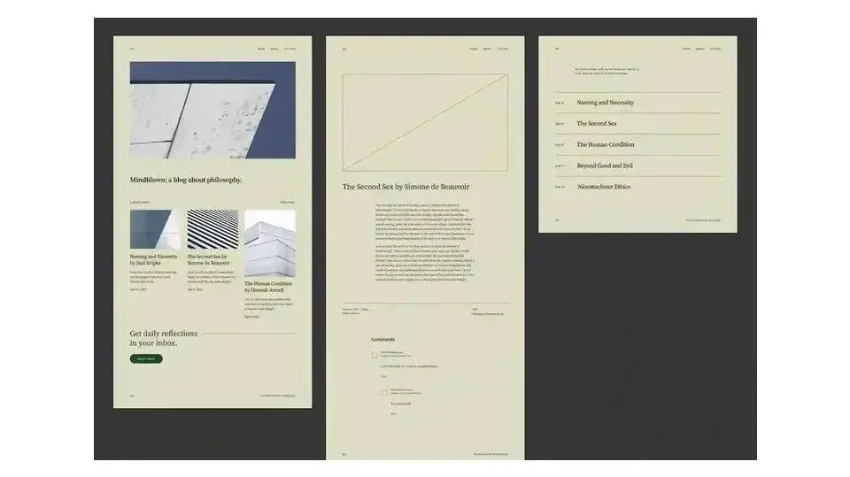
This style variation is subtle and simple but still a nice option for any kind of site you'd like to build. It includes lovely typography, a neutral background, and dark green buttons for dramatic effect.
You can access each of these style variations within WordPress itself. And you can create your own custom variation by accessing the Twenty Twenty Three theme's Figma file.
5. Fluid Typography
One of the more interesting features of the new default theme is fluid typography. Introduced in WordPress 6.1, fluid typography allows you to gradually adjust the type size depending on the viewport's width.
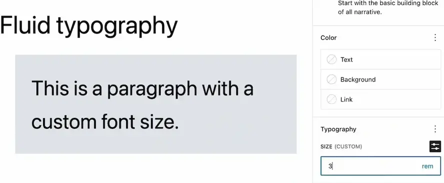
This feature is great for sites that have longer form content, as it keeps the text from becoming too small or too hard to read when viewed on mobile devices.
The new default theme also includes support for fluid spacing, which allows you to adjust the spacing between elements depending on viewport size. This can help keep your content looking great no matter what device someone is using. It also means you can now transfer spacing settings like padding, gap, and margin between different themes as time goes forward.
This can make for a greater level of stylistic consistency on your site, while still allowing you to make small tweaks in order to achieve the look and feel that you want -- especially as you transition between different themes in the years to come.
Twenty Twenty-Three also comes with several preset typefaces as well, including the following:
- System Font
- DM Sans
- IBM Plex Mono
- Inter
- Source Serif Pro
Putting the Twenty Twenty Three WordPress Theme to Work
Learning about this new default theme in the abstract is helpful and all, but it might be a bit difficult to conceptualize how to actually use it in real-life scenarios. For this, we've put together a few ideas for site types where we think this theme can really excel. Let's explore those now.
1. Corporate Website
The Twenty Twenty Three theme is a great choice for corporate websites, as its sleek and clean design makes it perfect for showcasing a business's culture, values, and message. The fluid typography feature also makes the large amounts of content found on corporate websites much easier to consume.
2. eCommerce Site
The Twenty Twenty Three theme is also a great choice for ecommerce sites. Its modern and fresh design will help your products stand out, while its responsive design means customers can easily browse your shop no matter what device they're using.
3. Personal or Niche Blog
Finally, the Twenty Twenty Three theme is also a great choice for blogging. Its fluid typography feature makes long-form blog posts easier to read, while its customizable options make it easy for bloggers to create a unique style for their blog.
Get Started With Twenty Twenty-Three in 2023
The Twenty Twenty Three theme is a great all-around choice for a variety of website types. With its flexible design and customizable features, it's sure to be a hit with users of all kinds.
We hope this guide has helped you get a better understanding of the new Twenty Twenty Three WordPress theme. And if you're on the hunt for high-quality hosting to support your use of this new theme, our hosting plans for WordPress offer everything you need and more to get started.
We can't wait to see what you create with it in 2023!
Frequently Asked Questions
Is WordPress free?
All you need to do to use WordPress is to invest in a web hosting plan since the software itself is free.
Are WordPress-free themes safe?
People often think that free themes have low quality. However, free WordPress themes actually have high quality and are free to use.
Are WordPress plugins free?
WordPress has loads of plugins you can install, some of them are free, but some of them you will need to pay for. You can learn how to use WordPress Plugins on our blog.
Why choose Verpex for WordPress?
As the leading CMS out there, we’ve made it our mission to offer the most comprehensive and streamlined WordPress solutions on the market. Backed by a responsive customer care team and reliable site enhancement tools, we ensure our users get the full WordPress value and support for a reasonable price.

Nile Flores is a long time professional blogger, as well as WordPress website designer and developer from the St. Louis Metro East. Nile blogs at NileFlores.com, where she’s passionate about helping website owners, whether they’re small business owners or bloggers. She teaches about Blogging, Social Media, Search Engine Optimization, Website Design, and WordPress. Additionally, Nile loves to speak at WordCamps (WordPress conferences) across the United States. When Nile isn’t knee-deep in coding, she’s a proud mom of a college student, and enjoys oil painting, cigar smoking, nail art design, and practicing traditional Okinawan kempo karate.
View all posts by Nile Flores


