CSS plays a significant role as one of the core foundations for building web applications. It brings imagination to life through colour, layout, spacing, responsiveness, animations, transitions, etc
Web tools are constantly evolving to give users the best experience, and CSS is no exception. As the ecosystem advances, new features make styling cleaner, easier, and more modern.
Some developers prefer using CSS frameworks that simplify the process of writing styles, while others prefer working with vanilla CSS or a mix of both.
If you regularly work with vanilla CSS, certain features can help improve your applications, some of which are recent.
Let’s see what these features are.
CSS Features You Should Check Out
Cascading Style Sheet, commonly referred to as the skin of a website, offers many benefits. Apart from adding colours, text to pages, CSS helps you create a consistent design across multiple web pages. It handles the following:
Layout and Structure: The layout and Structure of a website refer to how elements are placed on a page. This can be achieved using Flexbox, Grid, and positioning.
Responsiveness: Responsiveness refers to how elements change to different screen sizes, such as mobile, tablet, and desktop. This is handled by using media queries, and units like %, vw (viewport-width), and vh (viewport-height).
Animations and Transitions: Animations and transitions add smooth effects without JavaScript, using techniques like hover, slide-in effect, and more to make the interface feel dynamic.
Theme and Design: CSS allows you to create custom themes, and consistency in design using utility classes, layering, etc.
Accessibility: Accessibility in CSS refers to using various elements like colour schemes, fonts, spacing, focus styles for accessibility and readability.
Here are some CSS features to use in 2025 to make your website look more visually appealing, cleaner and well-structured.
- :has()
:has() is a functional pseudo-class that lets you select an element if it contains element that matches a specific selector. It is also called a “parent selector.”

In the example above, the :has() property selects any <li> inside a <nav> that contains a nested <ul> as a child, and applies styles to ::before pseudo element of the <li>. This places the asterisk (*) before the content of the <li>
- :is()
:is() is a CSS selector function that allows you to write one rule for multiple selectors in a shorter form. It makes CSS more readable and maintainable by allowing you to apply global styling efficiently, reduce redundancy, and improve the management of large codebases.

The selector :is( h1, h3, .text) selects h1, h2, and elements with class name “text” and applies the text colour of orchid.
- Logical Properties
CSS logical properties and values define layout properties that adapt to text flow and direction.
Logical properties allow you set to spacing, positioning and other layout properties. For example, using inline and block values instead of using properties like margin-top, padding-right, width or height.
padding-inline-start:20px; padding-inline-end:20px
This is necessary because languages use different writing modes such as right-to-left and left-to-right, vertical, and more
For example, Arabic is written from right to left, Traditional Mongolian is written vertically from top to bottom, and Japanese is written top-down.
These variations require changing the writing mode to make CSS flexible, and to support internationalization. These properties are optional but recommended for global-designs.
- Backdrop
Backdrop filter allows you to change the appearance of elements behind another element.

In this example, the backdrop blurs the background and highlights the modal.
- Layer (@layer)
@layer rule allows you to create different layers in your stylesheet to control which styles take priority.
Specificity issues are one of the areas in CSS that many developers find frustrating; @layer manages these conflicts by letting developers define styles that take precedence.
This feature is not brand new, and is still unfamiliar to some developers.
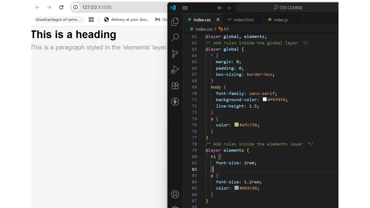
@layer is commonly defined at the top of the file. In the example above, we declared. @layer global, elements;
This tells the browser the order of priority between the layers. In this case, global has less priority than elements. This means if both layers have rules with the same specificity (or target the same element), the styles in the elements layer will override those in the global layer.
For example, in the example above, we styled two <p> tags, one in the global layer and the second in the elements layer. You can see that the colour applied in the elements layer is the one that appears on the screen, while the colour in the global layer is ignored.
This shows how layer order can override styles even when specificity is the same. Layer also keeps CSS organized and easy to maintain.
- Container Queries
Container queries complement media queries, which are used to make a responsive layout. This feature was introduced in 2021 but became fully supported by major browsers in 2022.
Unlike media queries, which depend on viewport size, container queries help create context-aware, responsive layouts by allowing components adapt to their own space or individual containers rather than the whole viewport.
This is great for modular designs and reusable components.
To use container queries, you must tell the browser what the container is by using; container-type: inline-size
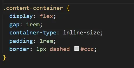
This declares a containment context, informing the browser to watch the container's size.
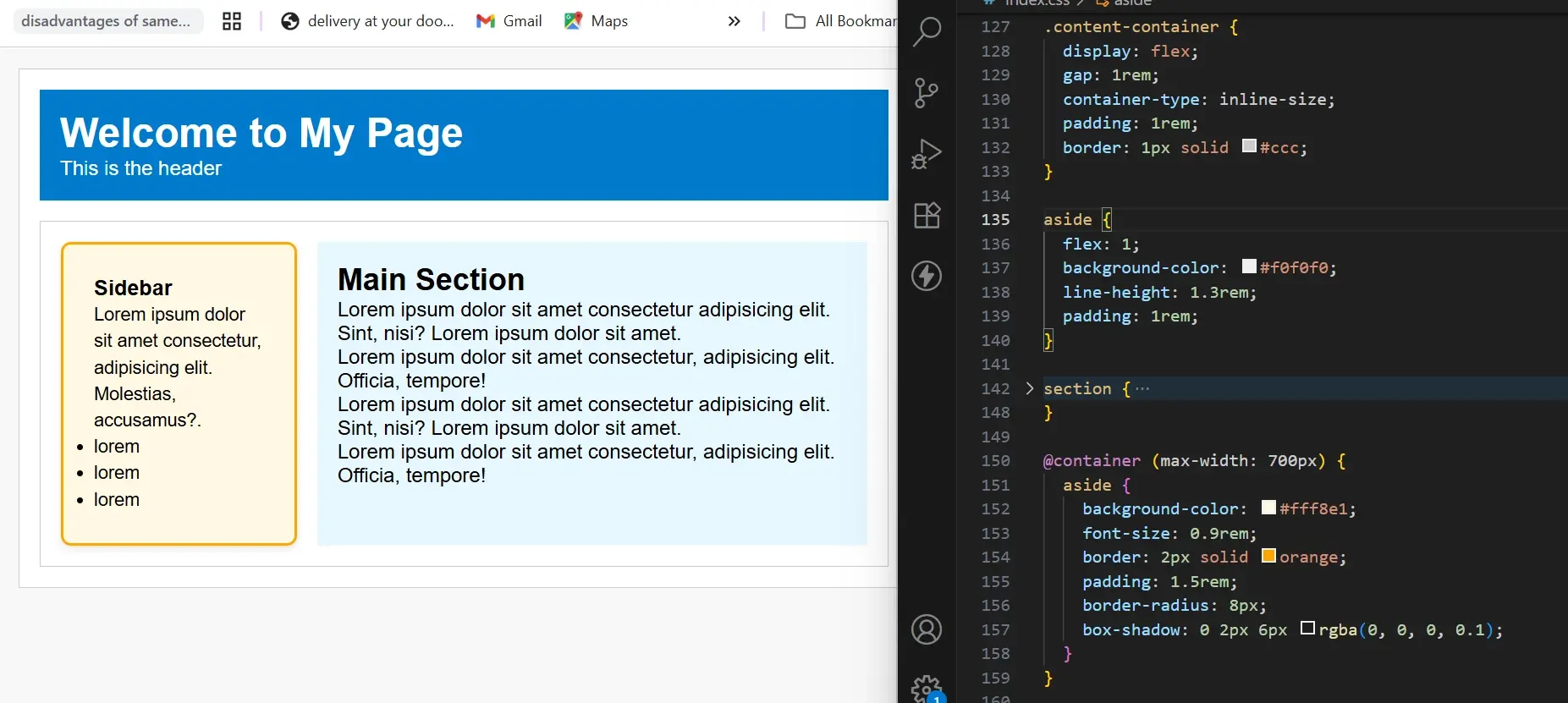
The example above shows what a container query looks like. container-type is declared on .content-container because it's the parent element.
This means you can style its children (the elements inside it) based on its size. In this example, aside is a child inside the .content-container and we use @container to apply a different style to the content within it when its max-width is 700px
- Relative colours
Relative colour is a way to deal with colours in CSS. You can use any colour function and import any colour in any format (such as RGB, HSL) and then derive a new colour from an existing one.
In other words, relative colour syntax allows a colour to be defined relative to another colour. This helps to maintain a consistent colour theme.

In the example, we styled two
background-color:rgb(from #f700ff r 100 b / 0.5)
This starts from #f700ff (a magenta colour) and reuses its red and blue components, sets the green to 100 and opacity to 0.5 to create a lighter, semi-transparent magenta background colour.
There's so much more you can do with this feature, like creating theme variations, mixing colours, and generating tints/shades.
- Subgrid
CSS Grid has limitations with nested elements. For example, when you nest a grid inside another, the child grid may not align with its parent and can overflow.
Using subgrid allows a child element to inherit the parent grid configurations or structure. This is not a brand-new feature, but its usage is new because browsers support was added in 2023.

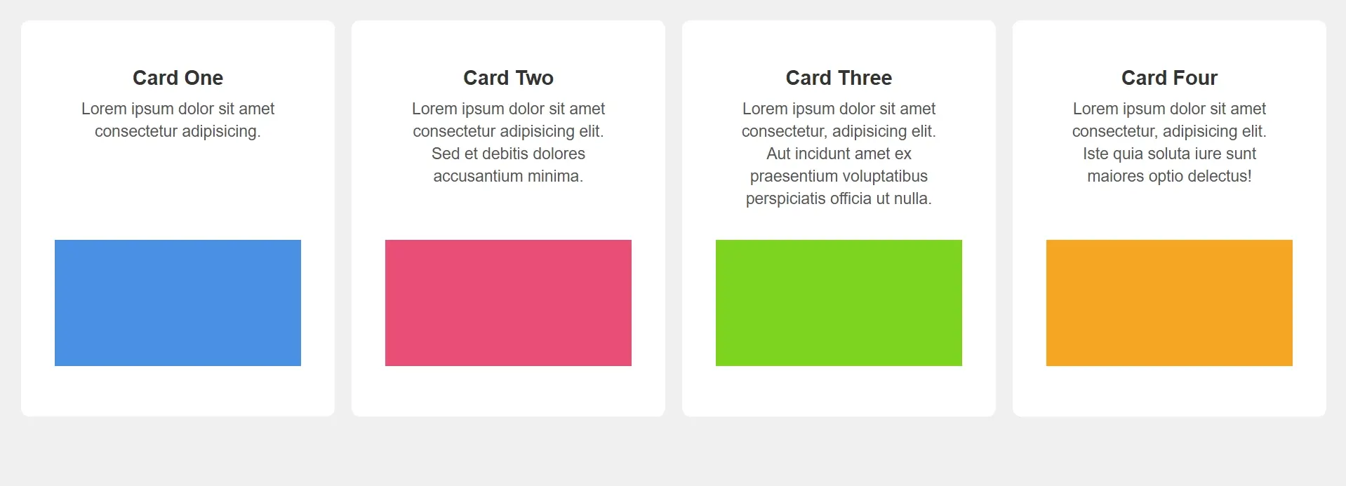
In the image you can see how the content in the card does not line up. When you use display: grid, only the direct children of the grid container become grid items and are placed on the grid.
The children or content inside the grid items (the card in this case) are not part of the parent grid and they display in normal flow, which can make the elements in the grid items become misaligned.
You can make each item a grid but because each one has its own independent rows and columns; the layout still won’t be aligned. Unless you manually align elements in each grid item using flexbox or other techniques.
Instead of doing that, subgrid allow grid items with their own grid to inherit row and column of parent grid. Instead of defining separate rows and columns, all the nested grid shares the same grid lines which helps to keep layouts aligned.
The CSS rule;
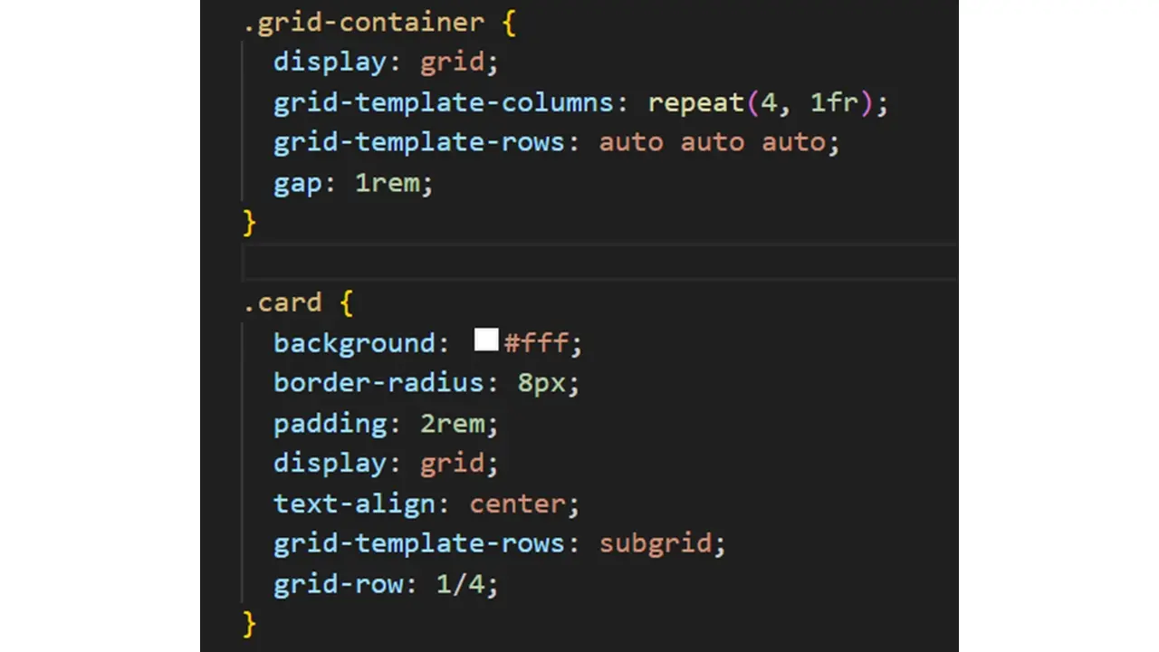
In the grid container, we defined 4 equal columns with 3 rows. The grid-template-rows: auto auto auto rule defines 3 rows (the space between the grid lines) that automatically adjust to fit their content.
We make each card a grid and use grid-template-rows: subgrid to allow the card to inherit the parent grid's row.
The rule grid-row:1/4 makes the card stretch from row 1 to row 4 which makes all content in the card align properly with the grid lines of the parent grid.
- Nesting
Nesting allows you to write CSS styles in a readable, modular, and maintainable way. It lets you define CSS rules using parent-child relationships instead of repeating selectors.
You can group related elements and style them together.
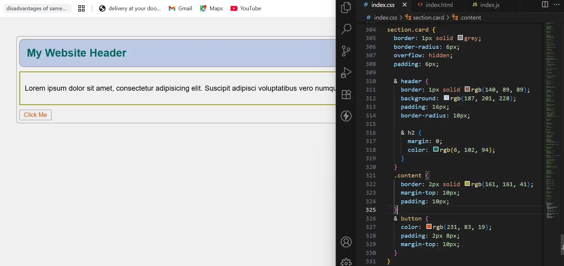
In the example above, we've nested the style rules. The ampersand (&) represents the parent selector. Instead of writing section.card header , you can write & header, the ampersand(&) replaces section.card in the nested CSS.
- Scroll-based Animation
Scroll-based animation means animating elements as the page scrolls, using only CSS, without relying on JavaScript, JavaScript libraries (e.g. AOS), or manually handling scroll events to achieve this effect.
In the example, as you scroll, the box's opacity changes from 0 to 1, creating a fade-in effect.
Opacity 0

The box is invisible from the start position and shifts to the left using transform:translateX(-200px)
animation: SlideFade linear forwards tells the browser to use the animation called slide fade, run it with a constant speed (no easing), and keep the final style after the animation completes.
animation-timeline: scroll(root) links the animation progress to the scroll position of the entire page.
animation-range: 0% 100% defines the scroll range that is, which animation runs from top to bottom in the scrollable section.
Opacity 1

@keyframes slideFade{
to {
opacity:1;
transform:translateX(0);
}
}
This simply fades in (from initial opacity of 0 to 1) and slides it into place from translateX (-200px to 0)
Summary
CSS not only improves a website's visual appearance, but also organizes its layout, and structure, and enhances accessibility.
It also supports a website's search engine optimization because it affects user experience and responsiveness, which are ranked by search engines.
The CSS features listed above help create more visually appealing and structured websites, and enhance how elements respond to interactions like transitions and animations.
Frequently Asked Questions
What security measures are essential for CSS hosting?
Key security measures for CSS hosting include SSL/TLS encryption, regular software updates, firewalls, and protection against DDoS attacks. These features safeguard your CSS files and the overall integrity of your website.
How does CSS hosting affect SEO and site performance?
Good CSS hosting improves site loading times, a crucial factor for SEO. Fast loading speeds enhance user experience, which is a significant ranking factor for search engines. Efficient CSS hosting also ensures better uptime, another important aspect for maintaining and improving your site’s SEO ranking.
Can free HTML editors support other languages like CSS and JavaScript?
Yes, free HTML editors often support languages like CSS and JavaScript, enabling integrated web development.
Are there any performance considerations when implementing HTML5 and CSS3?
Yes, using excessive animations and complex designs can impact performance. Optimize images, employ CSS minification, and follow best practices to ensure a smooth and fast user experience.

Jessica Agorye is a developer based in Lagos, Nigeria. A witty creative with a love for life, she is dedicated to sharing insights and inspiring others through her writing. With over 5 years of writing experience, she believes that content is king.
View all posts by Jessica Agorye
with the discount code


