The visual appeal of a website is crucial for drawing in and holding on to visitors. Color is essential for defining user experience, communicating brand identity, and motivating desired actions, in addition to functionality and information. The success of a website can be greatly affected by the effective, yet strategic choice of color combinations, which is more than just an aesthetic exercise.
This article delves into the art and science of selecting effective color palettes, exploring the advantages, techniques, tips, tools, and real-world applications that empower you to create a visually engaging and impactful online presence.
The Advantages of Effective Color Combinations
Choosing colors carefully has several benefits for your website. It significantly impacts how users perceive your brand and interact with your content. Thoughtful color selection can enhance user experience, improve brand recognition, and ultimately contribute to achieving your website's goals.
- Enhances brand recognition and recall
Consistent use of a specific color palette across your website and other marketing materials creates a strong visual identity, making your brand instantly recognizable.
- Evokes emotions and psychological responses
Understanding color psychology allows you to strategically choose colors that align with your brand's message and desired user experience. For instance, blue conveys trust and reliability, while red evokes excitement and urgency.
- Improves readability and accessibility
Contrasting colors ensure that text is easily readable against backgrounds, catering to users with visual impairments. This thoughtful approach demonstrates inclusivity and respect for all visitors.
- Enhances user navigation and engagement
Effective use of color can guide users through your website, highlighting key elements and calls to action. This intuitive visual hierarchy streamlines the user journey and encourages interaction.
- Contributes to a professional and polished aesthetic
A well-chosen palette fosters credibility and trust among visitors. This visual sophistication communicates attention to detail and reinforces brand authority.
How to Choose Color Combinations: A Step-by-Step Approach
Selecting the perfect color combinations involves a systematic approach that considers your brand, target audience, and website goals. Here's a step-by-step guide:
1. Define Your Brand Identity
Start by understanding your brand's core values, personality, and target audience. What emotions do you want to evoke? What message do you want to convey? Your brand identity should serve as the foundation for your color choices.
2. Understand Color Psychology
Research the psychological associations of different colors. Consider the emotions and meanings they evoke. For example, green is often associated with nature, growth, and harmony, while yellow conveys optimism and energy.
3. Choose a Base Color
Select a dominant color that represents your brand's core identity. This color will typically be used for your logo, headings, and primary calls to action.
4. Explore Color Harmonies
Understand the principles of color harmony to create visually pleasing combinations. These established guidelines provide a framework for selecting colors that work well together, resulting in a more balanced and aesthetically appealing design.
Familiarizing yourself with monochromatic, analogous, complementary, and other harmonies in color theory for website design will significantly enhance your color selection process.
Common harmonies include:
Monochromatic: Uses variations of a single color (shades, tints, and tones).
Analogous: Uses colors that are adjacent to each other on the color wheel.
Complementary: Uses colors that are opposite each other on the color wheel.
Triadic: Uses three colors that are evenly spaced on the color wheel.
Tetradic (Square): Uses four colors arranged into two complementary pairs.
Split-Complementary: Uses a base color and the two colors adjacent to its complement.
5. Consider Contrast and Accessibility
Ensure sufficient contrast between text and background colors to enhance readability. Use tools like contrast checkers to verify compliance with accessibility guidelines (WCAG).
6. Develop a Color Palette
Create a cohesive palette that includes your base color, secondary colors for accents, and neutral colors for backgrounds and text. A typical palette consists of 3-5 colors.
7. Test and Iterate
Test your color palette across different devices and browsers. Gather feedback from users and make adjustments as needed.
Tips for Effective Color Combinations
The choice of effective combinations of website colors calls for strategic thought in addition to creative sense It all boils down to developing an influential user experience and a powerful brand identity. The helpful advice that follows will help you make informed choices for a website that is both highly functional and aesthetically beautiful.
- Less is More
Avoid overwhelming your website with too many colors. Stick to a limited palette for a clean and professional look. A restrained approach prevents visual clutter and allows key information to stand out. This simplicity often conveys elegance and sophistication.
- Prioritize User Experience
Consider how colors impact user navigation and readability. Ensure that important elements are easily distinguishable. Poor color choices can lead to eye strain and frustration, ultimately driving users away. Thoughtful color selection contributes to a seamless and enjoyable browsing experience.
- Reflect Your Brand's Personality
Choose colors that align with your brand's values and target audience. The colors you select become a visual shorthand for your brand's identity and can attract the right customers. Authenticity in color choices fosters a stronger connection with your audience.
- Use Neutral Colors Effectively
Neutral colors like white, gray, and black provide balance and contrast, allowing your primary colors to stand out. They act as a canvas upon which your brand's personality can shine without being visually overpowering. Strategic use of neutrals enhances readability and creates a sense of visual harmony.
- Consider Cultural Associations
Be mindful of cultural differences in color meanings, especially if your website targets a global audience. What might be seen as positive in one culture could have negative connotations in another. Thorough research can prevent unintended misinterpretations and ensure respectful communication.
- Use Color to Create Hierarchy
Use different colors to highlight important elements and guide users through your website's content. Calls to action, headings, and key information can be visually emphasized to direct user attention. This visual cueing improves scannability and encourages desired interactions.
- Maintain Consistency
Apply your color palette consistently across your website and other marketing materials. This reinforces brand consistency, recognition, and creates a cohesive visual experience for your audience. Inconsistency can lead to a disjointed and unprofessional impression.
- Test on Different Devices
Ensure that your color combinations look good on various screen sizes and resolutions. Colors can appear differently on different screens, potentially affecting readability and overall aesthetics. Thorough testing guarantees a consistent and positive visual experience for all users, regardless of their device.
- Leverage White Space
White space, or negative space, provides visual breathing room and enhances the impact of your colors. It prevents your design from feeling cramped and allows the colors to have a greater visual impact. Effective use of white space contributes to a clean, modern, and easily digestible layout.
Apps, Resources, and Comparison
Numerous online tools and resources can assist you in creating effective color combinations. Here's a comparison of some popular options:
-
Features: Color wheel, color harmony rules, extract themes from images, and accessibility tools. It also allows users to save and share their created color themes within the Adobe ecosystem.
Pros: Comprehensive features, integration with Adobe Creative Cloud, strong community.
Cons: Requires an Adobe account for full functionality.
-
Features: Fast palette generation, explore trending palettes, image color picker, export options. Users can also create and organize their palettes into collections for different projects.
Pros: User-friendly interface, rapid palette generation, extensive library of curated palettes.
Cons: Limited customization options compared to Adobe Color.
-
Features: Upload an image to extract a color palette. This is particularly useful for quickly matching website colors to existing branding or imagery.
Pros: Simple and intuitive, great for beginners, integrates with [Canva design platformcan-i-use-images-from-canva-on-my-website.
Cons: Limited advanced features.
-
Features: Color wheel, harmony rules, preview palettes on a website layout. This preview helps visualize how the color scheme might appear in a real web design context.
Pros: Visual representation of color harmonies, website layout preview, customizable color adjustments.
Cons: The Interface can be slightly dated.
-
Features: Generate color palettes based on Material Design principles, preview palettes on UI components. It provides guidance on color contrast ratios to ensure accessibility according to Material Design specifications.
Pros: Designed for UI/UX designers, adheres to Material Design guidelines, accessibility tools.
Cons: Primarily focused on Material Design.
-
Features: Curated collection of beautiful color palettes. It serves as a fantastic source of inspiration for designers seeking pre-made and visually appealing color schemes.
Pros: Inspiration for color combinations, easy to browse and find palettes.
Cons: Limited customization, primarily for inspiration.
Use Cases: Applying Color Combinations in Real-World Scenarios
- E-commerce Website
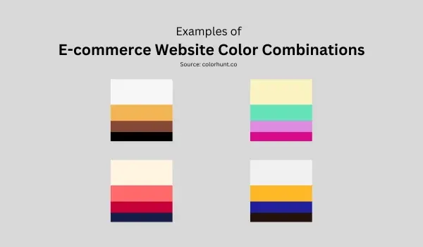
Use vibrant and energetic colors for calls to action, such as "Shop Now" or "Add to Cart." Employ contrasting colors to highlight product details and promotions for an E-commerce website color combination. Consider the psychological associations of colors when choosing product imagery and background colors.
- Portfolio Website
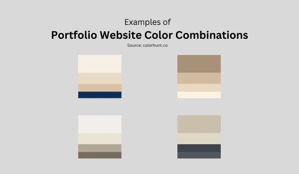
Opt for a clean and minimalist color palette to showcase your work. Use neutral colors for the background and accent colors to highlight key projects or skills.
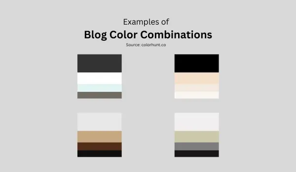
- Blog Website: Choose a readable color combination with sufficient contrast between text and background. Use accent colors to highlight headings, links, and important information.
- Corporate Website
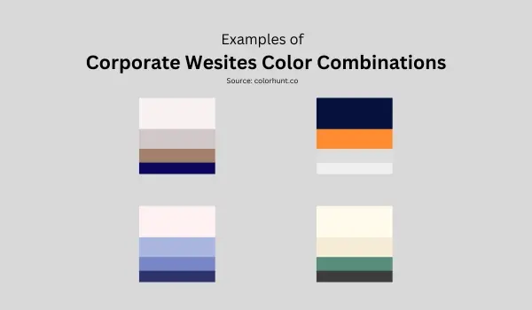
Select a professional and trustworthy color palette that reflects your company's brand identity. Use blue or green to convey reliability and stability.
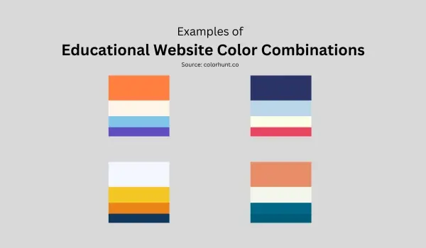
- Educational Website
Employ a calming and engaging color palette that encourages learning for an educational website color combination. Use bright and cheerful colors for interactive elements and illustrations.
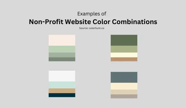
- Non-Profit Website
Choose a compassionate and trustworthy color palette that inspires action. Use green or blue to convey hope and reliability.
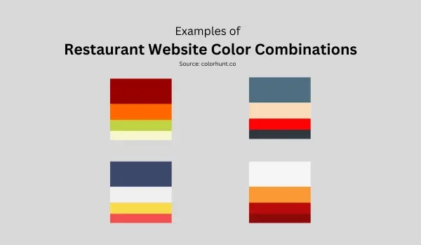
- Restaurant Website
Utilize appetizing and inviting colors that stimulate the senses for a restaurant website color combination. Use warm colors like red, orange, and yellow to create a welcoming atmosphere.
Conclusion
Choosing the right color combinations for your website is a crucial aspect of creating a visually appealing and effective online presence. By understanding color psychology, exploring color harmonies, and utilizing available tools and resources, you can develop a palette that aligns with your brand identity, enhances user experience, and drives desired outcomes.
Remember to prioritize readability, accessibility, and consistency. Experiment with different combinations, test your choices across various devices, and gather feedback from users. Ultimately, the perfect color palette is one that effectively communicates your brand's message and resonates with your target audience, leaving a lasting impression and contributing to the overall success of your website.
Frequently Asked Questions
Can AI generate entire websites?
Yes, AI-powered tools can generate entire websites based on user preferences and inputs, offering options for customization and optimization for factors like SEO and mobile-friendliness.
Is WooCommerce a good website builder?
Yes, WooCommerce is a good website builder, especially for WordPress users.
It's flexible, highly customizable, and perfect for those who want control over their online store's design and functionality.
That said, it requires more technical know-how compared to some other platforms like Shopify.
Can AI website builders create modern websites for online stores without coding knowledge?
Yes, AI website builders like Wix ADI can design modern, visually appealing online stores and landing pages without requiring users to have coding knowledge, streamlining the process of building websites.
Do AI plugins slow down website performance?
Some AI plugins may consume resources, which can affect website speed. To minimize impact, choose well-optimized plugins and regularly monitor your site’s performance.

Audee Mirza is a graphic designer and WordPress developer at audeemirza.com who resides in Surabaya, Indonesia. She's also the author of Graphic Identity Blog, a professional logo designer, and often creates vector illustrations for clients and marketplaces. She enjoys good typography design and all kinds of animation.
View all posts by Audee Mirza


