
Today, we're flooded with information, with about 2 billion websites out there and roughly 400 million active as of 2023.
For content creators and designers looking to stand out, using whitespace effectively in their designs can make a big difference.
What is Whitespace?
Whitespace, also known as blank space or negative space, is the white space that separates paragraphs of graphics, text, or blocks.
It is what makes documents look less crowded. Despite its simplicity, many creators and designers don't utilize it effectively.
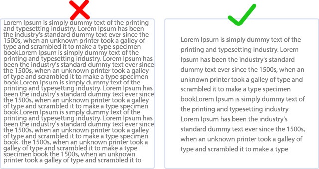
On the left, text without whitespace strains the eyes and looks dull, while text with whitespace on the right is more appealing and easier on the eyes.
How Does Whitespace Work
Whitespace, often referred to as negative space, plays a crucial role in design and layout by creating breathing room around elements.
This space is not necessarily white—it can indeed be any color or even have textures, as long as it serves the purpose of separating or surrounding visual elements;
- Enhance readability
- Improve comprehension
- or guide the viewer's eye through the design.
Below, we will go over some good and bad examples of using white space.
Good examples of using whitespace
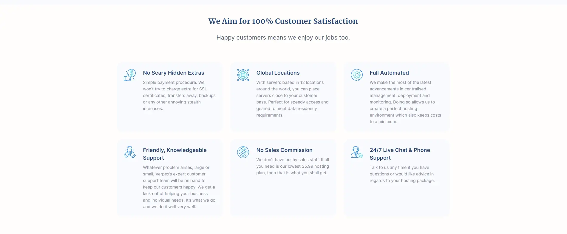
Our website is a great use of whitespace, or "negative space." Though not always white, it offers a visual rest for readers, making our message clear.
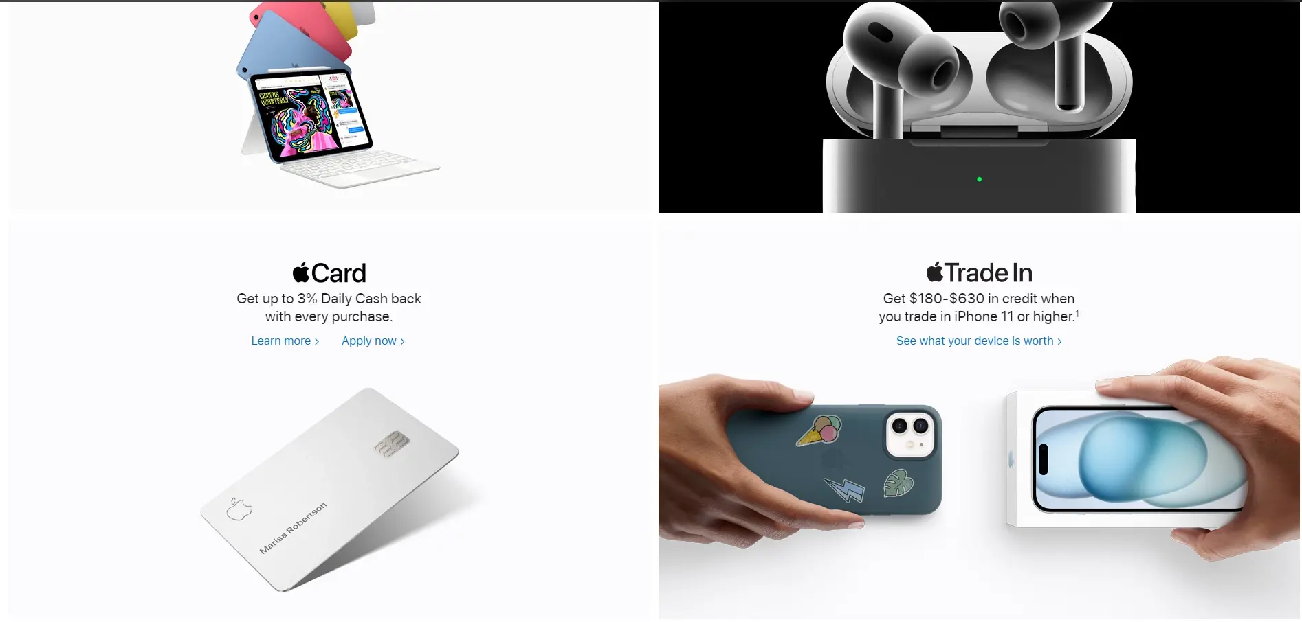
Apple's website is another stellar example of effective whitespace use. It has set the standard in design by using whitespace early on to highlight products.
Bad Examples of using whitespace

This is a poor use of whitespace. Despite offering amazing products, the website feels overwhelming and crowded, making it hard to decide where to look first.
Why Is Whitespace Important?
Appealing to the Eye: Whitespace highlights unique elements, providing visual rest and helping the brain process information by standing out against text and images.
Provides Balance: It balances websites with many images or text, preventing an overwhelming feeling by incorporating whitespace.
Gives Emphasis: It directs attention to key elements, leading viewers to important points quickly without confusion.
Improves Readability: Enhances content understanding and readability, keeping viewers engaged and less likely to leave.
Micro vs. Macro White Space
Designers use both micro and macro whitespace: micro to separate elements within a group, and macro to separate different groups. Both types are crucial for a website's appeal.
- Macro Whitespace: Macro whitespace is the space around larger elements like images, graphics, and text, including margins and paddings. Here's an example of macro whitespace.

- Micro Whitespace: Micro whitespace refers to the smaller spaces like line height, letter spacing, or kerning. Though less noticeable than macro spacing, it greatly enhances readability. Here's an example of micro whitespace.

Active vs. Passive White Space
Whitespace is divided into active and passive types based on its role in a layout. While active whitespace often gets more attention, passive whitespace is also important to consider.
- Active: Active whitespace is intentionally used in designs to structure and highlight specific elements, creating focus and separating content. Here's an example of active whitespace.

- Passive: Passive whitespace occurs naturally around graphic elements, logos, or between words. It should complement the overall design. Here's an example of passive whitespace.

The Psychology Behind Whitespace: How It Affects Viewer Perception
Whitespace is key in design, influencing how we see and feel about content. It affects our understanding and emotional reactions.
Here's a breakdown of the psychological effects of whitespace:
Sense of Luxury: Ample whitespace suggests elegance, making products seem premium (e.g., Apple).
Reduces Cognitive Load: Less clutter means information is easier to process.
Improves Comprehension: Proper spacing can boost understanding by 20%.
Encourages Interaction: Whitespace focuses attention on CTAs, increasing conversions.
Enhances Aesthetics: Clean designs are seen as more professional and trustworthy.
Facilitates Emotional Connections: Space usage can evoke feelings, like tranquility or urgency.
Guides User Journey: Whitespace navigates viewers through content smoothly.
Whitespace in Responsive Design: Adapting to Different Screen Sizes
Let’s quickly review the role of whitespace in responsive design.
Ensures readability across devices
Properly managed whitespace ensures text is legible and content is easily digestible, regardless of the device.
It involves adjusting margins and paddings to suit different screen sizes.
Maintains design integrity
As screens shrink, maintaining the integrity of the design becomes challenging.
Whitespace helps in reorganizing content in a way that keeps the user's focus on the essential elements, preserving the design's original intent.
Improves touch interactivity
Adequate spacing around touch targets (like buttons and links) is essential for touch screen usability.
Whitespace prevents accidental taps and enhances the user experience on mobile devices.
Balances dynamic content
Responsive design often means dynamic content that shifts based on the device.
Whitespace can be used to balance elements dynamically, ensuring the layout remains clean and uncluttered.
Facilitates scannability
Mobile users often scan content quickly. Whitespace breaks up text and elements, making it easier for users to scan and find the information they need.
Final Remarks
Whitespace not only balances and harmonizes website design but also highlights specific elements, playing a key role in attracting viewer attention.
To convey a clear message, avoid cluttering your layout. Whitespace aims to simplify the site, making content enjoyable and accessible for viewers.
Frequently Asked Questions
How do I produce high-quality content for my blog?
To create amazing content for your fitness blog, you will need to do proper research and take your time. Write fewer posts, but make sure that the ones you’ve written stand out.
How much money can you make from a blog?
In the first year, most bloggers earn very little money, mainly from affiliate marketing and ads. However, it’s possible to earn $50-$200 per month in the first year. When you increase your traffic, you can start earning over $1,000 per month.
How can I make my blog profitable?
One of the simplest methods to start earning money from a blog is selling digital products, affiliate marketing, and displaying ads.
Do I need a blogging strategy?
You will achieve rocketing success if you’re able to create an efficient blogging strategy. Make sure you create a great content strategy for your fitness business.
What are the disadvantages of white space?
While the right amount of whitespace can give a page a cool and confident feel, too much can make it seem empty and dull. It might cause readers to lose interest, similar to staring at a blank sheet of snow.

I've been navigating the web hosting waters for years now. As the Chief Editor at Verpex, I team up with some awesome writers to dish out the good stuff on hosting. Got a Master's in Journalism, so I always have an eye out for quality. Whether you're just dipping your toes or you're a seasoned surfer, I'm here to make everything web hosting feel like a breeze
View all posts by Julia Lozanov


