Have you noticed that many large websites often make small changes to their website designs? Maybe the change is a color, button size, icon location, typeface, or navigation adjustment. They seem to be making those changes regularly.
Why would they make these types of changes? They’re making small improvements to improve conversions. How do they know what to change? They make these decisions based on website A/B testing.
Also known as Split Testing, A/B testing is a method of testing two different website element designs to see which performs better. It’s a way of letting the audience tell you which they prefer. In this post, we’ll see how to perform website A/B testing to help you improve your website designs.
What is A/B Testing?
It can be difficult to know how to improve your website’s conversion performance. You could move a button from one location to another, change its color or size, use a different font, etc., but analyzing the results of those changes can take a lot of time.
The circumstances of each test could change drastically before you finish the test.
This is the advantage of A/B testing. You can test two versions of one element at the same time. Half of the audience sees one design and the other half sees the other design.
You can quickly know which of those designs converted the best. This allows you to make large or small adjustments and move on to the next test.
You can test single elements or the entire page. However, the more focused the test is the better the results because you’ll have targeted information to make your decisions.
You can also test elements across multiple pages. This is a good idea if the pages include the same elements, such as the same CTA.
You’ll also want a large testing sample. For example, 1000 visitors will give you more accurate results than 10 visitors.
What to Test
There are several approaches to testing including multivariate, multi-page, split, and A/B testing. Many testing platforms include all options, and the terms are sometimes used interchangeably. The A/B testing tools show the website owner statistics, such as the number of clicks, allowing them to make decisions about colors, fonts, sizes, shapes, placement, animations, effects, etc.
Virtually any website element can be used in the A/B test. For example, you could test:
Images
Buttons
Fonts
CTAs
Banner ads
Headlines
Text
Element locations
Graphics
Charts
Navigation
Videos
And lots more
For the best website design possible, you should always have an A/B test running on your website. There is no limit to the number of A/B tests you can run, so you can constantly see how to improve your website’s conversion performance.
Why Use A/B Testing?
A/B testing removes the guesswork from your website design. It’s an easy way to know how to improve your website design, which can reduce your bounce rate. An A/B test lets you choose the best design based on data from your actual visitors.
You won’t have to guess what your visitors will like or dislike, or what works or doesn’t work. The test results will tell you. You’ll know more about your audience. You’ll know what they like or dislike, which helps you target them for conversions.
Examples of What A/B Testing Can Improve
Here are some examples of what A/B testing can help you improve.
Conversion Rate
A/B testing can improve your conversion rate since you’ll know which element designs work the best. This is simply the number of visitors that respond to your CTA, such as clicking a button, signing up to your email, signing up for a course, making a purchase, etc.
Click-Through Rate
A/B testing can improve your click-through rate (CTR). This is the ratio of the number of clicks to the number of visitors that saw the element, such as a CTA. The CTR is measured in percentages. The higher the percentage the better.
For more information about click-through rate, see the article How to Improve Click-Through Rate (CTR).
Sales
It can increase your sales because you’ll know the best design elements for your ads, links, and CTAs. You’ll know the best fonts, colors, images, button styles, element placement, and more.
Page Views
Since your site would have colors, fonts, images, and headlines that appeal to your audience, A/B testing can reduce your bounce rate, improve your page views, and increase the average time on your pages.
For more information about bounce rate, see the article How to Reduce Website Bounce Rate?
Build a Following
A/B testing can help increase your social media following. It can help you choose the social icons, their sizes, colors, placement on the site, text to use, the number of times they appear on the site, and more. For more information about social media, see the article Social Media Marketing in the 2020s.
Improved Copy
You’ll have better headlines and web copy. Better headlines will catch the attention of your readers and increase your post-read-throughs. Better web copy will help your products and services stand out.
Navigation and Layout
Your website would have improved navigation and a better layout. A/B testing could help you reduce the clutter and streamline the design of both your navigation and your website’s layout. It would remove elements that are not important and emphasize the most important elements. This would remove the confusion, resulting in a better UX and UI.
For more information about layout design, see the article 21 Types of Effective Website Design.
Website A/B Testing Example
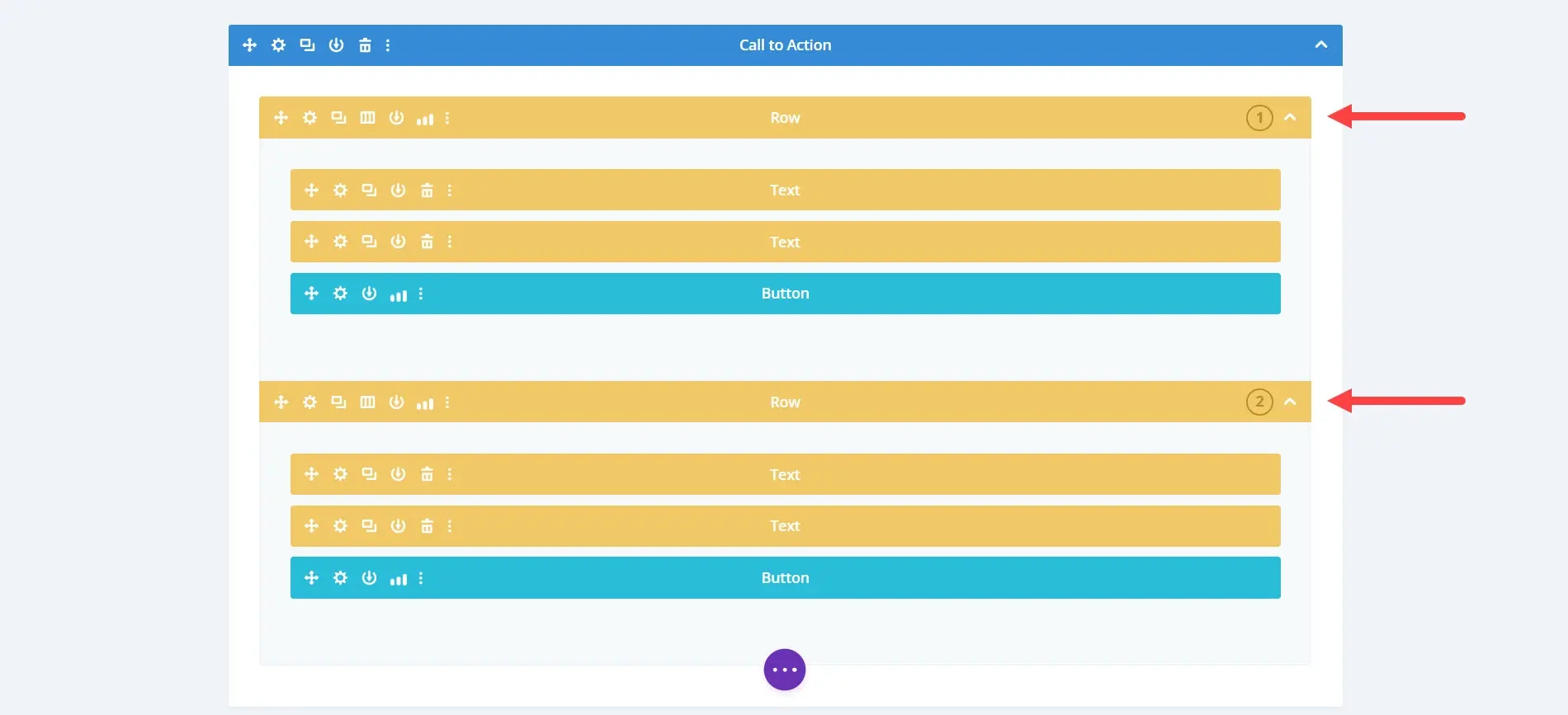
As an example, let’s say you’re running a sale on your website. You have a call to action, and you want to get the most conversions possible. You could create two CTA designs. Half the audience would see the first design while the other half would see the second design. The image above shows a split test using the Divi theme.
Once you’ve gotten enough traffic to get a good sample you can view the statistics to see which design performed the best. For example, let’s say 100 visitors clicked on the CTA and 70 of those visitors clicked on the first design while 30 visitors clicked on the second design. Since the majority preferred the first design, you use it as your CTA.
You could even make small changes to the winning design to test again. For example, you could change the copy, color of the text, button, image, location on the page, etc. Continue testing until you’re satisfied with the results.
A/B Testing Tools
Many advertising plugins include A/B testing as part of their toolset. Some WordPress themes, such as Divi, also include A/B testing. Some themes, such as Elementor, have A/B testing plugins available for free in the WordPress repository.
Here’s a list of the most popular A/B testing plugins and tools available with a look at how to use them. Some are free but there are a few that require a premium subscription. The WordPress plugins and tools are in no particular order. As always, they must have good reviews and have been updated recently.
Nelio AB Testing

Nelio AB Testing lets you test pages, posts, custom post types, featured images, product descriptions, and headlines, and shows a heatmap. It also tests templates, themes, widgets, menus, CSS, and JavaScript. It’s compatible with WooCommerce and includes testing for products and bulk sales.
The processing load for the tests is performed in the cloud, so your server won’t see a hit in performance. The free version works on low-traffic sites. High-traffic sites will need the premium version.
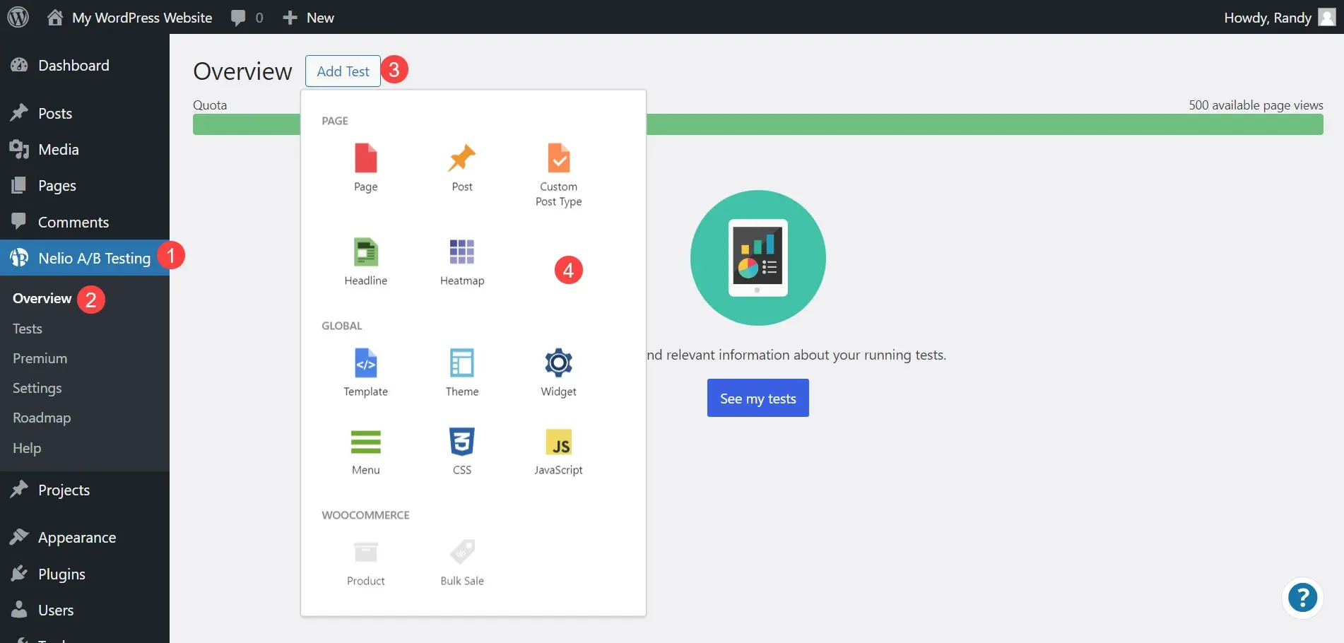
To perform a test, click Add Test and choose the type of test you want to perform from the list.
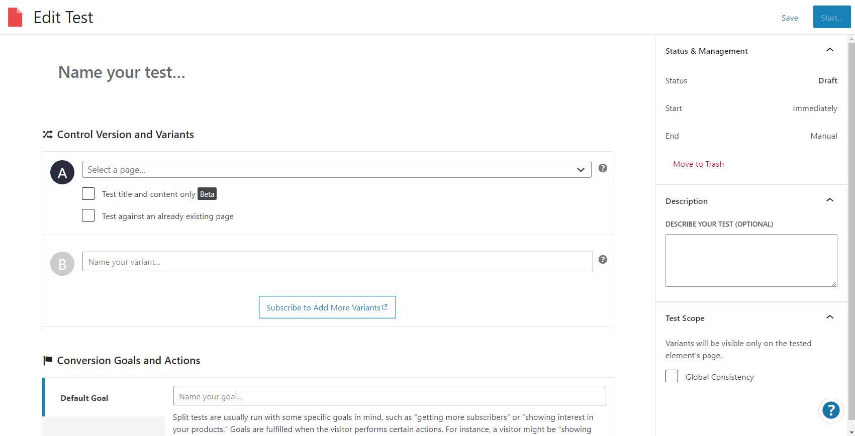
You’ll see a test editor where you can create the two variations of the element. Select the control version and variants, the conversion goals and actions, and the segmentation. Actions include page views, clicks, external link clicks, YouTube playback, or custom events.
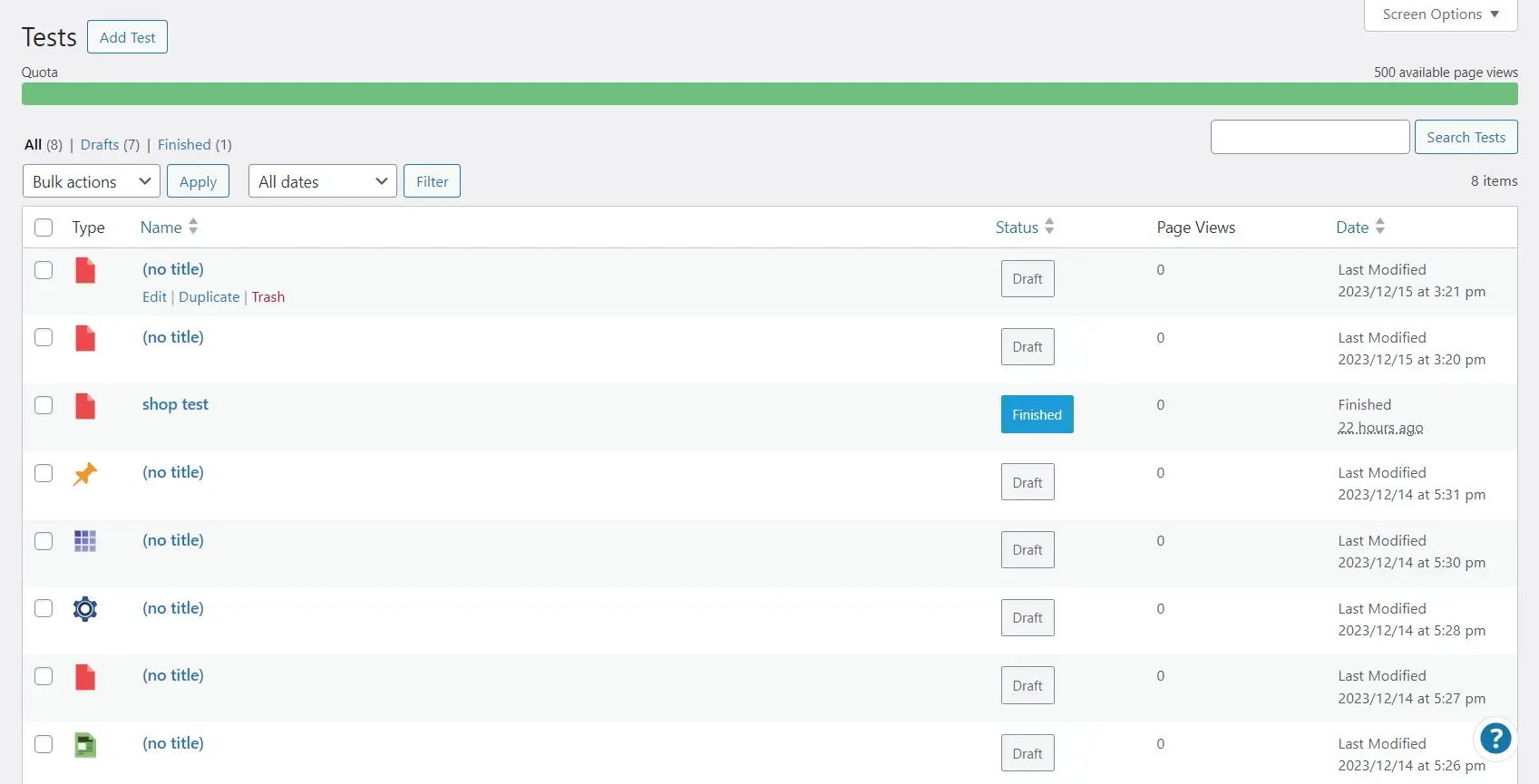
The Tests tab shows the variants with charts. Stop the test and select Apply to choose the winner.
Funnel Builder
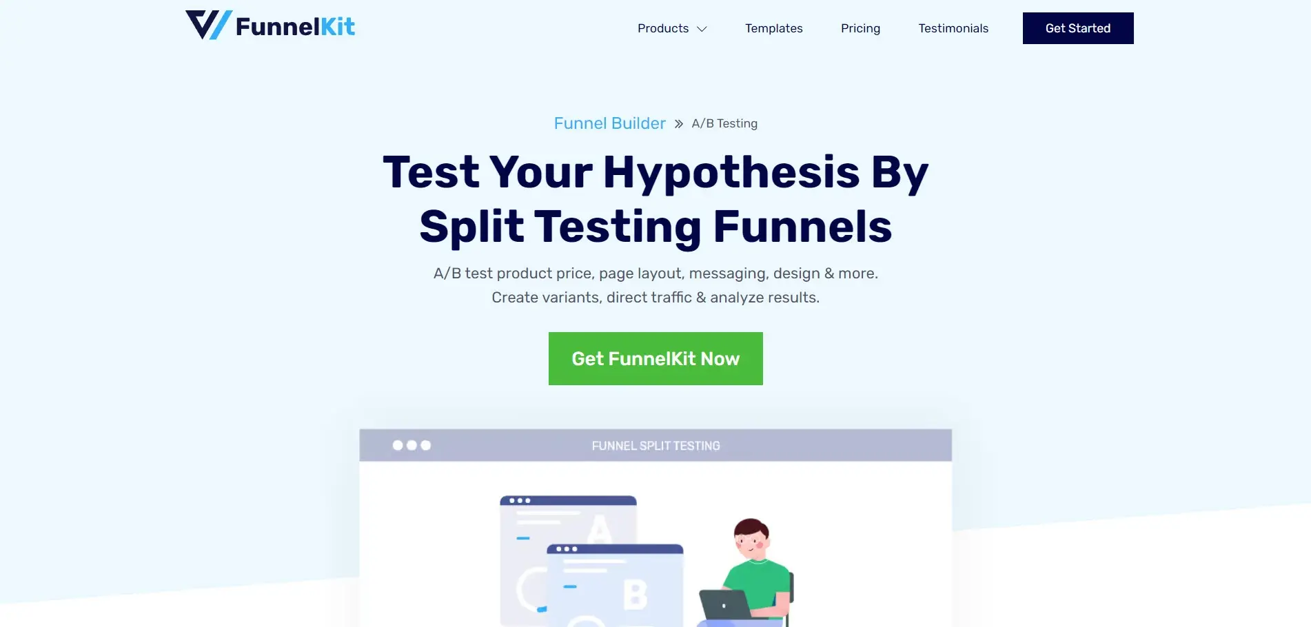
Funnel Builder for WordPress by FunnelKit is a marketing plugin that builds sales funnels. It has a free and a premium version with several different levels. The premium versions, starting at Plus, let you split-test any page within the sale funnel.
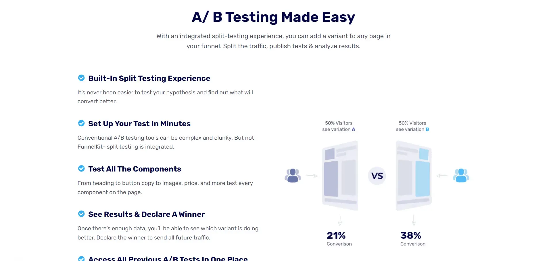
Test every element of the page. This includes WooCommerce checkout pages, the products for sale, product prices, headings, sales copy, button text, images, and lots more. Once you’ve completed your split test, view the stats and choose the winner. You can view all of your A/B tests in one location.
Optimizely
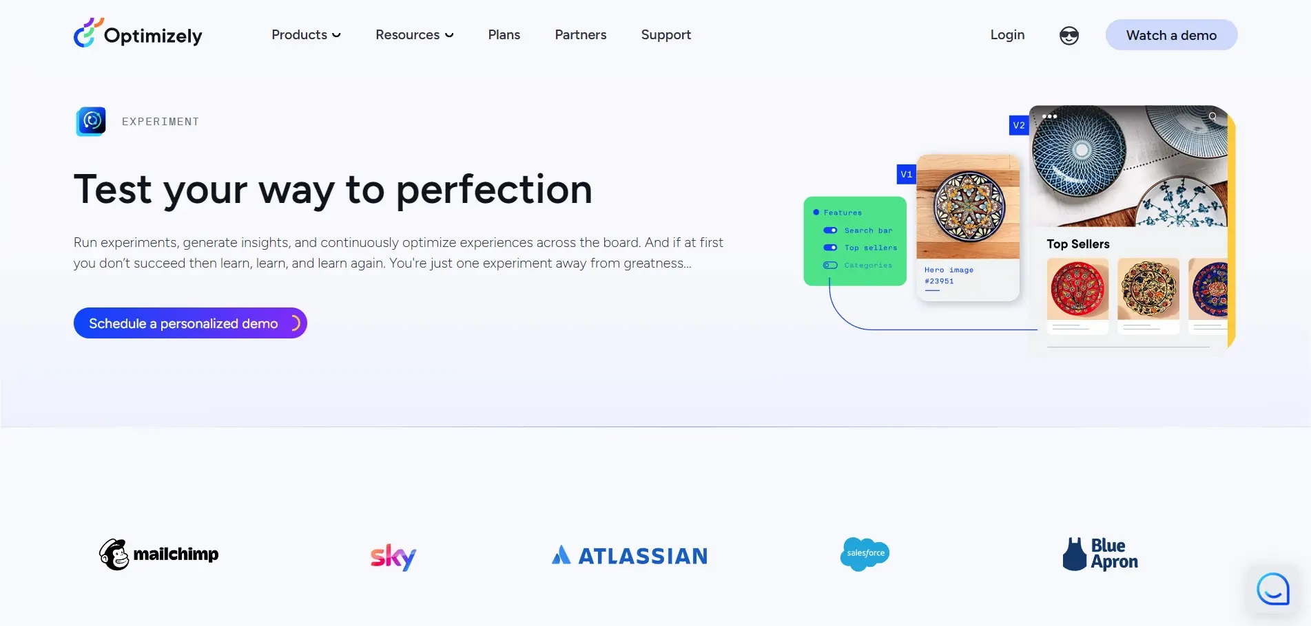
Optimizely Experiment is a premium product that includes lots of testing tools to optimize your website. It uses a WYSIWYG visual editor that you can allow the team to access. They can conceptualize ideas, customize the size, and collaborate with other team members.
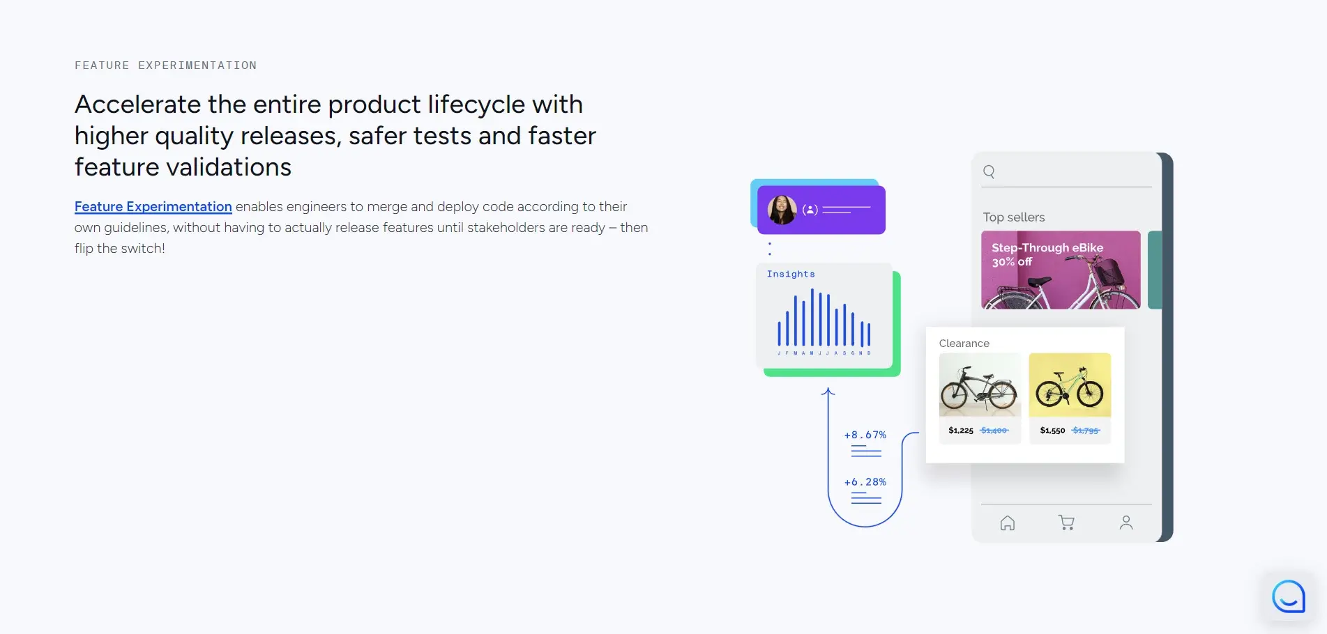
Easily create and test multiple versions of an element and then choose the winner based on insights generated from Optimizely. It’s fast and easy to use.
VWO
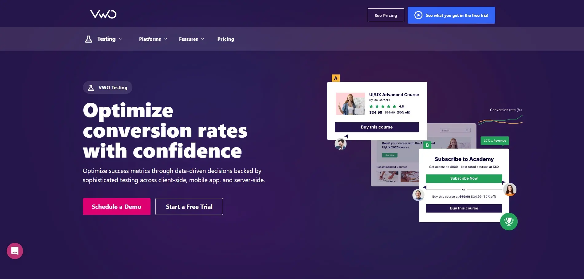
VWO is a premium testing and experimentation platform designed to optimize UX and increase conversions. It contains lots of testing features including A/B and multivariate testing. View Bayesian statistics and heat maps to decide which design to choose.
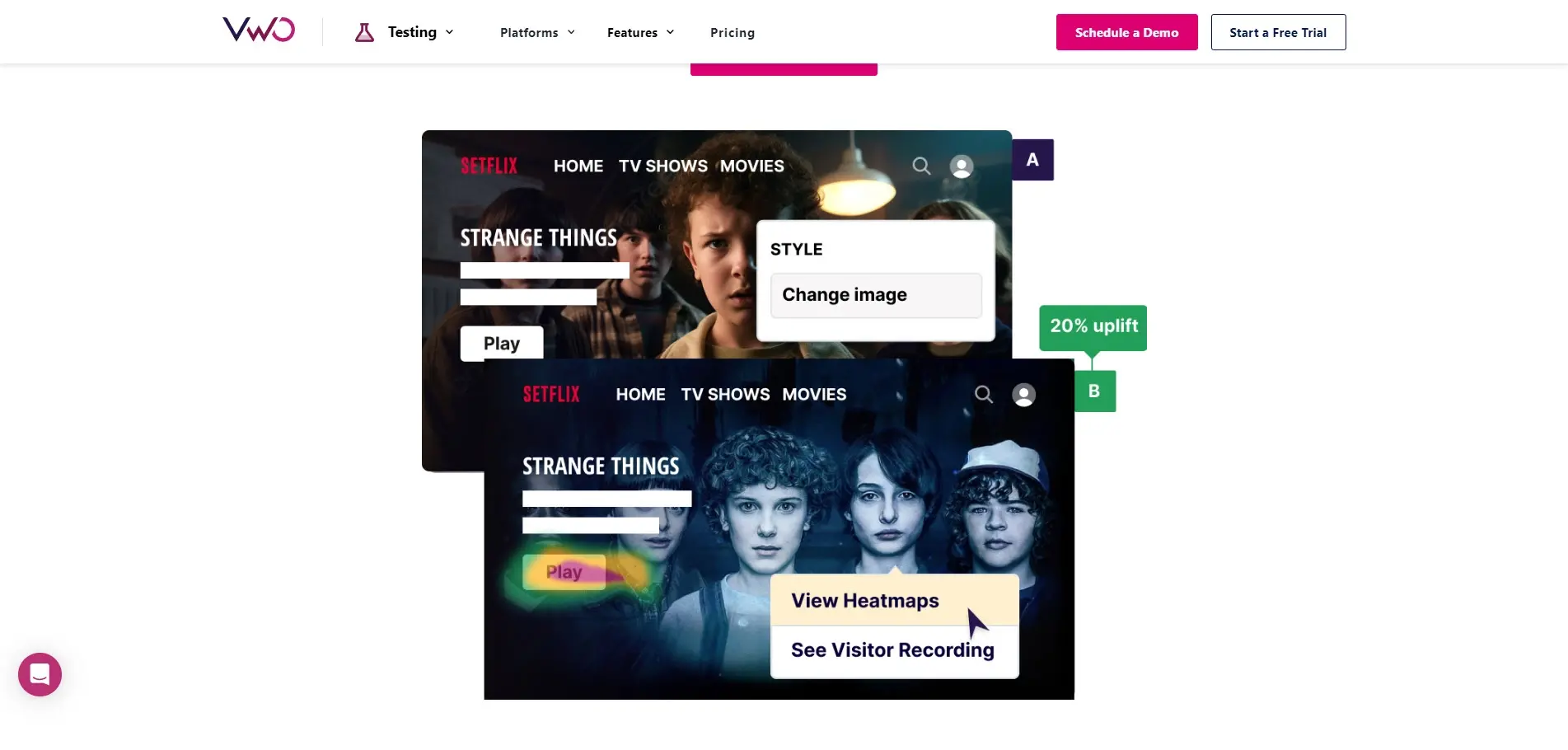
It has a low impact on page performance, and you can make modifications with the widget library and code editor. It includes tools for the server, website, and mobile apps.
AB Tasty
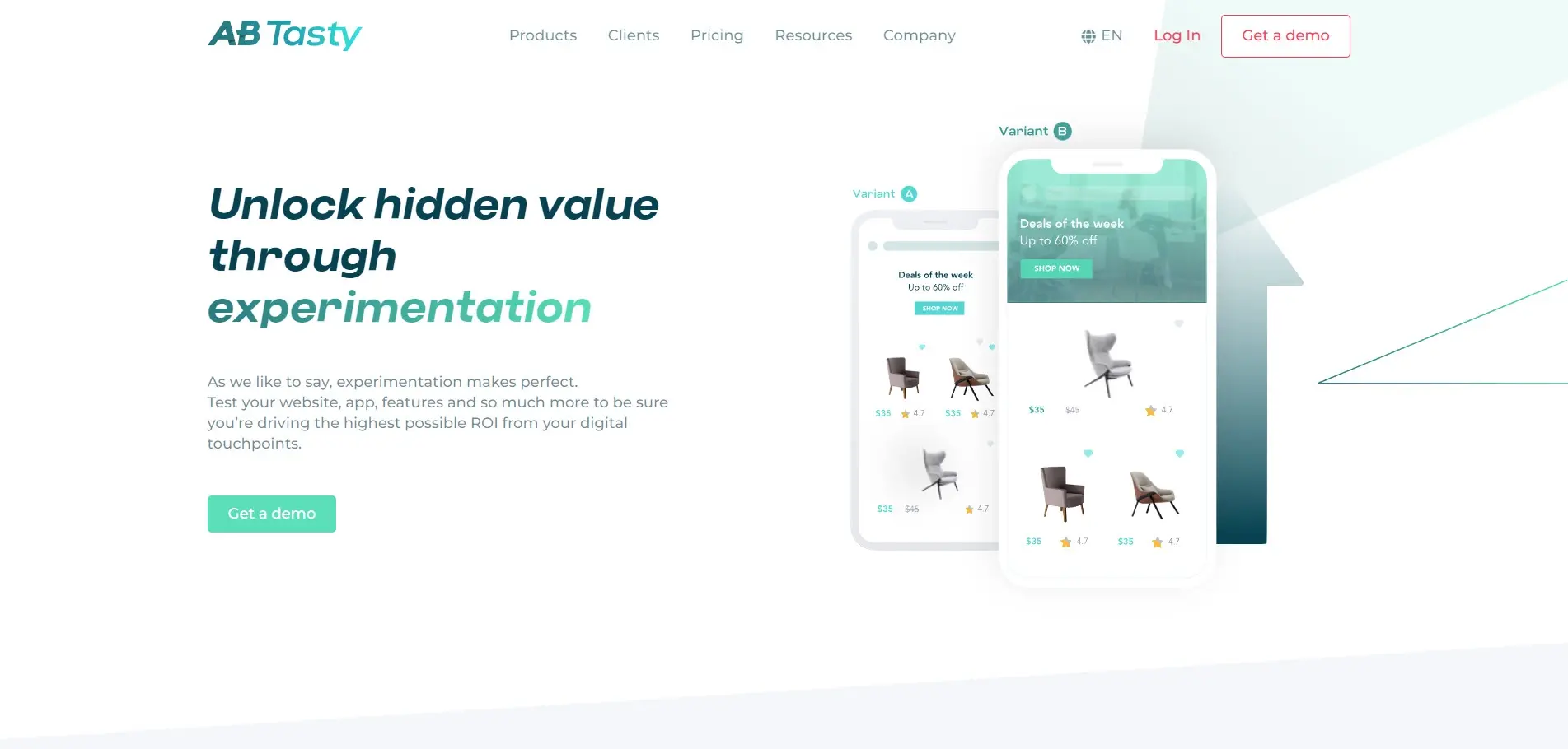
AB Tasty Web Experimentation is a premium testing platform with a code-no-code approach. It includes multivariate testing, multi-page testing, split testing, and A/B testing.
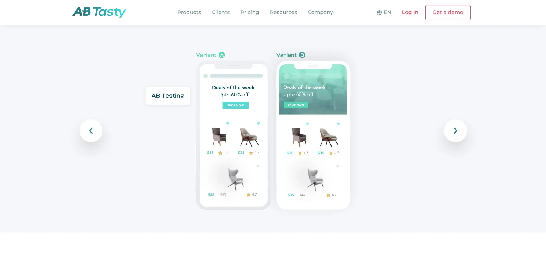
You can set the targeting segments, create the variations, set the goals, allocate traffic both locally and globally, and integrate it into your data stack. You can track the ROI of your experiments. It also uses the Bayesian statistics engine.
Divi
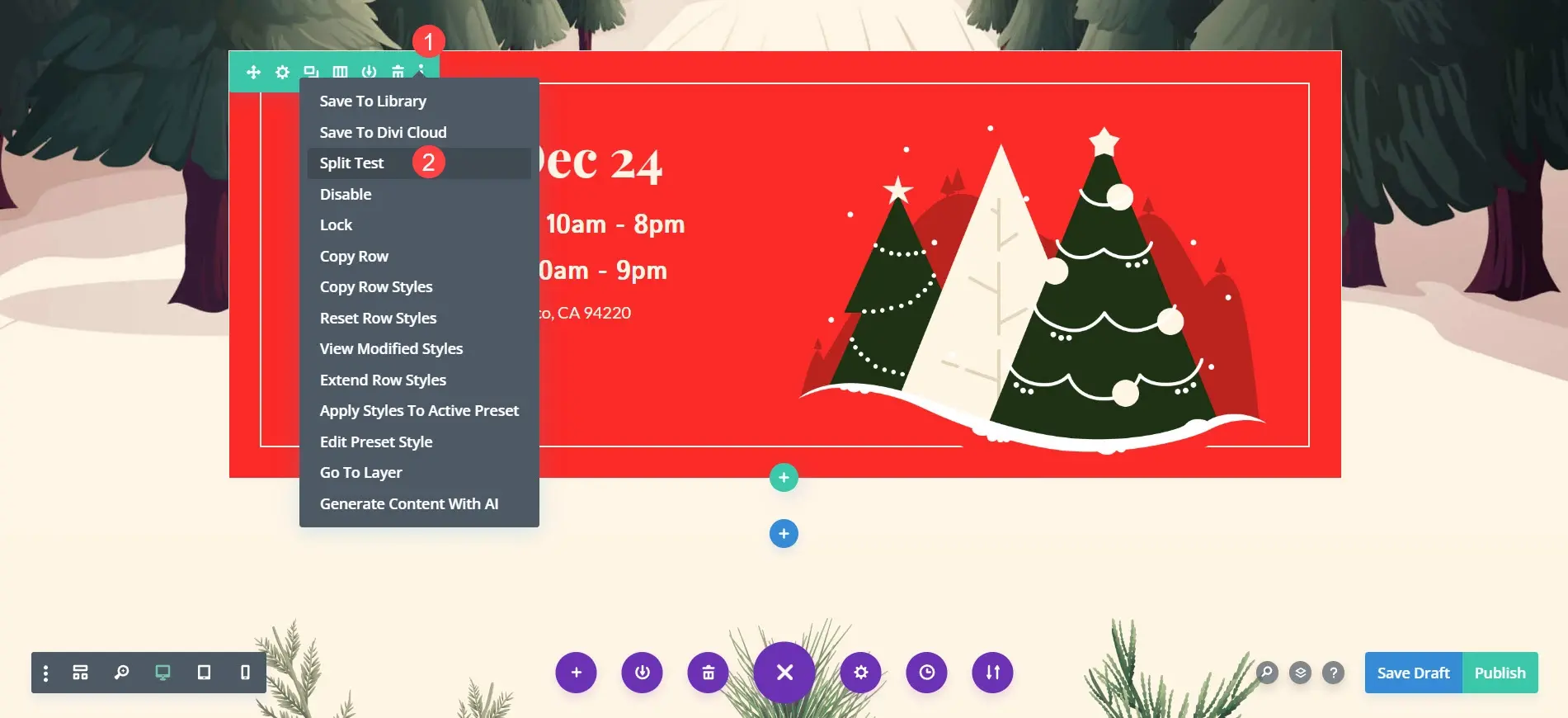
Divi is a WordPress theme with a drag-and-drop builder. It includes A/B testing of every element. To run an A/B test, click the three dots of any element in the Divi Builder and choose Split Test.

Next, choose the subject you want to test. Divi will duplicate the element and use the subject as the test, so you’ll have two versions of that element. Make any changes you want to one of the elements and publish the page. Divi will track statistics until you turn off the test.
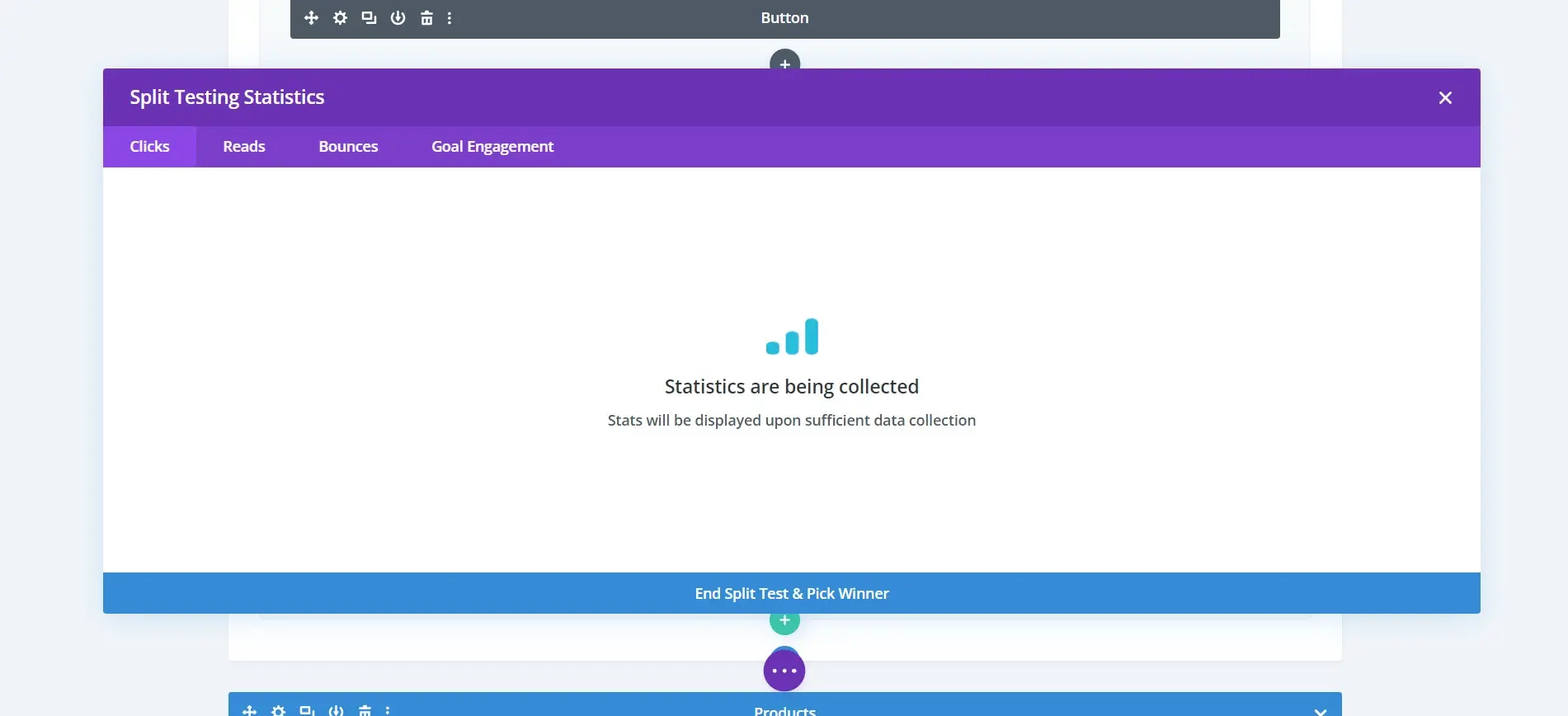
To see the statistics, click the animated graph on the element. Select the tabs to see clicks, reads, bounces, and goal engagement. You’ll see a graph that compares the two elements in the test. You can also end the test and choose the winner.
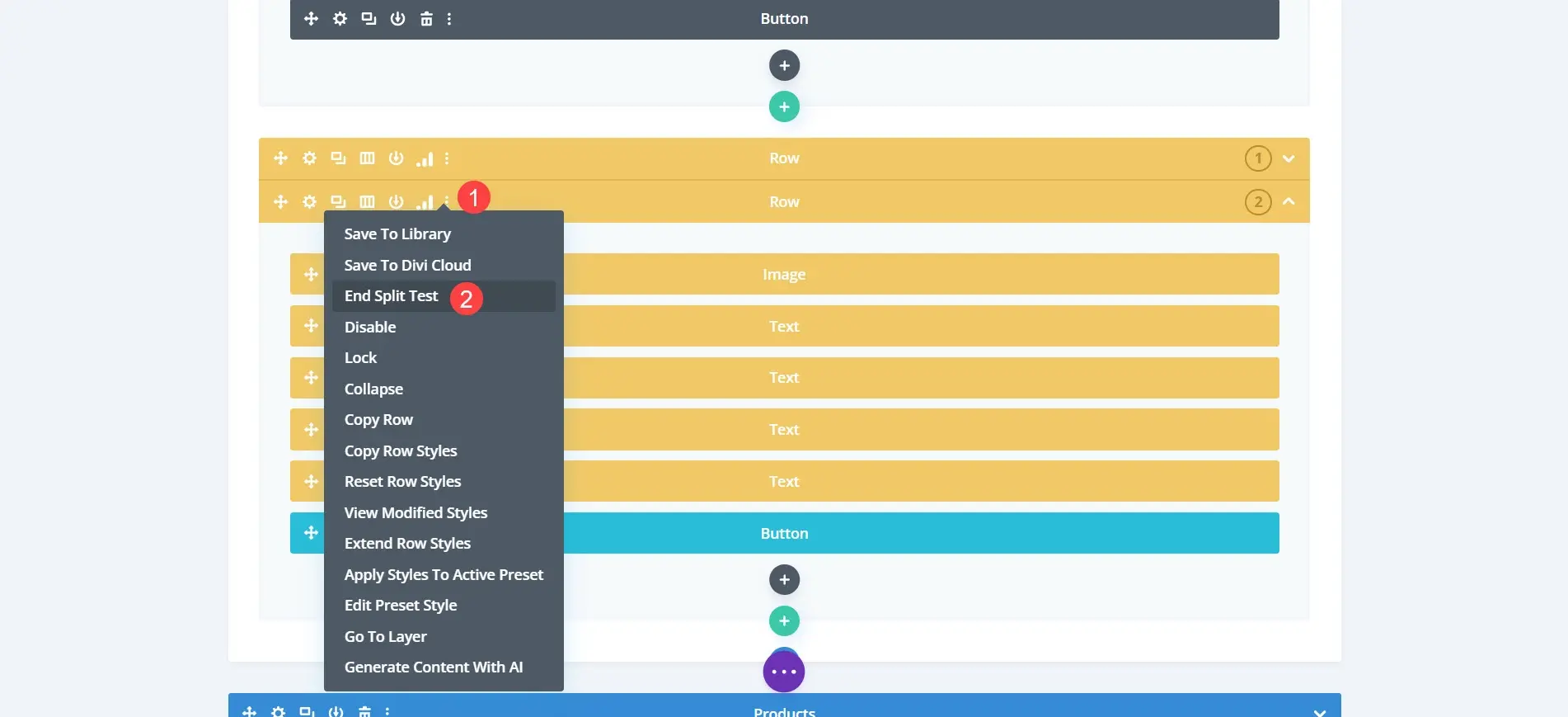
To end the test outside of the statistics screen, click the three dots on the element and choose End Split Test.
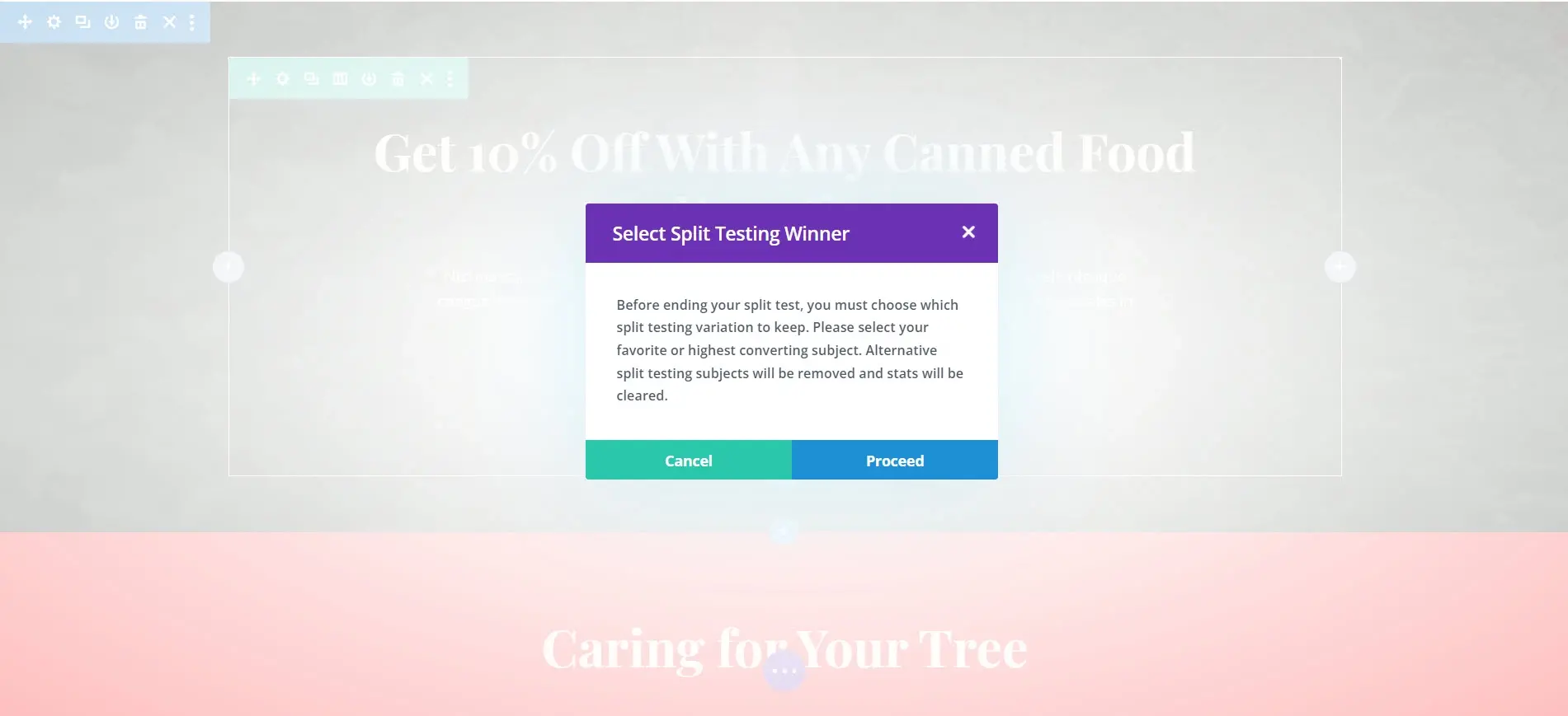
A modal will ask you to choose the winner. The element you choose becomes the live element and the other one is deleted.
For more information about Divi, see our Divi review.
A/B Testing Tips
Test the simplest and most important variables first.
Test multiple variables.
Don’t test everything at once.
Don’t test every possible element.
Focus on the most important elements.
Once you’ve selected the winner, make changes and test again.
If the impact is small, move on to a different element.
Run multiple A/B tests across your website.
To improve the accuracy of the test, run the test until you get a large sample.
Always run an A/B test to constantly improve your website.
Ending Thoughts on Website A/B Testing
That’s our look at website A/B testing. A/B testing is a great way to improve your website. Your visitors’ actions will tell you what works and what doesn’t, so you’ll make changes to your website based on real data from your website.
You won’t have to make hard decisions or guess what might or might not work. Simply create two versions of an element and let your audience decide. A/B testing is easy to perform, and you can run them on every page if you want.
A/B testing is the best way to improve your conversions and every element of your website.
We want to hear from you. Have you tried A/B testing on your WordPress website? Let us know about your experience in the comments.
Frequently Asked Questions
What tools are available for automated testing of WordPress themes?
Use tools like Theme Check, PHP_CodeSniffer, and automated testing frameworks such as PHPUnit for unit testing to ensure code quality and theme functionality.
Is a website on WordPress safe?
Websites on WordPress are safe, however to avoid hacking keep your website up to date.
Why should I create a website?
There are many reasons why you should create a website if you’re an artist. You can use it to create a place where people can learn about you, talk about your art, or show off your work.

Randy A. Brown is a freelance writer from east TN specializing in WordPress and eCommerce. He's a longtime WordPress enthusiast and loves learning new things and sharing information with others. If he's not writing or reading, he's probably playing guitar.
View all posts by Randy A. Brown


