The triangle is probably the most popular shape in CSS and also the easiest one to create. A lot of techniques can be used to create such a shape but most of them are too old and not efficient (like the border method).
“Why another article about triangles?” you may ask. In this article, I am going to focus on modern ways to create triangle shapes but I will do even more than simple triangles. I am also going to create border-only variation and rounded corners variation as well.
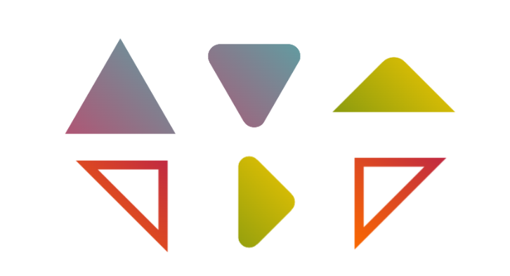
In addition to the different variations, the main challenge is to consider only one element and an optimized CSS code that we can easily adjust to control the shape.
I have an online generator for triangle shapes from where you can copy/paste the code of any triangle shape you want but stay with me if you want to know the secret behind creating them.
Creating a Triangle Shape
To create a triangle all you need is the clip-path property and a 3-point polygon. That’s all!
clip-path: polygon(x1 y1,x2 y2, x3 y3);
I think it’s not really a surprise since 3 points is all we need to draw a triangle.
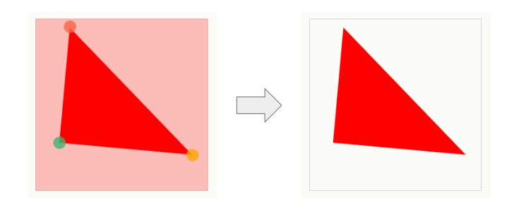
In reality, we are not going to use random points but rather consider the easy ones like the corners or the middle of sides.
For example, the below will create an isosceles right triangle.
.triangle {
  width: 200px;
  aspect-ratio: 1;
  polygon(0 0,100% 100%,0 100%);
}
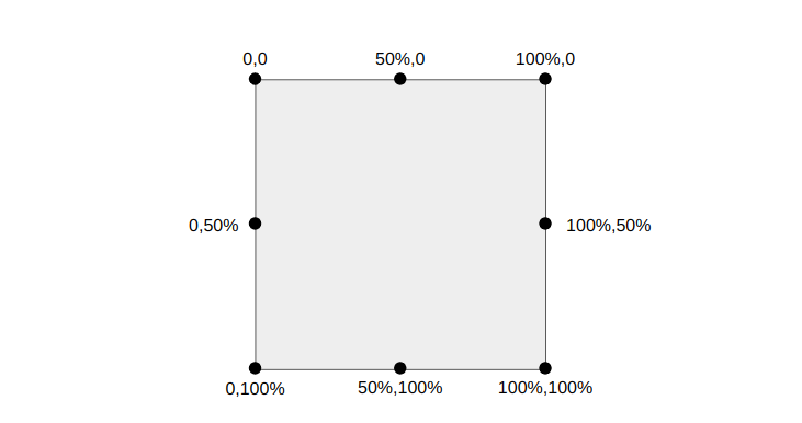
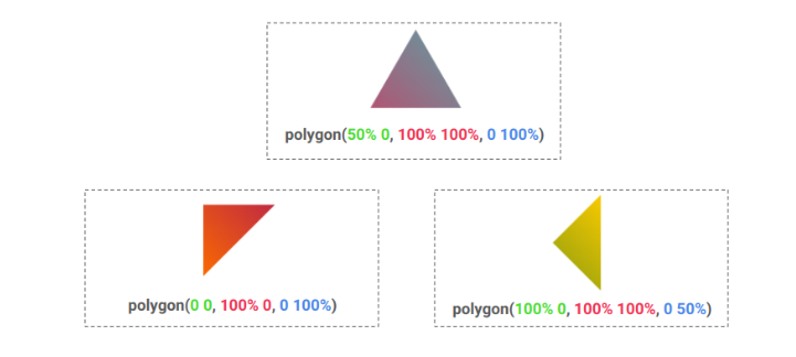
It’s pretty simple and if you have trouble with the coordinates of the points here is a figure to illustrate the common ones you will use the most. You can also refer to my article "CSS Tricks To Master The clip-path Property" for more details
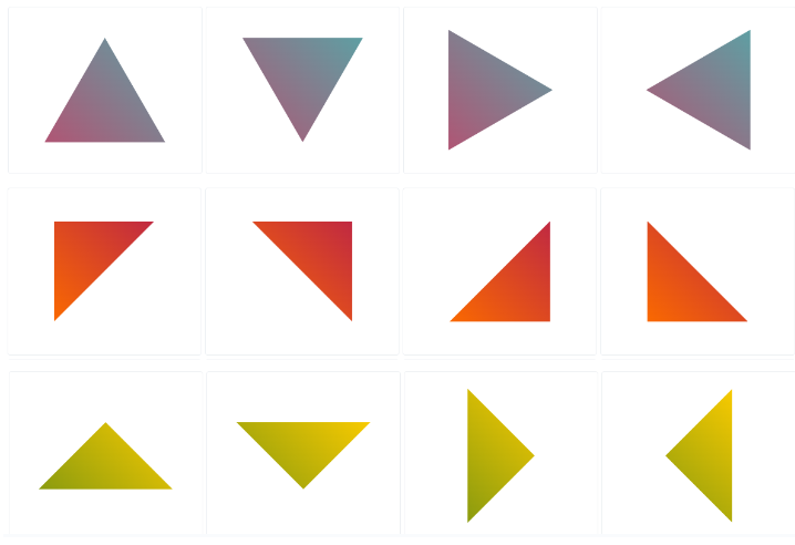
And here are a few examples of triangles
Note the use of aspect-ratio which is useful when dealing with responsiveness. It allows you to define the ratio and then only update one value (either the width or the height) to control the size.
Now you have all that you need to create any kind of triangle shape. You can even apply it to image elements and consider gradient coloration!
You can find the common shapes within my online collection but I highly recommend you to try creating some of them as a small exercise. A good opportunity to practice with clip-path and build some triangles!
Border-only Triangle Shapes
Creating a simple triangle is easy but it gets more tricky when we want to consider the border-only version. We are still relying on clip-path but we need more points this time.
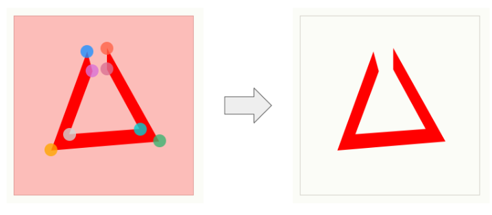
The above figure illustrates the number of points. I am intentionally leaving a gap at the top to understand that we need an 8-point polygon. You may intuitively think that we need a 6-point polygon since we started with a 3-point polygon for the simple triangle but no.
This said, we only have 6 different coordinates because if we close the gap at that top, we will have an overlap between 4 points so two points will get repeated.
Let’s take the previous triangle and create a border-only version of it:
.triangle {
  width: 200px;
  aspect-ratio: 1;
  clip-path:
    polygon(
      /* the outer points */
      0 0,100% 100%,0 100%,0 0,
      /* the inner points */
      5% 10%,5% 95%,90% 95%,5% 10%
    );
}
The “outer points” are the ones we used to create the basic triangle where the first point (0,0) is repeated twice and the “inner points are the new ones that will define the border of our triangle. The first point (5%,10%) is also repeated twice.
The difficult part here is to find the correct coordinates for the inner points to get a uniform thickness on all the sides. You will need some geometry/math knowledge to identify the formulas and I know that it can be tricky that’s why having an online generator can be a lifesaver.
The code of the previous triangle can be written like below:
.triangle {
  --b: 15px; /* control the border thickness */

  width: 150px;
  aspect-ratio: 1;
  clip-path:
    polygon(
      /* outer points */
      0 100%,0 0,100% 100%,0 100%,
      /* inner points */
      var(--b) calc(100% - var(--b)),
      calc(100% - var(--b)/tan(22.5deg)) calc(100% - var(--b)),
      var(--b) calc(var(--b)/tan(22.5deg)),
      var(--b) calc(100% - var(--b))
    );
}
Even if you don’t understand all the values/formulas of the clip-path, all you have to do is update one variable to control the border thickness.
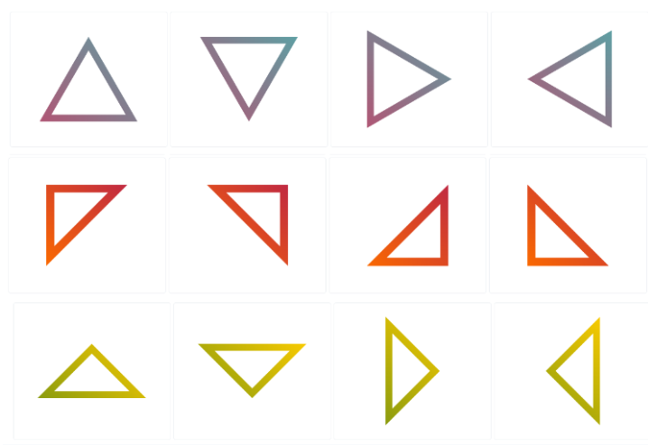
You will find 12 variations within my collection. I tried to create the most common ones.
Rounded corners triangle shapes
For this variation, we are going to introduce mask. clip-path alone cannot give us rounded shapes but mask combined with radial-gradient() can do it.
Here is a figure to illustrate the process
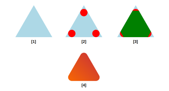
The first step is to use a 3-point polygon to create a simple triangle as we did in the first section. The second step is to use radial-gradient() to create 3 circles each one placed at a corner. We will need 3 gradients and a variable to control their radius. The third step is to fill the middle area using another gradient illustrated in green.
If we consider the red and green areas as the visible area of our element then we get the rounded triangle shown in the last step.
Explained like that, the process may sound easy but finding the gradient configuration is not that easy. It’s more complex than the border-only version because it depends on the nature of the triangle and each type of triangle will have its implementation.
Here is the code for the previous figure:
.triangle {
  --r: 20px; /* border radius */

  width: 180px;
  aspect-ratio: 1/cos(30deg);
  --_g:calc(tan(60deg)*var(--r)) bottom var(--r),#000 98%,#0000 101%;
  mask:
    /* a conic gradient to fill the middle area */
    conic-gradient(from -30deg at 50% calc(200% - 3*var(--r)/2),#000 60deg,#0000 0)
     0 100%/100% calc(100% - 3*var(--r)/2) no-repeat,
    /* 3 radial gradients for 3 circles */
    radial-gradient(var(--r) at 50% calc(2*var(--r)),#000 98%,#0000 101%),
    radial-gradient(var(--r) at left  var(--_g)),
    radial-gradient(var(--r) at right var(--_g));
  /* the 3-point polygon */
  clip-path: polygon(50% 0,100% 100%,0 100%);
}
Like the border-only version, even if the code may look complex all you have to do is to update one variable to control the radius:
You can find the code of the common shapes within my collection of triangle shapes
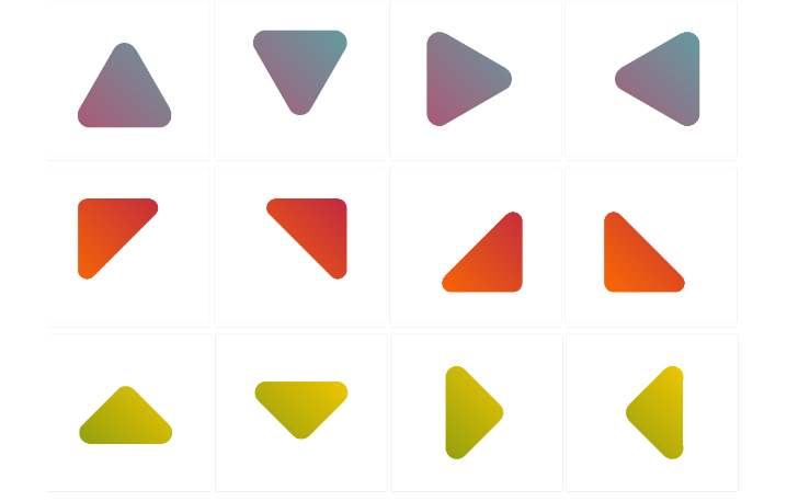
Adding Some Animations
Now that we have our shapes, let’s animate them! Both the border-only and rounded variations rely on a CSS variable to control the border thickness or the radius. We can animate that variable to get cool effects.
For this, we need to rely on @property to register the variable and be able to animate it.
@property --r {
  syntax: "<length>";
  initial-value: 0px;
  inherits: false;
}
We can for example create a hover effect to slightly adjust the radius of the rounded triangles:
If we use a big radius value we can transform a circle into a triangle:
We can also do the same with the border-only version by animating the thickness to create some cool reveal effects.
Conclusion
I hope that, after this article, we will no longer use old methods to create triangles. With modern CSS we were able to create simple triangle shapes and also more complex ones like the border-only and rounded variation. Not to mention the animation effect as a bonus.
Don’t forget to bookmark my online generator for triangles to easily grab the code of any triangle. Also check my CSS Shapes collection for more CSS-only shapes.
Frequently Asked Questions
How do I choose a design for my website?
One of the most important things when creating a website for your art is the design. Even though your pieces of art might be amazing, people will leave if your site is hard to navigate. This is why it’s important that the site is easy on the eyes and easy to navigate.
How does CSS hosting handle scalability for high-traffic websites?
CSS hosting typically employs scalable infrastructure, like cloud hosting, which can dynamically allocate resources to handle increased traffic. This ensures your site remains fast and reliable, even during traffic surges.
Which type of hosting is best for a WordPress website?
For a WordPress website, the best type of hosting is hosting for WordPress. hosting for WordPress is specifically designed and optimized to provide the best performance, security, and support for WordPress websites.
Can I integrate other technologies with my HTML website when hosting?
Yes, you can integrate various technologies with an HTML website during hosting. This includes adding CSS for styling, JavaScript for interactivity, and even server-side scripts like PHP or databases for dynamic content.

Temani Afif is an expert web developer, a content creator, and a CSS addict. He is the mastermind behind CSS Loaders, CSS Generators, CSS Tip and a lot of CSS stuff.
View all posts by Temani Afif


