 On Sale

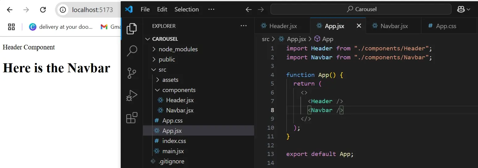
The user interface of a website allows users to interact with a computer, website, or web application. It is what gets a user's attention before they begin to explore. A well-designed UI intends to be visually appealing to its users and ensure that users can engage with the content.
In website or application development, frameworks and libraries are created to help developers build more structured, flexible and interactive applications. React is top of the list.
Using React; user interfaces [UI] are built by breaking code into smaller pieces. One of the ways to beautify or make a UI interactive is to add a carousel to your website.
In this article, we’ll discuss what a carousel is and how it can be created in React. We would also look into React components, the reason developers need components, and how we can build a carousel using components in React.
React for Building Applications
React is a JavaScript library used by developers to build user interfaces for websites and mobile applications. It follows a declarative approach, and uses a component-based structure, enabling developers to create reusable UI elements and manage application state effectively. Let’s break down these concepts;
Component-Based: React assists developers in creating user interface [UI] using components. These components are independent and reusable bits of code that display content on the UI. The purpose of components is to allow developers to break down code into smaller parts that make up a whole, which keeps it organised, easy to maintain and reusable. The components represent different parts of the user interface and can be nested within each other for reusability, it can have a header, footer, sidebar component etc.
There are two types of components;
- Functional Components
Functional components are JavaScript functions that return JSX.
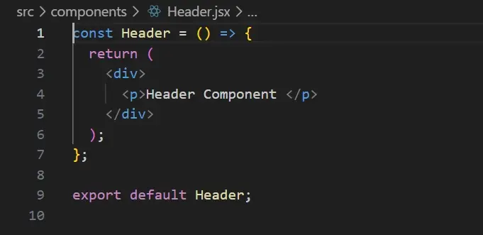
In the image above, we created a simple JavaScript arrow function that returns JSX.
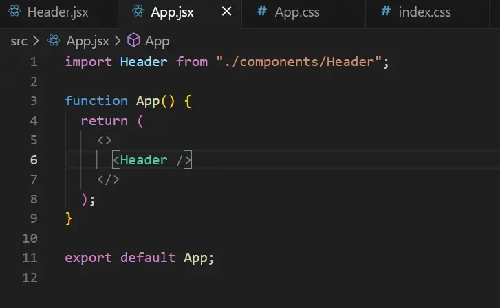
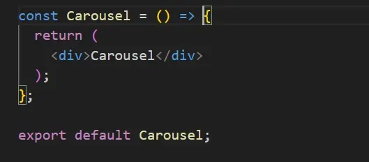
JSX is a syntax extension of JavaScript which resembles HTML - basically, it allows us to write HTML-like code within JavaScript. To use the function component, we need to access the APP component which is already created when we install REACT using vite. Then we render the Header component, in other words, the
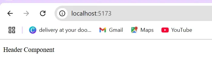
The rendered component content is on the web browser in the image below.
The APP often serves as the central or root component of the application where other components are called or merged to create a whole UI.
- Class Components
This is a JavaScript class that extends REACT component class and includes a render method that returns JSX.
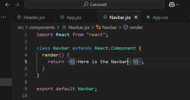
To use the class component, we have to go into our APP component as well, and then render the Navbar component. The image below is what would be displayed on the web browser.
Reusability: When components are reusable, it means they can be used in multiple applications or projects. For instance, a button can be a component that can be used in multiple places within an application.
This reduces code duplication and makes it easier to maintain the code. Props can be passed to components, allowing them to behave differently without the need to re-write code. In other words, props enable you to customize a button component so that, when it's used in different parts of the application, it can be tweaked or styled differently without having to create another button component.
Declarative: React follows a declarative approach, allowing you to determine what you want your application to look like, while React takes care of the rendering aspect, meaning you don't have to explicitly tell React how to update the UI.
Before we can build a carousel using the React framework, we must answer the question, what is a carousel?

Carousel Defined
A carousel or a carousel slider is a box of information that changes or a UI component that combines items such as images, videos, text or cards into a single space - it’s more like a collection of items that users can slide, scroll using arrow or dot navigation controls.
Carousels are used to display multiple content in a limited space and can be used to showcase featured products or promote products and services. They also include interactive elements to engage users. The transitions in carousel sliders can also enhance the appearance of a website.
Different designs can be achieved by building a carousel. Here’s an example of a carousel to provide a visual representation.

src:https://www.sliderrevolution.com/design/carousel-slider/
If you’re looking for a slider or carousel design/inspiration you can check out this website.
A carousel is typically made up of;
Container: This is the box that holds all the elements of the carousel. It handles the structure and layout of the carousel such as width, height, positioning, etc.
Content: The content is the items that would be displayed in the carousel such as images, text, and videos.
Navigation Controls: These allow users to navigate through the content within the carousel such as arrow buttons and swiper for touch devices.
Auto play: This is a feature that automatically transitions between contents within a carousel. It displays the content without the user having to navigate through them manually.
Transitions Effects: These are effects that determine how the content moves from one slide to another. Examples include fading, smooth sliding, flipping, etc.
Indicators: These are visual elements like dots or thumbnails that show the current position of a slide and then direct users on how to move between slides.
Descriptions (Optional): These are additional content like title, and product description that provide more context about the displayed content.
Best Practices for Carousel Design
Ensure the carousel is responsive and mobile-friendly
Ensure the carousel is swipe-friendly and if you must use auto-play avoid using it on videos so your users have control, and it doesn't end up being annoying. Also, auto-play can increase the page's load time which can frustrate users
Ensure your carousel is simple and also utilize intuitive UI elements
Ensure that the page is not occupied with too many carousels it can make your website appear overly busy
Ensure that the UI elements are functional and easy for users to interact with.
Building a Carousel
There are different ways to build a Carousel you can either, custom-build or use ready-made libraries.
Custom Build: Building a carousel from scratch allows you to have control over the design, behaviour and functionality. You can use vanilla CSS or tailwind CSS to style the layout, responsiveness and transitions, and JavaScript for functionality such as auto-play, pause on hover, navigation controls (like next or previous buttons) and swiping.
The advantage is that;
It is customizable to meet the needs of the project.
It is lightweight because it doesn't have unnecessary features.
It doesn't depend on external libraries
The disadvantage of a custom-built carousel is that it can be time-consuming.
Ready-Made Libraries: You can create a carousel using third-party libraries. These libraries offer a range of features for functionality and customization. Examples of carousel libraries include;
Swiper.js: Swiper.js provides customizable options, supports lazy loading, and offers touch gesture functionality
React-Slick: This is a React wrapper for slick carousel, making it easy to integrate into React Projects.
These libraries save development time, are compatible with modern browsers, and include features such as touch/swipe gestures and various animation styles. However, they may include unnecessary features that increase the weight of your project.
Also, customisation may be limited in comparison to custom-built carousels, and they depend on third-party code.
In this example, we’ll be working with an already-made library, and here’s how you can incorporate it into your code;
Prerequisite: Before building a carousel component, you should have installed React and other dependencies, such as TailwindCss for styling.
Step One: Create a folder called component; this is where you will create the file for your carousel.
In the folder, create a new file and name it Carousel.jsx ensure the file is a .jsx extension since we are using JavaScript, not Typescript.
In the Carousel.jsx file, create an arrow function and save it to the carousel variable.
Step Two: Render the Carousel component in the APP component, so you can view the content on the web browser.
Step Three: Create an array of objects that will contain the content we want to display in our carousel.
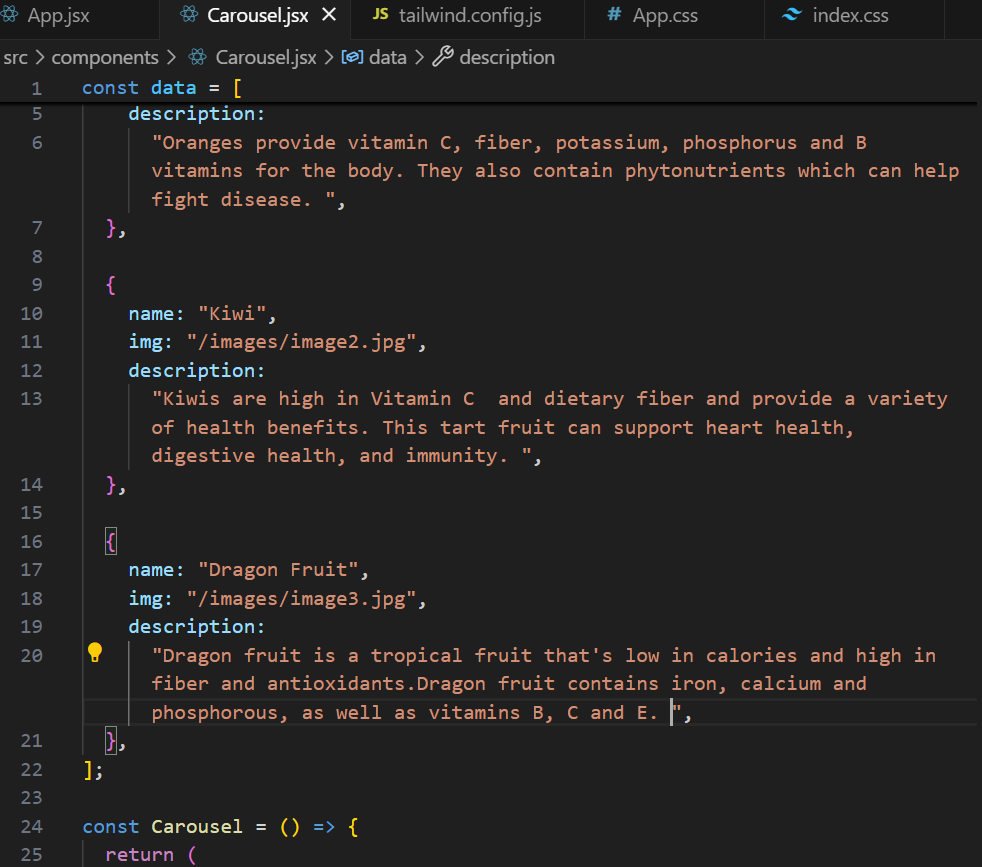
Note: You can do this in an external file but for the sake of the project, let’s create the array of objects in the carousel component.
Step 4: Create and style cards for the carousel component.
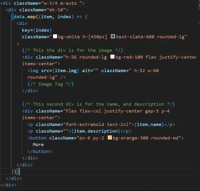
In the image above, we created a card that contains a div for the image and another div for the item details; such as name, description and a button. We also added styling to the elements within the div. This is what it looks like;
Now that you have styled the cards in the component, use react-slick to create a carousel using these cards.
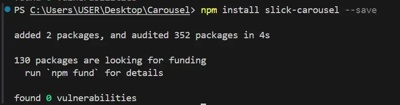
Step 5: Install React-Slick which is a carousel component built with React.
Install react-slick by running the following commands;
npm install react-slick --save

npm install slick-carousel --save
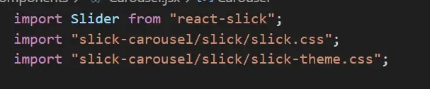
Step 6: After installation is complete, import the react-slick and react carousel into your project like so;
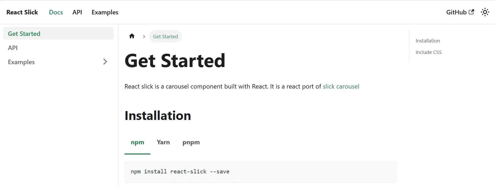
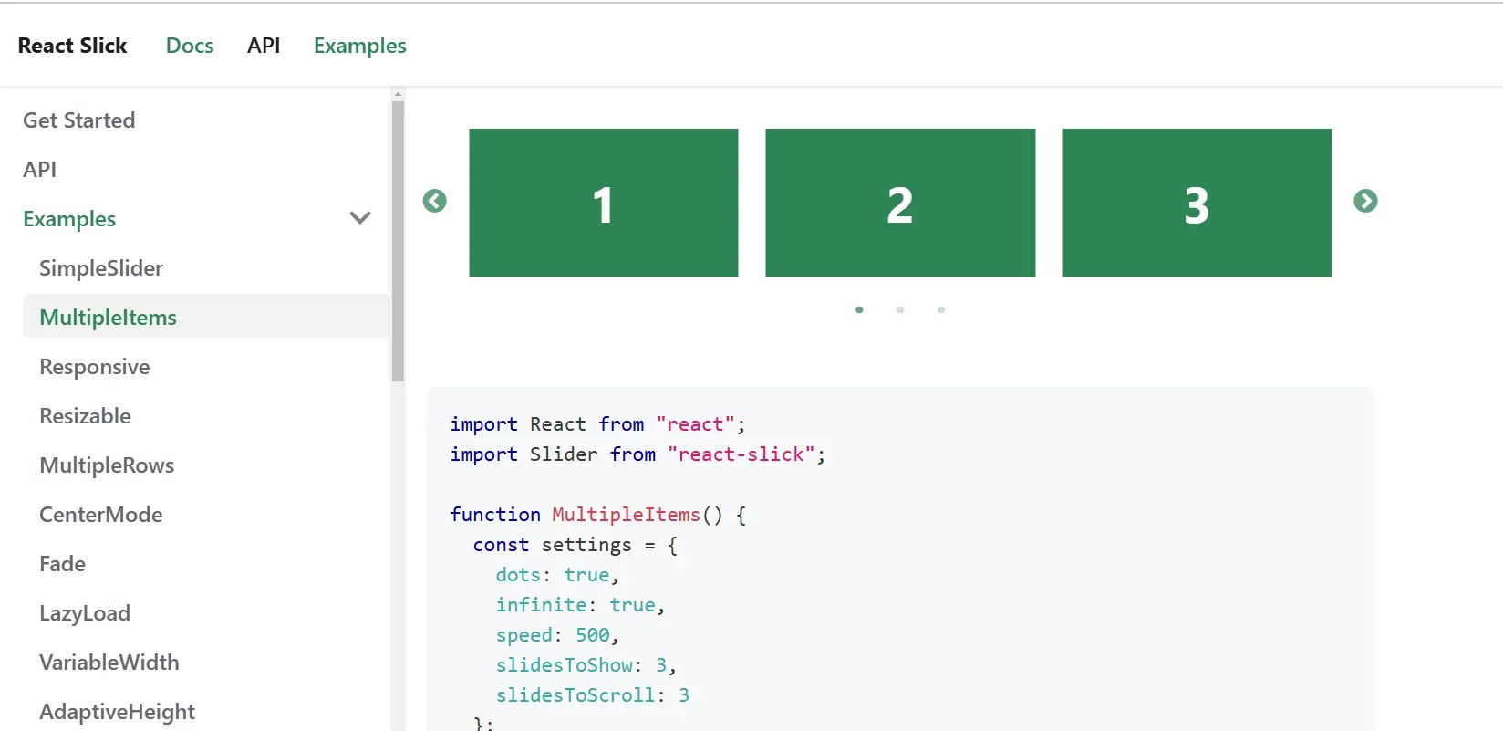
In the documentation, when you click on examples, you will find various examples of sliders such as simple sliders, multiple items, centre mode, etc. In your project, you will be using the multiple items slider component.
Step 7: Insert the slider component into your project and specify some settings, use the setting from multiple items slider.
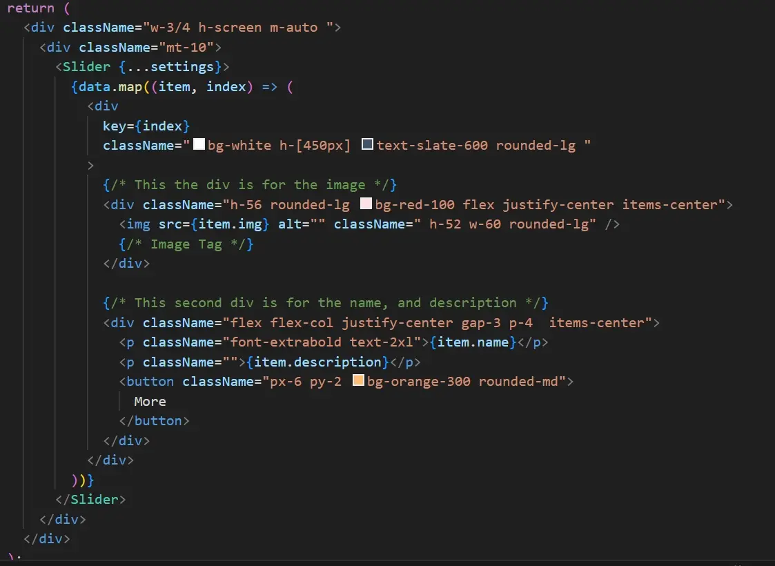
Place the setting inside the carousel component before the return statement like so;

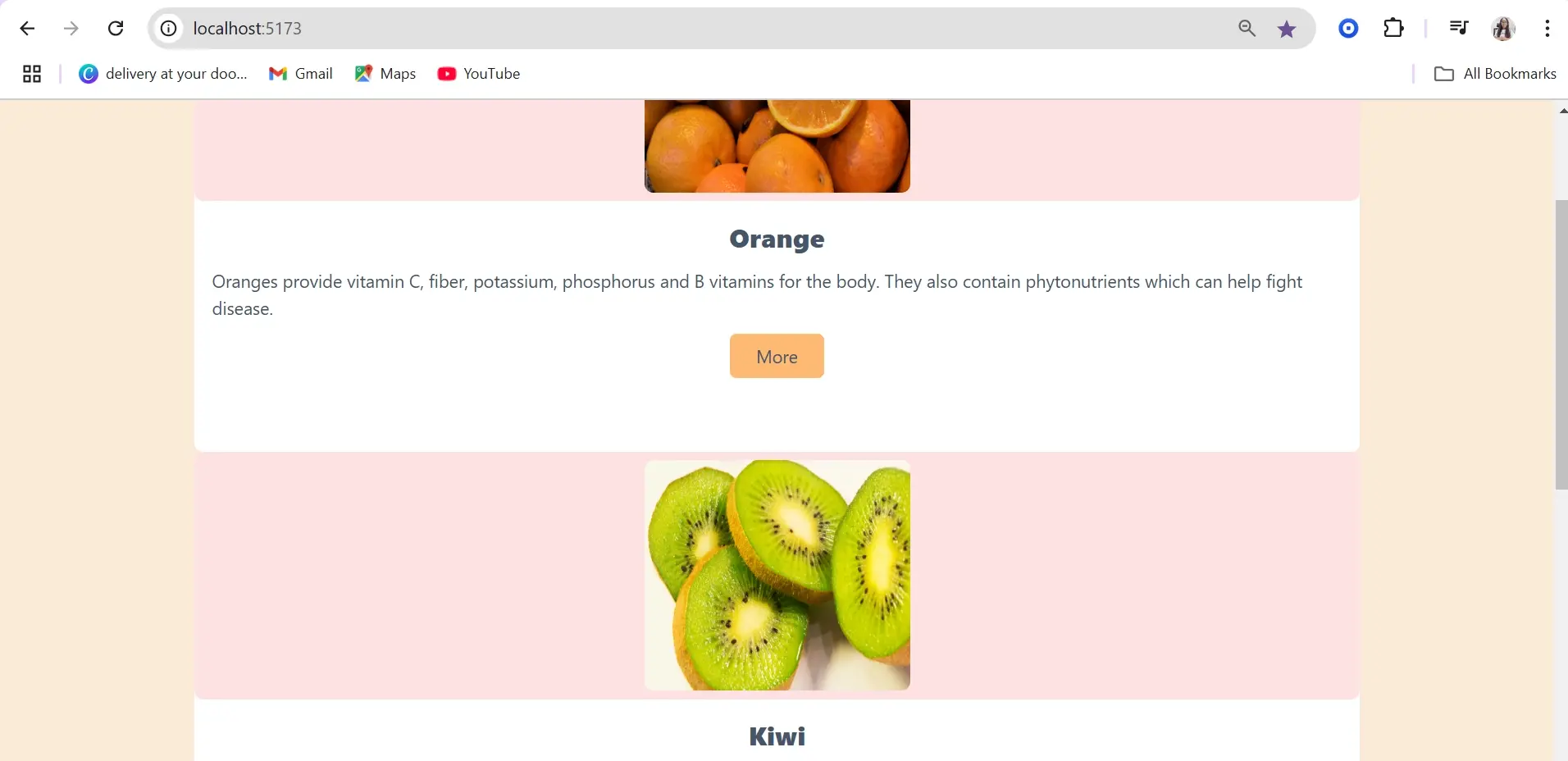
After adding the Slider component, this is what the card should look like. If yours looks like the image below, you have successfully created a carousel.
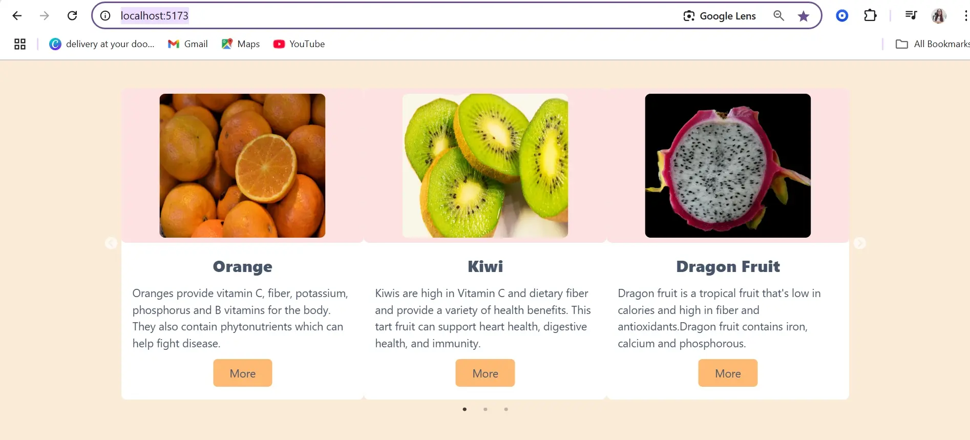
From the image, you can see the navigation control (arrow) that lets us move from one item to another. You can tweak the setting, and also check out the react-slick documentation, and explore more examples to create your carousel to your taste.
Should you use a carousel?
The use of a carousel is dependent on the design and what the website aims to achieve. In most cases, it's advised not to use carousels on certain websites.
For instance, many people place a carousel in the header section, which can distract users instead of prompting them to action ultimately decreasing the conversion rate.
Carousels are better located below the header, such as displaying testimonials. They are great for e-commerce and photography websites where visuals are important.
The header of the website should focus on the solution you provide and guide users on how to get in touch or sign up for your service.

Summary
Using React for your project allows you to build structured code that can be maintained easily. While creating a carousel component for your React project you have the option to custom-build or utilize ready-made libraries that simplify the process of development.
Deciding which to choose depends on your project requirements. If you need something more customisable and lightweight, it is great to choose a custom-built solution. However, if you're looking for a faster implementation that works well, ready-made libraries are a great choice.
Frequently Asked Questions
Can I use JavaScript frameworks like React or Vue.js in my WordPress plugin?
Yes, you can. Enqueue your scripts properly using wp_enqueue_script(). Ensure compatibility with WordPress core and consider using the REST API for seamless communication.
Are there specific hosting requirements for JavaScript frameworks like React, Angular, or Vue.js?
Answer: Generally, hosting for client-side JavaScript frameworks like React, Angular, or Vue.js does not require specialized servers since the frameworks run in the user's browser.
Does SSR affect client-side JavaScript functionality?
SSR does not negatively impact client-side JavaScript functionality; both can work together seamlessly.
Can I use Astro.js with other JavaScript libraries and frameworks?
Yes, Astro.js is designed to work with various frontend frameworks and libraries, allowing you to leverage your preferred tools alongside its performance optimizations.

Jessica Agorye is a developer based in Lagos, Nigeria. A witty creative with a love for life, she is dedicated to sharing insights and inspiring others through her writing. With over 5 years of writing experience, she believes that content is king.
View all posts by Jessica Agorye


