 On Sale
The hamburger menu is a must when dealing with responsive design. Having the ability to show/hide the menu on small screens is essential to keep the navigation on the website easy. In this post, we will build a CSS-only responsive menu with a minimalist code.
This article will be a step-by-step tutorial where we will start by creating the icons until we reach a fully functional menu.
Creating the icons
To build the hamburger menu, we need two icons: The hamburger icon and the close icon. A lot of techniques exist to create such icons and many of them rely on a lot of code but here we are going to use only CSS applied to one HTML element.
For the hamburger menu, we need 3 CSS declarations as follows:
.menu {
width: 150px; /* control the size */
aspect-ratio: 1;
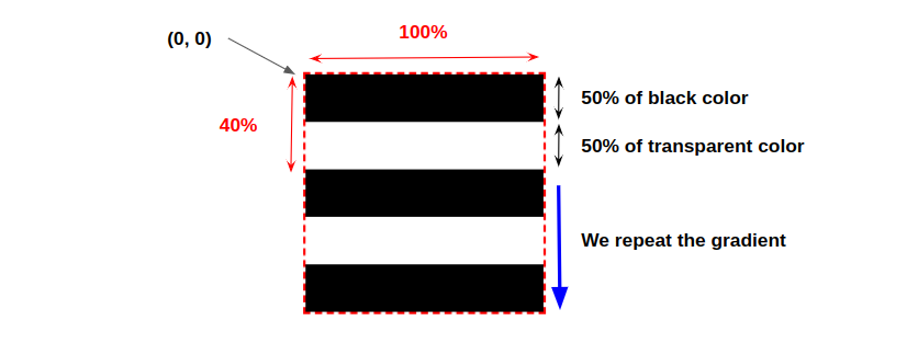
background: linear-gradient(#000 50%, #0000 0) 0 0/100% 40%;
}
We define a square element thanks to width and aspect-ratio then using a gradient we create the 3 bars. Below is an illustration to understand how the gradient is working:
And the code for the close icon is as follows:
.close {
width: 150px; /* size of the icon */
aspect-ratio: 1;
background:
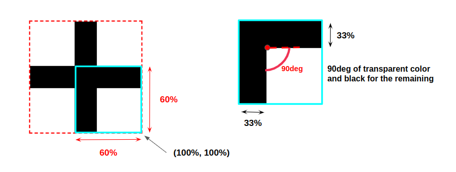
conic-gradient(from 90deg at 33% 33%, #0000 90deg, #000 0)
100% 100%/60% 60%;
transform: translateZ(0px) rotate(45deg);
}
We are using a similar code to the hamburger icon with one value to control the size and a gradient to create the shape. Below is an illustration of the gradient before we apply the rotation:
The above codes are the simple version of both icons. We can also have the version with rounded edges. For this I will consider more gradients.
For the hamburger icon:
.menu {
width: 150px; /* update this to control the size */
aspect-ratio: 1;
background:
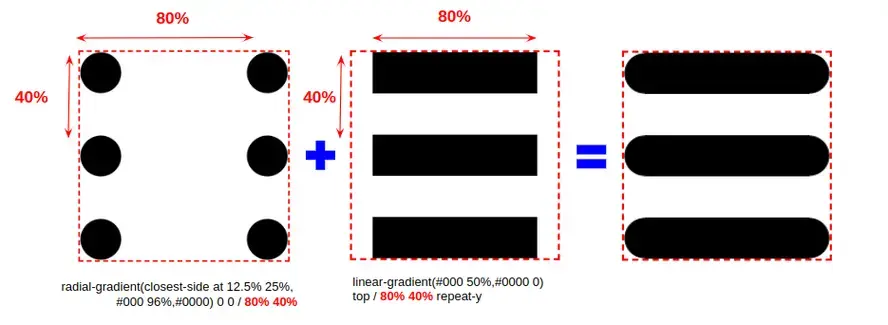
radial-gradient(closest-side at 12.5% 25%,#000 96%,#0000) 0 0/80% 40%,
linear-gradient(#000 50%,#0000 0) top/80% 40% repeat-y;
}
And for the close icon:
.close {
--s: 150px; /* size */
width: var(--s);
aspect-ratio: 1;
padding: calc(var(--s)*.1);
box-sizing: border-box;
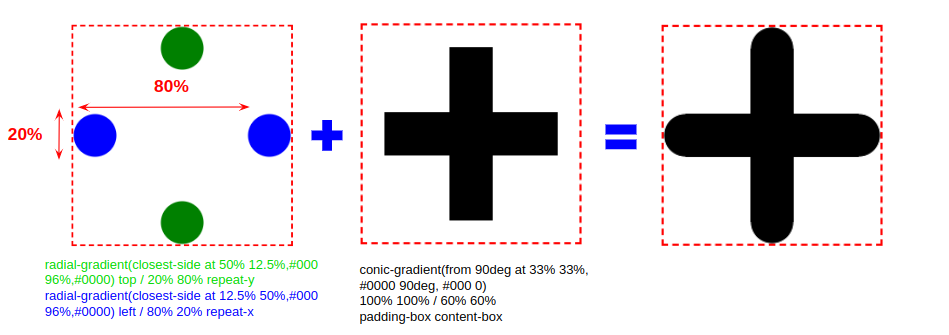
--_g: radial-gradient(farthest-side,#000 96%,#0000);
background:
radial-gradient(closest-side at 50% 12.5%,#000 96%,#0000) top /20% 80% repeat-y,
radial-gradient(closest-side at 12.5% 50%,#000 96%,#0000) left/80% 20% repeat-x,
conic-gradient(from 90deg at 33% 33%, #0000 90deg, #000 0)
100% 100%/60% 60% padding-box content-box;
transform: translateZ(0) rotate(45deg);
}
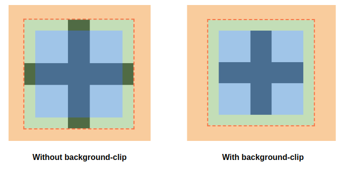
This one is a bit tricky. First, I am considering a CSS variable to define the size as I need to set padding that is equal to 10% of that size. That padding area will allow me to cut the conic-gradient() to leave spaces for the rounded edge. To do this I am using padding-box content-box which set the background-origin to padding-box and the background-clip to content-box
In other words, I am using the padding area to define my gradient then the gradient will show only inside the content area.
Then we add two radial-gradient() for the rounded edges. Both gradients have similar a configuration. I am simply inverting some values.
Here is a live demo with all the icons together

Creating the button
Now that we have our icons, it’s time to create the menu button that will toggle the visibility of the menu on a small screen. For this task, we are going to rely on a checkbox which is a native toggle that allows us to have two states (checked, unchecked)
In the above demo, I applied the style of the icons to an <input> element. The hamburger icon on the default state (the unchecked) and the close icon on the checked state. As simple as that!
I am also adding extra lines to disable the default styles of the input (you can refer to my previous article for more detail about this part)
input {
  width: 150px; /* control the size */
  aspect-ratio: 1;
  background: linear-gradient(#000 50%, #0000 0) 0 0/100% 40%;

  -webkit-appearance:none;
  -moz-appearance:none;
  appearance:none;
  cursor:pointer;
}
input:checked {
  background:
    conic-gradient(from 90deg at 33% 33%, #0000 90deg, #000 0)
    100% 100%/60% 60%;
  transform: translateZ(0px) rotate(45deg);
}
We can do the same with the rounded version of the icons.
The above demos are the most basic example of a menu button. We are simply toggling between two icons which is enough but we can go further and add some animation.
We can rely on pseudo-elements to create a fading effect:
Each pseudo-element will define one icon then we simply adjust the opacity. The code looks like the below:
input {
  width: 150px;
  aspect-ratio: 1;
  display: grid; /* we define a grid */
}
input:before,
input:after {
  content: "";
  grid-area: 1/1; /* both pseudo element on the top of each other */
  transition: .3s; /* we need some transition */
}
input:before {
  /* put the code for the hamburger icon */
  opacity: 1;
}
input:after {
  /* put the code for the close icon */
  opacity: 0;
}
input:checked:before {
  opacity: 0;
}
input:checked:after {
  opacity: 1;
}
I think the above code is self-explanatory. The same code structure can be used to create more animation.
We can have a scaling effect:
Another idea with a translation effect:
In addition to the static icons, we can consider more fancy animations. We can transform the hamburger icon into the close icon using a lot of techniques while keeping the same HTML code (only the <input> tag).
I won’t get into a lot of details for this part but here are a few examples I recently made:
Creating the menu
Now that we have made our button with its animation, it’s time to build the whole menu. The main code will look as follow:
<nav>
  <input type="checkbox" role="button" aria-label="Display the menu" aria-expanded="false" aria-controls="menu">
  <ul id="menu">
    <li><a href="/">Home</a></li>
    <li><a href="/about">About</a></li>
    <li><a href="/shop">Shop</a></li>
    <li><a href="/contact">Contact</a></li>
  </ul>
</nav>
We create a <nav> element and inside we add the <input> and the menu using <ul>. You will notice the aria-* attributes and the role attribute as well. Those are needed to keep our menu system accessible. I won't detail that part since it’s out of the scope of this article but it’s always good to consider accessibility when writing HTML code (https://web.dev/semantics-aria/)
For the CSS, we will have two parts. In the first part, we will use a media query to have two styles for our menu: one for big screens and one for the mobile menu.
For simplicity, I am going to consider a basic configuration to illustrate the technique:
If you resize the above demo you will notice that the menu will disappear on small screens (under 600px width as defined by the media query) and the menu button will appear.
Now, we will consider the checked state of the input to toggle the visibility of the menu. For this, we will rely on the sibling selector +. The code will be as follow:
input:checked + ul {
  /* show the menu */
}
Now our menu is fully functional. On big screens, we have a standard menu and on small screens, we have the hamburger menu that we can toggle using a button.
We can still go further and add more styling to our menu and consider a few animations to make the menu appear/disappear nicely but the main trick will always remain the same.
Here is an example where we consider a sliding effect by using transform/opacity instead of display
We can have a lot of animation/effects. The main idea is to define a “hidden” state and a “visible” state that we control using the :checked pseudo-class

Wrapping Up
From creating the icons to building the menu, we saw how to create, using CSS and a minimal HTML code, a fully functional responsive menu. Before we end, here is a sum-up of the whole code we used. I am gonna highlight only the important parts.
The HTML code:
<nav>
  <input type="checkbox" role="button" aria-label="Display the menu" aria-expanded="false" aria-controls="menu">
  <ul id="menu">
    <li><a href="..">Menu Item 1</a></li>
    <li><a href="..">Menu Item 2</a></li>
    <!-- ...  -->
  </ul>
</nav>
The CSS code:
/* the CSS code to style the menu for big screens */
nav { ... }
nav ul { ... }
nav ul li a { ... }
nav ul li a:hover { ... }
/**/
nav input {
  /* the CSS style for the hamburger icon */
  display: none; /* hide the input on big screen */
  -webkit-appearance:none;
  -moz-appearance:none;
  appearance:none;
  cursor:pointer;
}
nav input:checked {
  /* the CSS style for the close icon */
}
@media (max-width:600px) { /* update the max-width as you want */
  /* the CSS code to style the menu for mobile screen */
  nav { ... }
  nav ul {
   display: none; /* hide the menu on mobile */
 }
  nav ul li a { ... }
  nav ul li a:hover { ... }
  /**/
  nav input {
    display: block; /* show the icons on mobile */
  }
  /* show the menu on checked */
  nav input:checked + ul {
    display: block;
 }
}
The above code is a kind of “pseudo-code” to highlight the main ideas we used in this article. In a real example, you may need to use a slightly different code like in the last example where I used transform / opacity instead of display to toggle the visibility.
If you want to ensure your site is running optimally, now’s the time to consider speed-optimized web hosting. At Verpex we offer web hosting plans suitable for businesses of any scale.
Frequently Asked Questions
How do I choose a design for my website?
One of the most important things when creating a website for your art is the design. Even though your pieces of art might be amazing, people will leave if your site is hard to navigate. This is why it’s important that the site is easy on the eyes and easy to navigate.
Can WordPress be used for eCommerce?
WordPress offers many different ways to build an eCommerce online store for all types of products and markets. Almost 40 percent of all online shops are powered by WooCommerce, a WordPress eCommerce plugin.
How much traffic can shared hosting handle?
Shared hosting serves multiple sites on a single server. The costs of this type of web hosting are low since the users utilize the resources on a single server.
Can you migrate my existing website over?
Yes, and without issue. Regardless of how many websites you’re managing, we’ll bring all of them under the Verpex wing free of charge. Just send us the details of your websites when you’ve signed up to get started.

Temani Afif is an expert web developer, a content creator, and a CSS addict. He is the mastermind behind CSS Loaders, CSS Generators, CSS Tip and a lot of CSS stuff.
View all posts by Temani Afif


