CSS has transformed from a simple styling language to a powerful tool for creating dynamic and maintainable designs in the ever-evolving web development landscape. CSS variables (custom properties) and math functions are central to this evolution, which together empower developers to build responsive, adaptable, and themable interfaces.
This article delves deep into the world of CSS variables and math functions, exploring their advantages, practical implementation, tips, resources, use cases, and ultimately, how they revolutionize the way we approach web styling.
The Advantages: Flexibility, Maintainability, and Performance
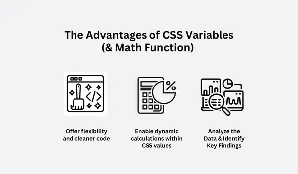
Offer flexibility and cleaner code
CSS variables offer unparalleled flexibility by allowing developers to store and reuse values throughout their stylesheets. This eliminates the need for repetitive declarations, leading to cleaner and more maintainable code.
When a change is required, simply update the variable's value, and all dependent styles are automatically adjusted. This centralized control significantly reduces the risk of inconsistencies and simplifies the process of theming and adapting designs for different contexts.
Enable dynamic calculations within CSS values
Furthermore, math functions like calc(), min(), max(), and clamp() enable dynamic calculations within CSS values. This allows for responsive layouts that adapt to varying screen sizes and content lengths without relying on JavaScript. For instance, calc() can be used to create fluid grids, while min() and max() can ensure elements maintain a consistent size within specified bounds. This eliminates the need for complex media queries in some scenarios, leading to more concise and efficient CSS.
Faster Rendering Times
From a performance perspective, CSS variables and math functions are processed by the browser's rendering engine, which is highly optimized for these operations. This often results in faster rendering times compared to equivalent JavaScript-based solutions. Moreover, the declarative nature of CSS allows the browser to optimize layout and painting processes, further enhancing performance.

How To: Defining, Using, and Manipulating Variables and Math Functions
Defining CSS Variables
CSS variables are defined using the -- prefix followed by the variable name.
They can be declared globally within the :root pseudo-class or locally within specific selectors, offering different levels of scope and accessibility. This flexibility allows for both site-wide theming and component-specific styling.
CSS
:root {
  --primary-color: #007bff;
  --spacing-unit: 1rem;
}


.container {
  --container-width: 80%;
}
Using CSS Variables:
Variables are accessed using the var() function.
This function takes the variable name as its primary argument and retrieves the stored value. You can also provide a fallback value as a second argument, which will be used if the specified variable is not defined.
CSS
.button {
  background-color: var(--primary-color);
  padding: var(--spacing-unit);
}


.container {
  width: var(--container-width);
}
Math Functions:
calc(): Performs calculations using various units and operators (+, -, *, /). This powerful function enables you to mix different CSS units within a single value, which is particularly useful for creating responsive layouts and precise spacing. For example, you can subtract a fixed pixel value from a percentage-based width.
CSS
.element {
  width: calc(100% - 2rem);
  margin-left: calc(var(--spacing-unit) * 2);
}
min()andmax(): Returns the minimum or maximum value from a list of values. These functions are incredibly useful for setting boundaries on element sizes or font sizes, ensuring they don't become too small or too large under different conditions.
CSS
.box {
  width: min(50%, 300px); /* Width is 50% or 300px, whichever is smaller */
  font-size: max(16px, 1.2rem); /* Font size is 16px or 1.2rem, whichever is larger */
}
clamp(): Clamps a value within a specified range defined by a minimum, a preferred (or central) value, and a maximum. This function provides a concise way to create responsive typography or control element dimensions that scale fluidly but stay within defined limits, enhancing both visual consistency and usability across different screen sizes.
CSS
.heading {
  font-size: clamp(1rem, 4vw, 2rem); /* Font size is between 1rem and 2rem, scaling with viewport width */
}
Tips for Effective Usage:
To harness the full potential of CSS variables, adopting strategic practices is crucial for maintainability and scalability. The following tips offer guidance on how to effectively integrate and manage CSS variables within your projects. By adhering to these recommendations, you can create more organized, understandable, and robust stylesheets that are easier to work with in the long run.
- Use semantic variable names
Choose names that clearly indicate the variable's purpose. For example, --text-color-primary is more informative than --color-1. This practice significantly improves code readability and makes it easier for other developers (and your future self) to understand the role of each variable.
- Organize variables
Group related variables within specific selectors or :root to maintain a clear structure. This could involve grouping color palettes, typography settings, or spacing units together, making your stylesheet more modular and easier to navigate.
- Provide fallback values
Use the second argument of var() to specify a fallback value if the variable is not defined. This ensures that your styles don't break if a variable is accidentally misspelled or not yet implemented, leading to more resilient and predictable styling.
CSS
.element {
  background-color: var(--secondary-color, #ccc); /* Uses #ccc if --secondary-color is not defined */
}
- Leverage inheritance
Variables inherit values from their parent elements, allowing for scoped theming. By defining variables on parent elements, you can easily apply consistent styling to all their descendants, simplifying theme variations within specific sections of your application.
- Combine variables with math functions
Unleash the full potential of dynamic calculations by combining variables with calc(), min(), max(), and clamp(). This synergy enables you to create highly adaptable layouts and styles that respond fluidly to different screen sizes and content without relying heavily on JavaScript.
- Utilize browser developer tools
Inspect the computed styles to verify the calculated values of variables and math functions. Most modern browsers provide excellent tools for examining the resolved CSS, allowing you to debug and understand how your variable values and math expressions are being interpreted in real-time.
CSS Resources and Comparison:
Several tools and resources can aid in working with CSS variables and math functions. Online playgrounds and code editors often provide features like syntax highlighting and autocompletion for CSS variables, making the development process smoother. Furthermore, many front-end frameworks and UI libraries offer built-in support and guidelines for effectively utilizing CSS variables within their ecosystems.
- Browser Developer Tools:
All major browsers provide robust developer tools for inspecting and editing CSS variables and computed styles. This allows for real-time debugging and experimentation.
- CSS Preprocessors (Sass, Less, Stylus)
While CSS variables offer native variable support, preprocessors provide additional features like mixins, loops, and functions that can complement and enhance the use of variables. However, using native CSS variables removes the compilation step and makes debugging easier.
- PostCSS Plugins
PostCSS plugins like postcss-custom-properties and postcss-calc can polyfill and enhance CSS variables and math functions in older browsers.
- Design Systems and UI Libraries
Many design systems and UI libraries, such as Material UI, Bootstrap, and Tailwind CSS, leverage CSS variables for theming and customization. Studying their implementations can provide valuable insights.
- Online Resources and Documentation
MDN Web Docs, CSS-Tricks, and other online resources offer comprehensive documentation and tutorials on CSS variables and math functions.
Comparison:
| Feature | CSS Variables | Preprocessor Variables (Sass, Less) |
|---|---|---|
| Native Browser Support | Yes (modern browsers) | No (requires compilation) |
| Dynamic Updates | Yes (runtime) | No (compile-time) |
| Inheritance | Yes | No |
| Scope | Global and local | Global and local |
| Math Functions | Limited (calc, min, max, clamp) | Extensive (custom functions, loops) |
| Debugging | Easier (browser tools) | More complex (source maps) |
| Performance | Generally better (native processing) | Depends on the preprocessor and compilation |
Use Cases: Real-World Applications
- Theming and Customization
CSS variables are ideal for creating themes that allow users to customize the appearance of a website or application. By defining variables for colors, fonts, and spacing, developers can easily switch between different themes or provide users with options to personalize their experience.
- Responsive Design
Math functions like calc(), min(), max(), and clamp() enable the creation of fluid layouts that adapt to various screen sizes and content lengths. This reduces the need for extensive media queries and simplifies the process of creating responsive designs.
- Component-Based Styling
CSS variables can be used to define component-specific styles, allowing for modular and reusable components. This promotes consistency and maintainability across the codebase.
Dynamic Spacing and Layout Math functions can be used to calculate dynamic spacing and layout values based on content or viewport dimensions. This allows for more flexible and adaptable designs.
Animation and Transitions
CSS variables can be used to control animation and transition properties, allowing for dynamic and interactive effects. For example, a variable can be used to adjust the duration or easing of an animation based on user interaction.
- Conditional Styling
While CSS variables themselves don't provide conditional logic, they can be combined with JavaScript to dynamically update variable values based on specific conditions. This enables conditional styling without relying on complex CSS selectors.
- Accessibility
CSS variables can be used to define accessible color palettes and font sizes, ensuring that the website or application is usable by users with disabilities.
- Dark Mode and Color Schemes
CSS variables make it easy to implement dark mode and other color schemes by simply updating the variable values. This allows for a seamless transition between different color modes.
- Creating Design Tokens
CSS variables can be used to define design tokens, which are reusable design elements like colors, typography, and spacing. This promotes consistency and maintainability across the design system.
- Generating Gradients and Patterns
Math functions can be used to generate dynamic gradients and patterns, allowing for more creative and visually appealing designs.
Conclusion
CSS variables and math functions are a big step forward in web styling because they let developers make designs that are dynamic, easy to manage, and work well. Developers can improve their design skills, expedite workflows, and provide outstanding user experiences by bridging the gap between dynamic scripting and static styling. They provide a more declarative and effective method of developing interfaces that are responsive and flexible.
Frequently Asked Questions
Can I integrate CSS preprocessors like SASS or LESS with my CSS hosting?
Yes, most CSS hosting services support preprocessors like SASS or LESS. They allow for more advanced CSS functionalities, enabling you to write cleaner and more maintainable code.
How do vendor prefixes work in CSS3?
Vendor prefixes like -webkit-, -moz-, and -ms- are used to implement CSS3 features during their experimental stages in different browsers. However, they should be used carefully to ensure consistent experiences across browsers.
How do CSS3 transitions and animations enhance web interactivity?
CSS3 transitions allow smooth transitions between different states of an element, while animations enable the creation of dynamic movement and effects. These features enhance user engagement by adding interactivity and visual interest to web interfaces.
Are HTML5 and CSS3 important for mobile web development?
Absolutely. HTML5 and CSS3 enable responsive design, ensuring websites adapt to different screen sizes and devices. This is crucial for delivering a consistent and user-friendly experience on mobile devices.

Audee Mirza is a graphic designer and WordPress developer at audeemirza.com who resides in Surabaya, Indonesia. She's also the author of Graphic Identity Blog, a professional logo designer, and often creates vector illustrations for clients and marketplaces. She enjoys good typography design and all kinds of animation.
View all posts by Audee Mirza


