In this article, we will study two common web components: Tooltip and Speech Bubble. Both have different names but share the same design idea. We always have that small arrow/tail linked to a rectangular element with or without rounded corners.
I have a collection of more than 100 different tooltip/speech bubble variations from where you can easily copy/paste the code. In this tutorial, we will see how to easily build such components using only one element and in a way to make them easy to update.
We will focus on two techniques:
clip-pathandmask.
Creating Tooltip/Speech Bubble using CSS clip-path
This technique is useful if we want to consider a rectangular design where we don’t need any rounded corners. Let’s start with a basic example to illustrate the idea:
We are using a seven-point polygon to create the whole shape. That small arrow is not made using a pseudo-element or an extra element. It’s part of the main shape which is a cool thing because this way we can easily apply any kind of background to our element.

Now we are going to update the code to make it adjustable by introducing CSS variables and some calculations to easily update the shape, especially the small arrow at the bottom.
.tooltip {
  --h: 20px;
  --w: 40px;
  --p: 50%;

  clip-path:
    polygon(0 0,100% 0, /* [1],[2] */
      100% calc(100% - var(--h)), /* [3] */
      calc(var(--p) - var(--w)/2) calc(100% - var(--h)), /* [4] */
      var(--p) 100%, /* [5] */
      calc(var(--p) + var(--w)/2) calc(100% - var(--h)), /* [6] */
      0 calc(100% - var(--h)) /* [7] */
    );
}
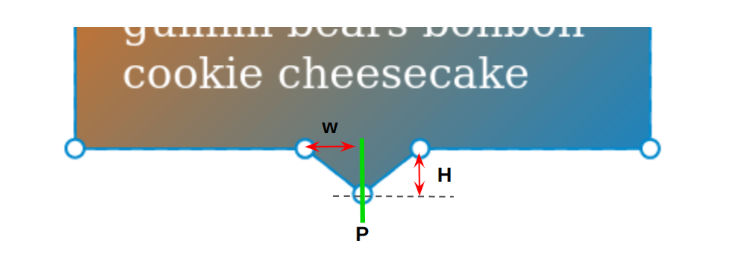
Both the variables --h and --w will control the dimension of the arrow and the variable --p will control its position. Below is a figure to illustrate the different values.

Note that I am also using the variable --h with the border-bottom property to make sure we have consistent padding for the element. In other words, the arrow will go into the border area and will not disturb the padding area.
Now, all you have to do is to update the variables to control the Tooltip shape. We can easily do the same for the other direction and have a generic code like below:
.tooltip {
  --h: 20px;
  --w: 40px;
  --p: 50%;
}
.bottom {
  clip-path:
    polygon(0 0,100% 0,
      100% calc(100% - var(--h)),
      calc(var(--p) - var(--w)/2) calc(100% - var(--h)),
      var(--p) 100%,
      calc(var(--p) + var(--w)/2) calc(100% - var(--h)),
      0 calc(100% - var(--h))
    );
}
.top {
  clip-path:
    polygon(
      0 var(--h),
      calc(var(--p) - var(--w)/2) var(--h),
      var(--p) 0,
      calc(var(--p) + var(--w)/2) var(--h),
      100% var(--h),
      100% 100%,0 100%
    );
}
.left {
  clip-path:
    polygon(
      100% 0,100% 100%,
      var(--w) 100%,
      var(--w) calc(var(--p) - var(--h)/2),
      0 var(--p),
      var(--w) calc(var(--p) + var(--h)/2),
      var(--w) 0
    );
}
.right {
  clip-path:
   polygon(
     0 100%,0 0,
     calc(100% - var(--w)) 0,
     calc(100% - var(--w)) calc(var(--p) - var(--h)/2),
     100% var(--p),
     calc(100% - var(--w)) calc(var(--p) + var(--h)/2),
     calc(100% - var(--w)) 100%
   );
}
Creating Tooltip/Speech Bubble using CSS mask
Now, if we want to consider rounded corners we have to use CSS mask. The trick is similar to the previous one. We will build the whole shape using one element but with gradients this time.
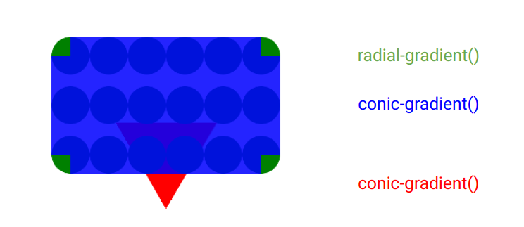
Here is a figure to illustrate the gradients configuration:

We use a radial gradient and a conic gradient to create the rectangle shape with the rounded corner. Then another conic gradient for the bottom arrow. The first two gradients will cover only the padding area so that we can control the size of the last gradient using the border property.
Of course, we are not going to keep playing with gradients (I know it can be tricky) so we can add CSS variables to the game to easily control the shape.
.tooltip {
  --r: 20px;  /* radius */
  --t: 20px;  /* the arrow/tail size */
  --a: 60deg; /* the angle of the tail*/
  --p: 50%;   /* the position */

  --m:
    conic-gradient(from calc(var(--a)/-2) at bottom,#0000,#000 1deg var(--a),#0000 calc(var(--a) + 1deg))
     var(--p) 100%/100% 50% no-repeat,
    conic-gradient(at var(--r) var(--r),#000 75%,#0000 0)
     calc(var(--r)/-2) calc(var(--r)/-2) padding-box,
    radial-gradient(50% 50%,#000 98%,#0000)
     0 0/var(--r) var(--r) space padding-box;
  border-bottom: var(--t) solid #0000;
  -webkit-mask: var(--m);
          mask: var(--m);
}
All you have to do is to adjust the different variables to get the result you want. Note that in this case, we have a variable to control the angle of the arrow. Using the clip-path method, we had the width and height but with the mask method, we have the height and the angle.
Let’s make the code for the other directions:
.tooltip {
  --r: 20px;  /* radius */
  --t: 20px;  /* the arrow/tail size */
  --a: 60deg; /* the angle of the tail*/
  --p: 50%;   /* the position */

  --_main:
    conic-gradient(at var(--r) var(--r),#000 75%,#0000 0) calc(var(--r)/-2) calc(var(--r)/-2) padding-box,
    radial-gradient(50% 50%,#000 98%,#0000) 0 0/var(--r) var(--r) space padding-box;
  --_g: #0000,#000 1deg var(--a),#0000 calc(var(--a) + 1deg);
  padding: calc(2*var(--r)/3);
  -webkit-mask: var(--m);
          mask: var(--m);
}
.top {
   --m:
     conic-gradient(from calc(180deg - var(--a)/2) at var(--p) 0%, var(--_g))
       top/100% 50% no-repeat,
     var(--_main);
   border-top: var(--t) solid #0000;
}
.bottom {
  --m:
    conic-gradient(from calc(var(--a)/-2) at var(--p) 100%, var(--_g))
     bottom/100% 50% no-repeat,
    var(--_main);
   border-bottom: var(--t) solid #0000;
}
.left {
  --m:
    conic-gradient(from calc(90deg - var(--a)/2) at 0% var(--p),var(--_g))
     left/50% 100% no-repeat,
    var(--_main);
  border-left: var(--t) solid #0000;
}
.right {
  --m:
    conic-gradient(from calc(-90deg - var(--a)/2) at 100% var(--p),var(--_g))
     right/50% 100% no-repeat,
    var(--_main);
  border-right: var(--t) solid #0000;
}
You can notice that even for the other direction we use the same gradients to create the rectangle shape. The only difference is the conic gradient that creates the arrow. For this reason, I created intermediate variables to avoid code repetition.
The mask method is really powerful when it comes to creating such a design. The above is only one example of Tooltip/Speech bubble component. We can update the conic gradient that control the arrow to get a different design.
Here is another example of Speech Bubble design suitable for Chat layouts:
All I did is replacing the conic gradient with a radial gradient. Everything else is almost the same and all you have to do is to update the CSS variables to control the shape.
Conclusion
Now you know all the secrets behind creating a Tooltip or Speech Bubble component using only one element. Either with clip-path or mask, all you have to do is to adjust a few CSS variables to control the shape.
The examples we just saw are the basic shapes that are commonly used but we can do even more. You can check my online collection to get more variations.
Frequently Asked Questions
Can you migrate my existing website over?
Yes, and without issue. Regardless of how many websites you’re managing, we’ll bring all of them under the Verpex wing free of charge. Just send us the details of your websites when you’ve signed up to get started.
How much does web hosting cost?
Comparing prices is usually simple in other industries. However, when it comes to web hosting, it can be quite confusing since when you’re comparing the prices, you need to consider all of the features that the plans offer and compare them as well. The cost of web hosting varies depending on the plan you get and the web hosting provider you get it from, so make sure that you have a good understanding of the structure of pricing.
How to reduce hosting cost?
To reduce the cost of hosting, you need to have a clear strategy for your website. You should optimize and consolidate your database, consult a professional, classify your data, and revisit your server and strategy requirements from time to time.
What is managed hosting?
Rather than a plan, managed hosting is more of a type of service. With managed hosting, the web hosting provider takes care of all the maintenance tasks that are related to running a site.
Why is unmanaged hosting cheaper?
Since with unmanaged hosting, there is no routine support – i.e., no management of your website, it is cheaper than managed hosting.

Temani Afif is an expert web developer, a content creator, and a CSS addict. He is the mastermind behind CSS Loaders, CSS Generators, CSS Tip and a lot of CSS stuff.
View all posts by Temani Afif


