 On Sale
In a previous article, we explored different techniques to create a responsive menu where we only used CSS. We build the hamburger and close icons and used a checkbox trick to toggle the visibility of the menu on small screens.
Here is one of the demos we did (Reduce your screen size to test the responsive part)
In this article, we are going to build a responsive sidebar menu. I will be reusing the same code structure as the previous article so it’s highly recommended to read it before this one to fully understand all the tricks.
The HTML markup
<nav>
  <input type="checkbox" role="button" aria-label="Display the menu" aria-expanded="false" aria-controls="menu">
  <ul id="menu">
    <li><a href="/">Home</a></li>
    <li><a href="/about">About</a></li>
    <li><a href="/shop">Shop</a></li>
    <li><a href="/contact">Contact</a></li>
  </ul>
</nav>
The HTML structure is the same as the previous article. The idea is to be able to choose between different designs while keeping the same markup. All we have to do is to change the CSS.

Building the Sidebar Menu
Let’s start with the basic structure of our menu.
Below is the relevant part of the code. I am creating a two-column grid configuration inside the body element then we style the <nav> element in a way to have the menu items centered under each other.
body {
  display: grid;
  grid-template-columns: auto 1fr;
  gap: 20px;
  margin: 0;
}
ul {
  padding: 20px 0;
  margin: 0;
  min-height: 100vh;
  min-width: 180px;
  background: teal;
  display: flex;
  flex-direction: column;
  align-items: center;
  list-style: none;
}
ul li a {
  padding: 10px 20px;
  display: block;
}
Nothing complex so far and at this step the <input> element is hidden.
Now, we will add the responsive part. Under a specific screen width, we hide the menu and turn our layout into a single-column layout. Then we show the <input> as a fixed element at the bottom right. Also, note that most of the code is taken from the previous article especially the one related to styling the <input> element.
If you reduce the screen size, the menu will disappear and you will have the hamburger icon to toggle its visibility. Here is the relevant code:
nav input {
  position: fixed;
  bottom: 20px;
  right: 20px;
  width: 40px;
  aspect-ratio: 1;
  padding: 20px;
  display: none;
  overflow: hidden;
  box-sizing: content-box;
  background: teal;
  border-radius: 50%;
}
@media (max-width:600px) {
  body {
    grid-template-columns: 1fr; /* one column setting */
  }
  nav {
    position: fixed; /* make the menu fixed position */
    top: 0;
    left: 0;
  }
  nav ul{
    transform: translateX(-100%); /* we slide the menu to the left */
    transition: .5s;
  }
  nav input:checked + ul {
    transform: translateX(0); /* we show it on checked */
  }
  nav input {
    display: grid; /* input visible only on small screen */
  }
}
That’s it! We already have our responsive sidebar menu. We only need a few updates to turn a classic menu into a sidebar menu.
Starting from this code we can do different adjustments to create variations of the same menu and add a few more effects.
We can for example add a semi-transparent overlay above the content when the menu is opened. For this, we can consider a simple box-shadow applied to the <ul> element like the below:
nav ul{
  box-shadow: 0 0 0 100vmax #0000; /* a big transparent box-shadow */
}
nav input:checked + ul {
  box-shadow: 0 0 0 100vmax #0005; /* we update color on checked to a semi transparent one */
}
We can also consider a different kind of animation where we make the menu appear from the top and cover the screen.
All I did is little updates to the code to get a new animation:
nav {
  position: fixed;
  top: 0;
  left: 0;
  right: 0; /* we add right to cover the whole screen */
}
nav ul{
  transform: translateY(-100%); /* we consider translateY instead of X */
  justify-content: center; /* we center the content vertically */
  transition: .5s;
}
nav input:checked + ul {
  transform: translateY(0);
}
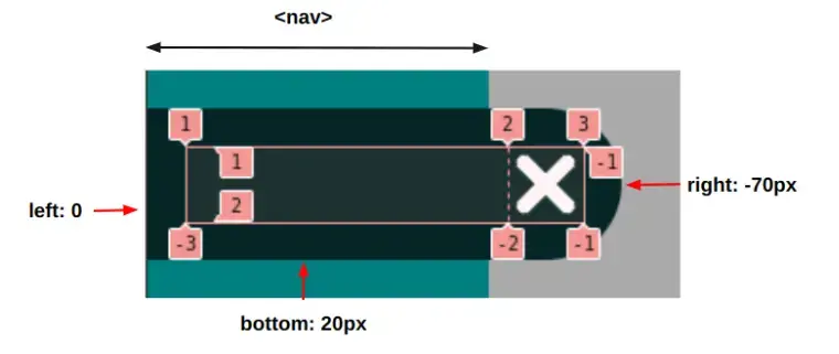
Here is another idea where this time I will update the position of the hamburger icon to make it on the bottom left side and it will slide with the menu.
Here is a figure to understand the adjustments I made to the icon:
Using left/right/bottom and height I make the input full width of the <nav> element but it will extend by 70px from the right side. Then I define a two-column layout inside it. One on the right with a dimension equal to 40px (where I will place the icons) and the left one will fill the remaining space.
Similar to the way I animate the menu, I do the same with the <input> element using translate:
nav input {
  position: absolute;
  bottom: 20px;
  left: 0;
  z-index: 2;
  right: -70px;
  height: 40px;
  grid-template-columns: 1fr 40px;
}
nav input:before,
nav input:after {
  grid-area:1/2; /* first row, second column */
}
@media {
  nav input {
    display: grid;
    transform: translateX(calc(80px - 100%)); /* keep 80px of width to show the icon */
    transition: .5s;
  }
  nav input:checked {
    transform: translateX(0);
  }
}
Here is another variation where I will not completely hide the menu on small screens but I will keep a small bar visible on the left.
For this variation, in addition to showing the menu, I am also sliding the content with it. I am keeping the same two-column structure and I am playing with the width of the menu to increase/decrease the size of the sidebar. To this, I add an opacity transition and the effect is perfect!
nav ul{
  opacity: 0;
  transition: .5s linear;
  min-width: 0;
  max-width: 0;
  overflow: hidden;
}
nav input:checked + ul {
  max-width: 180px;
  min-width: 180px;
  opacity: 1;
}

Conclusion
In the previous article, we styled a checkbox input to switch between the hamburger and the close icon. Then we build a simple responsive menu where we used that input to toggle the visibility of the menu on small screens.
In this article, we took a step further and updated our menu to make a sidebar menu still with a responsive feature. We kept the same code structure and only updated the CSS. It means that we can easily switch between a classic menu and a sidebar menu without a lot of hassle. We also made a lot of variations by simply doing small updates to the CSS. You can imagine all the possible combinations we can get from the same code structure.
Frequently Asked Questions
How to design a podcast website?
When using a CMS, designing your website will be quick and easy. You can add a template you’ve created or pick one of the pre-made templates that the CMS features in its library.
How do I choose a design for my website?
One of the most important things when creating a website for your art is the design. Even though your pieces of art might be amazing, people will leave if your site is hard to navigate. This is why it’s important that the site is easy on the eyes and easy to navigate.
What type of design should my fitness blog have?
When you’re a beginner, don’t go crazy with the design of the site. The most important thing is to have a site that looks professional, easy to read, and fast.
Can I afford a website builder?
Yes. Besides paid website builders, there are also free ones; however, they come with fewer options.

Temani Afif is an expert web developer, a content creator, and a CSS addict. He is the mastermind behind CSS Loaders, CSS Generators, CSS Tip and a lot of CSS stuff.
View all posts by Temani Afif


