In the previous article, we learned how to master the clip-path property. We explored a bunch of CSS tricks that allow you to easily create any kind of shape. This article is a direct follow-up where we will learn more tricks around the clip-path property.
We will see how to invert a shape created using polygon(). Such shapes are also called cut-out shapes.

The left shape is a classic shape created using polygon() and the shape at the right is the inverted version (the cut-out shape). The idea is to take a rectangle and cut the left shape from it to get the right one.
The goal of this article is to learn how to easily get the inverted version of any shape you want.
Creating The Main Shape
For this part, I will redirect you to my previous article or to my guide for making CSS shapes. I will not focus on how to create shapes using clip-path but rather how to invert existing shapes.
Our starting point will be the polygon of the shape you want to invert:
clip-path: polygon(X0 Y0, X1 Y1, ... Xn Yn);
If you are new to clip-path, I highly recommend you read the articles I linked to familiarize yourself with the basics of creating shapes. You don’t need to know or master all the tricks related to clip-path but at least understand how the coordinates system works and how to create some common shapes. You can also grab the code of many CSS shapes from my online collection.
Inverting The Shape
Now that we have our main shape, let’s invert it! I am going to give the process of doing it then I will explain how it works. It’s like a recipe to follow that works for any kind of shape.
First, take the previous polygon and place it inside a CSS variable.
--shape: X0 Y0, X1 Y1, ... Xn Yn;
Second, copy the first value and place it at the end. We need to duplicate the first coordinate.
--shape: X0 Y0, X1 Y1, ... Xn Yn, X0 Y0;
After that let’s create a simple rectangle having the same dimension as the shape we want to invert:
.invert {
  /* the size */
  width: ...;
  aspect-ratio: ...;
  /**/
  clip-path: polygon(0 0,100% 0,100% 100%,0 100%);
}
The polygon I am using is nothing but the coordinates of the 4 corners as I am explaining in my previous article.
Next, let’s duplicate the first value to get the following polygon:
clip-path: polygon(0 0,100% 0,100% 100%,0 100%, 0 0);
And finally, we append the CSS variable at the end of that polygon
.invert {
  --shape: X0 Y0, X1 Y1, ... Xn Yn, X0 Y0;
  clip-path: polygon(0 0,100% 0,100% 100%,0 100%, 0 0, var(--shape));
}
We are done! Our shape is inverted without a lot of effort.
Cool right? A few steps to follow and you have the Cut-out version.
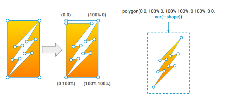
You are probably wondering how it works, here is a figure to illustrate the trick:

We have two groups of points, the outer points (the rectangle shape) and the inner points (the main shape). We use the outer points to cut the rectangle shape. We start for 0 0 and we get back to the same point. In the above figure, I am deliberating adding a small space between the points to better understand why we need to duplicate the first coordinate.
After that, we enter inside the rectangle and use the inner points to cut the main shape. Same logic with the first point, it should repeat twice to make sure we get back to the initial point and close the shape.
It may look non-intuitive or confusing at first glance but try to use a pen and paper to follow the different points and you will better understand. Even if you don’t fully grasp the trick, you can easily reuse it with any shape because all you have to do is update the --shape variable.
That variable has mainly two purposes, you can use it alone to draw the normal shape, or with the outer points to get the inverted shape.
polygon(var(--shape)); /* normal shape */
polygon(0 0,100% 0,100% 100%,0 100%, 0 0,var(--shape)); /* inverted shape */
In the end, you don’t really need to remember a lot of code. Simply grab the code of any shape, place it within the variable --shape and you are done! Don’t forget to duplicate the first coordinate at the end when defining the variable.
Controlling The Space
Inverting the shape is good but it’s be better if we can control the space around it. Actually, the shape is tightened to the border of the rectangle which is not good in most cases.
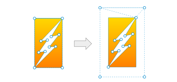
To add some space around the shape we are going to update the outer points like illustrated below:

All the outer points will move to the outside with the same amount of value. The new code will be:
.invert {
  --s: -20px; /* control the space */
  clip-path:
    polygon(
     /* outer points */
     var(--s) var(--s),
     calc(100% - var(--s)) var(--s),
     calc(100% - var(--s)) calc(100% - var(--s)),
     var(--s) calc(100% - var(--s)),
     var(--s) var(--s),
     /**/
    var(--shape));
}
At this step, nothing will happen because the outside is transparent so you will see nothing but you can add some box-shadow to visualize the new location of the outer points.
The next step is to add some padding and update the reference of the clip-path to be content-box. The idea is to make that space part of the element boundaries. The logical way to do this is to update the inner points instead but it would defeat the purpose of our trick since we don’t want to touch the points of the main shape.
For this reason, we move the outer points to the outside to create the needed space then with a combination of padding and content-box, we bring back everything to the element boundaries.
.invert {
  --s: -20px;
  padding: calc(-1*var(--s)); /* adding padding */
  clip-path:
    polygon(
     /* outer points */
     var(--s) var(--s),
     calc(100% - var(--s)) var(--s),
     calc(100% - var(--s)) calc(100% - var(--s)),
     var(--s) calc(100% - var(--s)),
     var(--s) var(--s),
     /**/
    var(--shape)) content-box; /* and updating the reference box */
}
Now you can easily control the space around the shape by adjusting another variable.
When using this method, you should pay attention to the use of box-sizing: border-box. If the shape doesn’t have a ratio equal to 1, using box-sizing: border-box will squish the shape. I will skip a boring explanation but keep in mind that you have to use box-sizing: content-box if you are adding space.
We can also consider two different variables to control the vertical and horizontal space separately.
.invert {
  --sx: -30px;
  --sy: -20px;
  padding: calc(-1*var(--sy)) calc(-1*var(--sx));
  clip-path:
    polygon(
     /* outer points */
     var(--sx) var(--sy),
     calc(100% - var(--sx)) var(--sy),
     calc(100% - var(--sx)) calc(100% - var(--sy)),
     var(--sx) calc(100% - var(--sy)),
     var(--sx) var(--sy),
     /**/
    var(--shape)) content-box;
}
We replace the --s variable with --sx and --sy and we update padding and clip-path accordingly. This can be useful especially if we want to have a full-width element with a cutout in the middle.
The “evenodd” Fix
While the method I am sharing looks good, it won’t work in some cases. You won’t see the inverted shape but only the initial rectangle.
Here is a simple example with a triangle:
There is nothing wrong with the code, the polygon is as simple as 3-point but we get nothing. Don’t worry, this is not a bug but a logical result and is related to the order of points.
I used the following polygon:
50% 0,100% 100%,0 100%;
But if I change the order of the points like below
50% 0,0 100%,100% 100%;
It works fine:
I know it’s a bit confusing and you are thinking that my method is not that good since not all the shapes can be inverted but don’t worry. This little quirk can be easily fixed by adding evenodd to the polygon.
It’s probably the first time you heard about this but polygon can take an optional value at the beginning that defines the filling rule used to draw the shape. In our case, we want an “evenodd” filling rule.
clip-path: polygon(evenodd, ...);
The
fill-ruleattribute is a presentation attribute defining the algorithm to use to determine the inside part of a shape. ref
You don’t really need to understand the logic behind this complex stuff. Just make sure to have evenodd added at the beginning and you will no more face the issue related to the order of points.
Here is a demo using both triangles and both of them are showing correctly.
Now the method is perfect and it works whatever the order of the points.
Conclusion
Let’s summarize the final code you will need to use to invert the shape
.shape {
  --shape: X0 Y0, X1 Y1, X2 Y2, ... , Xn Yn, X0 Y0; /* the first value is repeated */

  /* the size */
  width: ...;
  aspect-ratio: ...;
  /* the normal shape */
  clip-path: polygon(var(--shape));
}
.shape.invert {
  --s: -20px; /* to control the space */
  padding: calc(-1*var(--s));
  box-sizing: content-box; /* reset the box-sizing */
  /* the inverted shape */
  clip-path:
   /* evenodd at the beginning and content-box at the end */
    polygon(evenodd,var(--s) var(--s),calc(100% - var(--s)) var(--s),calc(100% - var(--s)) calc(100% - var(--s)),var(--s) calc(100% - var(--s)),var(--s) var(--s),var(--shape)) content-box;
}
And here's a demo with a few examples:
Now it’s your turn to do some practice. Pick the code of one shape and try to invert it. You can find different CSS shapes within my online collection and here is a list of articles where I am creating shapes using clip-path:
It’s worth noting that there are a lot of methods to create cut-out shapes. The one I am sharing with you considers the fact that you already have the polygon of the shape you want to invert. Depending on your needs, this method may not be the best. For this reason, I invite you to read my guide for making CSS shapes to learn more tricks around creating CSS shapes.

Temani Afif is an expert web developer, a content creator, and a CSS addict. He is the mastermind behind CSS Loaders, CSS Generators, CSS Tip and a lot of CSS stuff.
View all posts by Temani Afif


