Web typography is always made unique or interesting for the audience with carefully selected fonts to compose in one layout. This composition can be found in many sections of web layout as heading text or paragraph text to deliver messages and information as effectively as possible.
However, the main component of web typography is the fonts to use in a website. It could be a single type of font or font pairings to create balance or different levels of focus between the headings and paragraphs as the information is passed to the web visitors.
This article will cover the importance of font pairing in a website, and a better understanding of how to pair fonts for a website. Moreover, there are also examples of useful font pairings with previews and descriptions in the last section topic of this article.
Why Font Pairing is Essential for a Website?
Websites hierarchically provide content of information and this is where the typography hierarchy takes place to visually distinguish the heading text, sub-headings, and paragraph text. Typography hierarchy helps the readers to focus on the most important content, such as headline text before they decide to read the rest of the supporting content material.
As for creating an effective typography hierarchy, choosing the right fonts for headings, subheadings, and body text becomes important. The pairing of these selected fonts needs to follow some rules to be optimally accessible and effective for the website visitors to read and navigate the web content.

How to Pair Fonts that Work?
Pairing fonts is the next step to do after deciding on the right primary font. Here are 7 tips for pairing fonts that can be accessible and work optimally for all website readers.
1. Stay Consistent with the Brand
One thing for sure when selecting and pairing the right fonts for a website is to stay true and consistent with the brand company. Integrating the brand values with the right font pairing would need a greater level of sensitivity to the mood and style that the font can represent visually to the audience.
Each font has characteristics of style and to function as a web font, it needs to match the spirit of the brand which is owned by the web company. In some special cases, there are many custom fonts or typefaces made exclusively for a company to strengthen its branding identity.
2. Readability
The fonts or typefaces for a website are necessary to look nice, and equally necessary to be easy to read. Generally speaking, the visual complexity of the font for the headings and body text should be considered as minimal as possible for the reader's convenience. However, the font for headings can be a little stylish or bolder compared to the font for paragraph text.
3. Accessibility
Around 15% of the population has dyslexia and some typefaces may be inaccessible to persons with disabilities, particularly those with vision impairments or intellectual disabilities. Letter forms that have ornamentation, are not well defined, or are inconsistent in shape and size might be difficult to read.
It is highly suggested to use simple sans serif or serif fonts rather than stylish handwritten style typefaces if the main audience is people with vision disabilities so the headings and body text of a website can be accessed without much trouble.
4. Understand the Main Audience
Pick the right fonts by understanding who are the main audience or readers of a website. The audience can be specific in professional background, devices they use, gender, age, and their disability condition.
Font designs can express various attributes to a specific type of audience. They give the visual connotation, emotion, and meaning along with the characteristics of the design. Websites for children would be best to use friendly and fun web typefaces to pair rather than using elegant style script typefaces for example.
5. Finding the Visual Similarity
Choosing a primary web font for a website is the first step before pairing it with the font for subheadings or paragraph text. A useful technique to do so is to find the visual similarity between the primary web font as headings and the secondary fonts for subheadings and body paragraphs.
Several fonts to pair would be best to have a similar visual structure such as similar x-height, contrast, width, mood, and style. The font pairing should also not compete with each other yet be able to slightly look different from one to another.
6. Limit the Number and the Style of Font Pairings
Keep in mind to select only three maximum fonts for an entire website and ideally, at least two font design styles to avoid confusion, visual clutter, and inconsistency with the brand identity value that a web company wants to share with the audience.
7. Make Proper Tests
Last but not least, from all of the options available to select the primary web font and the secondary, there should be proper tests done carefully to see if the pairing works in some conditions and is accessible without issues. These necessary tests can be as this followings:
Use the recommended font sizes, especially for the body text
Try the font color with convenient contrast
Test the font characters in different weights or widths as well as their optical sizes
Try out the paired fonts with different line heights and character spacing
Test the font pairing on different mobile device screens
8 Font Pairings for Website
Here is the list of web font pairings examples with the font details and description to learn more about it.
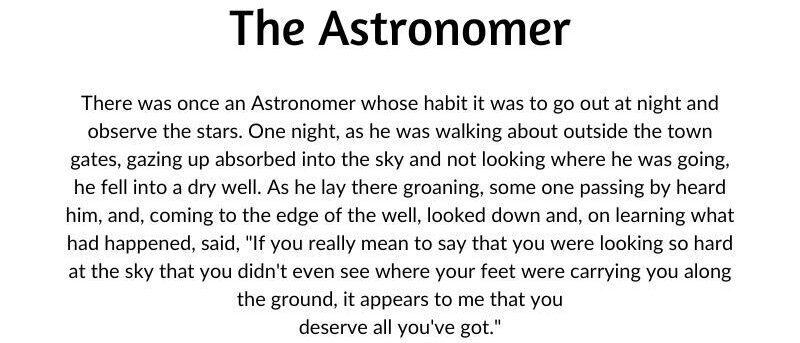
1. Amaranth & Lato
2. Arima Madurai Bold & Lustria
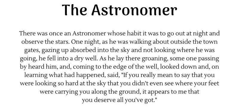
Arima is a display font with soft edges and a calligraphic feel. It is just legible for headlines to pair with the Lustria font, a rounded-serif text typeface with design characteristics that make it look appealing to use at bigger display screen sizes. The combination of these fonts brings an elegant style, yet keeps the professional look with the simple rounded serif as the body text.
3. Bebas Neue & Roboto Condensed
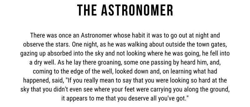
These two fonts to pair are both sans serif and condensed in style. Bebas Neue is an uppercase font with clean lines and elegant shapes to blend with Roboto Condensed that has natural width for easy reading rhythm. When combined, these fonts are similar enough to bring up a cohesive sense while also being distinctive enough to allow each to stand separate from the others.
4. Chunk Five & Roboto Slab Regular
ChunkFive is a bold slab serif font for display or headings, while Roboto Slab is also a slab serif font with a lighter weight and structure. The pairing of these two fonts creates great harmony with the American Western vintage look. This font pairing is often used for travel and tourism websites.
5. Cinzel Decorative & Della Respira
Cinzel Decorative is a typeface with classical proportions that was influenced by first-century Roman inscriptions. Pairing it with Della Respira gives an entirely retro feel of font composition as Della Respira is also inspired by a typeface from Florentine inscriptional capitals from the fifteenth century.
6. Kumar One & TT Lakes Neue
When you have a website related to technology or something futuristic in content, you can try to pair Kumar One and TT Lakes Neue. The combination looks edgy with these two squary fonts. Kumar One is a decorative display font with high vertical contrast which is good for headings and TT Lakes Neue is a simple and functional sans-serif that is influenced by the Finnish functionalism-era signs.
7. League Spartan & Glacial Indifference
These paired fonts are geometric sans serifs that have unique x-height accent on some characters. The combination of bold League Spartan and Glacial Indifference for the paragraph brings back the new classic style and elegant look. It will also make your website content easier to read in different screen sizes.
8. Londrina Solid & Rubik
Londrina Solid and Rubik makes a fun and friendly font pairing for kid's websites or any other type of creative content websites. Londrina Solid is a casual handwritten font which perfect for headings and Rubik is designed to have a slightly rounded corner that makes it blend easily with Londrina, yet easy to read as paragraph text.

Conclusion
There’s no perfect formula to pair web fonts, but to put more attention to user accessibility and maintain readability. Because these two components are the basic requirements to see if the selected fonts work for your web visitors. The rest of the components can help you to find the right style or characteristics of your paired fonts.
It’s really important to select fonts that are primarily designed for the web since there are big differences between web and print typography standards. Pick fonts that have the consistent attributes of legibility, readability, optimization, complete character set, proper weight, and thickness variety when they are applied to websites.
Frequently Asked Questions
What type of design should my fitness blog have?
When you’re a beginner, don’t go crazy with the design of the site. The most important thing is to have a site that looks professional, easy to read, and fast.
How do I choose a design for my website?
One of the most important things when creating a website for your art is the design. Even though your pieces of art might be amazing, people will leave if your site is hard to navigate. This is why it’s important that the site is easy on the eyes and easy to navigate.
How to design a podcast website?
When using a CMS, designing your website will be quick and easy. You can add a template you’ve created or pick one of the pre-made templates that the CMS features in its library.
What is the best way to display my art on my website?
Your website can be used for many things; however, you need to keep in mind that you created your website to promote your art. Don’t get wrapped up in all the things around your site and forget to put the primary focus on your art.
Audee Mirza is a graphic designer and WordPress developer at audeemirza.com who resides in Surabaya, Indonesia. She's also the author of Graphic Identity Blog, a professional logo designer, and often creates vector illustrations for clients and marketplaces. She enjoys good typography design and all kinds of animation.
View all posts by Audee Mirza