Building for the web has increasingly become more complex since it's humble beginnings. On one hand, we have a lot more power at our disposal then we did. Evergreen browsers ensure a "roughly" even playing field in terms of support and an incredible amount of improvements across the board (HTML, CSS, and JavaScript) mean we can build robust web applications that rival, if not beat, desktop applications.
With that great power, of course, comes great responsibility. In the past few decades of working on the web, most of us have seen some incredibly bad things that make browsing the web a not-so-fun experience. Many years ago popup windows were the bane of our existence, to the point of browser vendors actually building in features to block them.
Unfortunately, still today we see web sites do things that are anti-user. There is a reason for this, typically. Either as a way to earn advertising income or increase the number of signed up users, everything I'm mentioning below isn't being done with a necessarily "evil" intent, but just because something works doesn't mean it's not annoying users left and right.
Sure, you may have gotten a signup for your newsletter, but did you do so because you tricked a user into doing it? While that may help you achieve some quarterly metric, that's not going to be a user you can count on as an engaged customer.
Let's take a look at some of the most recent bad experiences around the web and what you can consider as an alternative.
Click-Bait Titles
A perfect example of "we use it because it works", and yes, I absolutely used it here on purpose, this is probably the least offensive to the user, mostly because it's usually not misleading. If a web page says it's the top X things about Y, most likely you're going to get exactly that.
I mention it here because it's possibly becoming a bit smarmy in terms of how well it works. Titles are incredibly important in terms of SEO, so you absolutely want to spend time considering what the best title of your content should be, but it may be time to move on from a style that's becoming overly used.
10000 Words Before the Answer
Anyone who has searched for a recipe has encountered this.
You google for something, fine a result, but before you can find what you're actually looking for, you have to go through a wall of text (and ads) before the result.
Recipes are great for this. You come in wanting a recipe for banana bread and end up reading about the author's time in Italy finding true love. Yes, the recipe is down there, but you have to scroll through an incredible amount of fluff before you get it. (As an aside, there's an incredible website/app called Saffron that will import recipes and 'scrape' them to the parts you actually care about it. I highly recommend it.)
Another place I see this, and I suppose we have to thank Marvel for it, is "does X have a post-credit scene". The answer to this is a strict yes or no, and then possibly detail about how many and where, but without a doubt I'll scroll through paragraphs of text before I find the answer.
Overall, it's a general recommendation to consider your reader and what they want. If they came for a specific thing, give them that thing as quickly and most directly as possible. In both examples above, that can be done right away with additional context coming after the initial content. Visitors who care for that context can keep reading, and those that don't can simply go away satisfied.
Autoplay Video and Audio
As a general piece of advice, if you build something into your website that browser vendors actively attack, then you may be doing something wrong.
For the most part, autoplay video and audio isn't as big of a problem as it used to be. YouTube still does this, but at least provides a setting for preventing it. Advertisers will often have autoplay video, but rarely with audio these days. CNN is the biggest culprit however. For a while their video player had nearly 20 different settings but disabling autoplay wasn't one of them. In fact, if you google for "cnn autoplay videos" you'll find numerous people complaining about and suggestions for how to correct it.
As a suggestion, if people are actively talking about how to change how your site works, you may be making a mistake.
One has to feel that decisions like this are done just for metrics - "Look, we had N videos played last week!" - but at the same time, no one is questioning the value of such metrics when a huge percentage of that number was not something a user actually wanted.
Chrome has both a mute site and mute tab option while Edge has mute tab. In general if I'm browsing CNN while also in a meeting (yes, I'll admit that), I ensure I'm on mute first. Edge doesn't yet have mute site, but when it does, I'll absolutely apply it here.
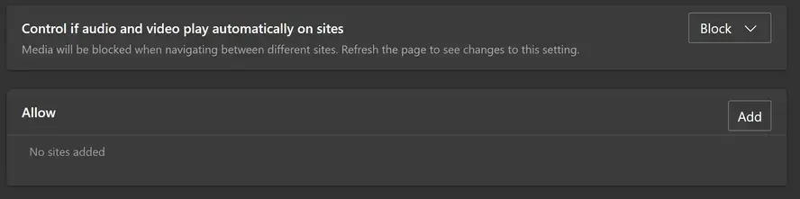
You can also control autoplay in the browser itself. Edge now has a "Media autoplay" setting that lets you set it to block:
Notifications Prompts
A staple of mobile apps, web sites can now use notifications as well. In theory, this is an incredibly useful feature and something I'd love to use. In reality, every single web site decided that not only did they absolutely need this feature but they needed to ask you right away.
Typically these notifications look like so:

This represents a "browser native" notification prompt, but many web sites use custom ones as well.
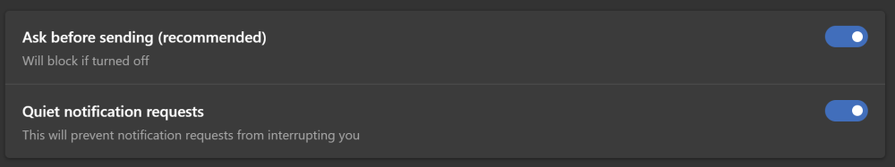
The issue here isn't the feature itself, but the fact that it blocks the user from reading a page with a prompt. This got abused to the point where - once again - browser vendors had to step in. About a year ago, Edge shipped changes to their browser to help reduce the appearance of these prompts. Specifically they have a "Quiet notification requests" setting that removes the prompt from blocking your ability to read a page:
I think the biggest issue here was the automatic prompt. There's ways to present these requests after a user actually requests them. For example, your content can mention the feature inline on the page and wait for the user to click requesting it before the actual prompt is presented. This would also result in having a list of users signed up who actually desire this connection versus those who may accidentally agree.
Bad Ads
Let's face it - web site ads are never going away. And I think it's fair to say that when getting something for free, a bit of advertising is a fair trade to make. However, there's a few ad practices that go above and beyond "polite" behavior. As you can imagine, they do this because it drives clicks and earns money, but when doing so at the expense of your users, you have to ask if the money is worth the pain. Some examples of bad ads are:
Ads that don't work on mobile: I remember seeing this quite a bit a year or so ago but it's more rare now, but you could tell when a site never tested their advertising on a mobile device. I've seen sites that popup full screen ads with no way to get back to the content. I've seen ads that even crash the mobile browser. This typically comes from the fact that ads are almost always an embed. You signed up with a service, they give you code to inject on your site, and then they actually handle the display. But this doesn't resolve you of the responsibility of ensuring these ads don't ruin the actual experience.
Ads that change size: This is typically a top level banner ad that "grows" when loaded, shifting down content. Even in a high speed connection, with a lot else going on in the page, it's possible I've already begun to read content when all of a sudden I'm having to scroll to get back to where I was. Even when the site tries to handle this, there's a jarring shift that interrupts my attempt to actually read the content I came here for.
Unexpected ads: Here's one I've seen recently. I'll be on a site I enjoy, in this case, MSPoweruser, click a link, and an ad pops up:
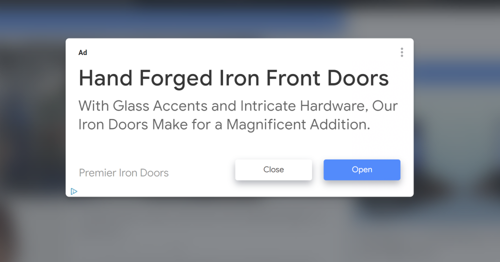
Looking at that screen shot, user's may be tricked into clicking "open" thinking that will get them to the next page, but instead they must "close" the ad to continue.
In general, I don't think anyone is arguing for advertising to go away, and I think we understand that the traditional banner ad is almost invisible, but at least do your best to actually use your site and see how your advertising impacts the experience for your users.
Initial Page Modals
Last, but certainly not least, is the practice that absolutely drives me bonkers. Imagine... you google for something your trying to solve... you see a result that looks perfect! You click, and land on a page that is immediately then hidden from you:
Typically this is a prompt to sign up for a newsletter or become a user. Here's an example from a Python site that regularly comes up in Google results:
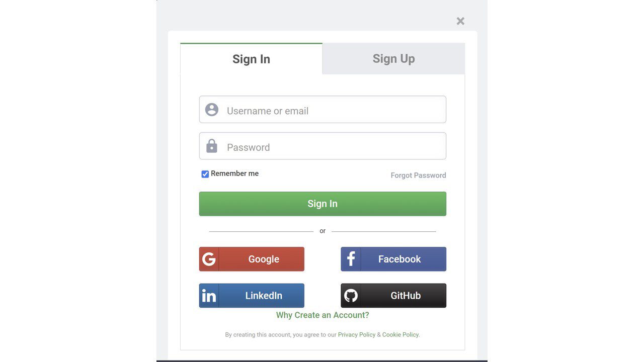
This is especially infuriating as it shows up after you scroll a bit. You are literally trying to get help and the site is preventing that. What's upsetting is that as someone who is new to Python, I'm actively looking for communities and newsletters to sign up with, but the fact that this site pushes it in front of me like this has turned me off to the point of actively ignoring them in search results.
Probably the worst offender of this, and it breaks my heart because of how much I love them, is LEGO. If you google for a specific LEGO set, and see a result that matches what you want, and then click, because you foolishly think you want to actually see that LEGO set, you end up with this:
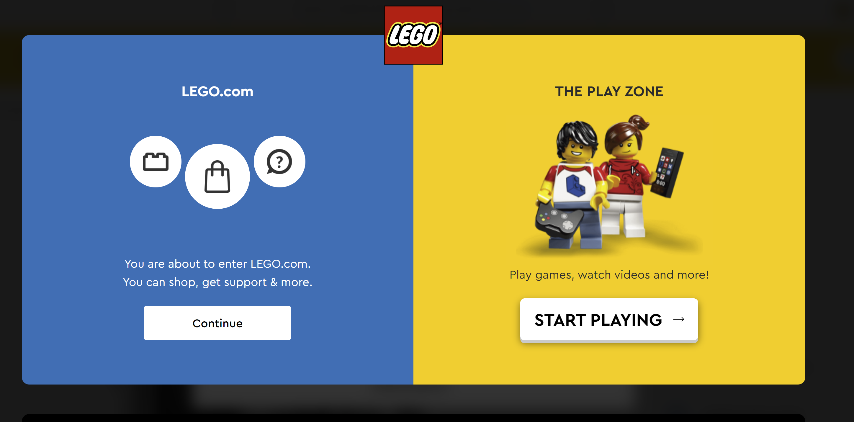
For the life of me, I can't see the logic to this. When a visitor comes to a specific page, there's a huge chance they actually want that page. Asking them if they are here to shop or play doesn't make any kind of sense. On the home page, I can absolutely see something like this making sense. But when a user enters your site at a specific URL, especially for a company like LEGO where folks are wanting information about a product, this is just plain dumb. As far as I can see, there's no way to permanently disable this in any way.
Of course, it gets even worse when you click to continue...
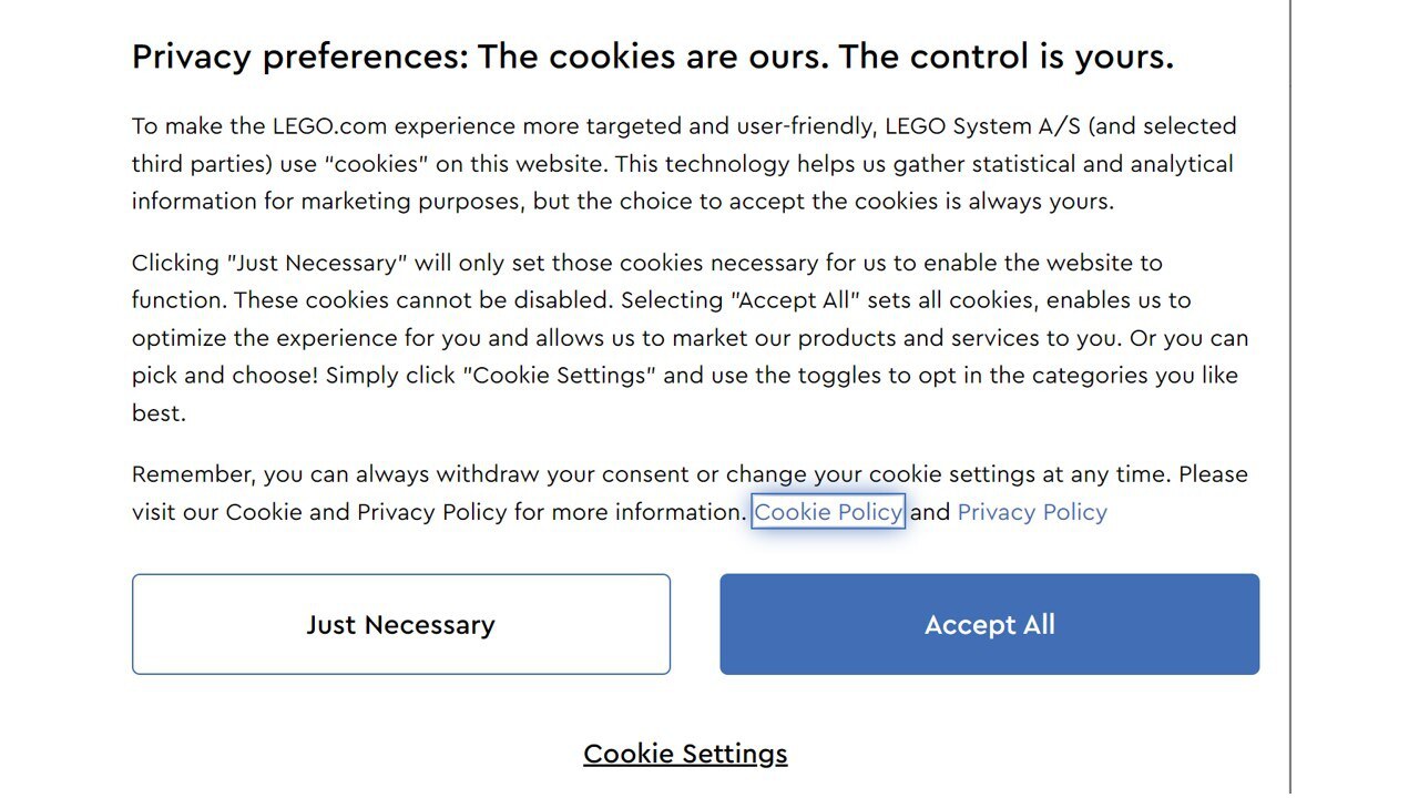
These cookie warnings are the law now, but many sites are moving them to the bottom of the screen. Letting the user ignore them if they don't care. In LEGO's case, it's now not one, but two clicks to actually get to the content that was desired. As a dedicated LEGO fan, this won't stop me from visiting, but it still annoys me!
Can We Do Better?
As stated in the beginning, a lot of what we see on the web that we don't like actually comes from things that have been shown to work. But we can absolutely do better for our visitors. We can hold off on prompting them for something until they've shown an interest. We can integrate testing of ad services as part of our day to day business. Simplest of all is for site creators to be active site users. If you find yourself hating something you added to your site, consider the fact that a good portion of your audience probably does as well!
Frequently Asked Questions
How do I choose a design for my website?
One of the most important things when creating a website for your art is the design. Even though your pieces of art might be amazing, people will leave if your site is hard to navigate. This is why it’s important that the site is easy on the eyes and easy to navigate.
Does a website need hosting?
Yes. In order for a site to be accessed by outside users, it needs to have website hosting.
Why should I create a website?
There are many reasons why you should create a website if you’re an artist. You can use it to create a place where people can learn about you, talk about your art, or show off your work.
Are website builders easy to use?
One of the easiest ways to build a website is with a website builder. Using a website builder doesn't require any programming and coding skills.

Raymond Camden is a Senior Developer Evangelist for Adobe. He works on the Document Services APIs to build powerful (and typically cat-related) PDF demos. He is the author of multiple books on web development and has been actively blogging and presenting for almost twenty years. Raymond can be reached at his blog www.raymondcamden.com and social media.
View all posts by Raymond Camden