 On Sale
Having a good background pattern can make a difference in your website design. Thanks to CSS gradients, we can create fancy and cool patterns using a few lines of code. In this post, we will study the conic-gradient and use it to create different CSS patterns.
How does conic-gradient work?
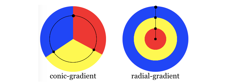
From the specification
A conic gradient starts by specifying the center of a circle, similar to radial gradients, except that conic gradient color-stops are placed around the circumference of the circle, rather than on a line emerging from the center, causing the color to smoothly transition as you spin around the center, rather than as you progress outward from the center.
And here is a figure from the MDN page
Let’s take a basic example to see how it works:
background: conic-gradient(at 75% 25%, red, blue, yellow)
We place the center point at X=75% and Y=25% then we create a color transition between red, blue, and yellow. As simple as that!
In most cases, we don’t need a smooth transition but rather “hard stop” colors. To do this, we need to make the color start where the previous one ends:
background: conic-gradient(at 75% 25%, red 90deg, blue 90deg 225deg, yellow 225deg)
Note the use of the same angle between two colors (90deg and 225deg). We can still do better like below
background: conic-gradient(at 75% 25%, red 90deg, blue 0 225deg, yellow 0)
By specifying 0 (a value smaller than the previous one) the browser will automatically make it equal to the previous one. This will avoid us writing the same value twice.
We still have the same center but no transition between the colors. The red is filling 90deg. The blue starts from where the red ends and continues until 225deg so it’s filling 135deg. The yellow is filling the remaining space which is also 135deg (360deg - 225deg).
If we define a background-size, we create a pattern:
Not the best pattern but it illustrates the technique we are going to use in this article to build better ones!

Checkerboard/Chessboard pattern
Let’s start with a basic pattern:
Below is a figure to understand the logic of this pattern:
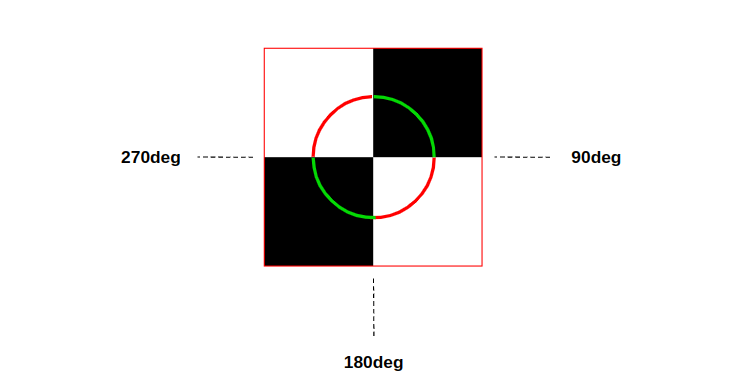
It’s clear that the center of our circle is placed at the center of the background area (the default position) so we don’t need to define it. Then we have 4 colors (2 whites and 2 blacks) each one filling 90deg (25% of the area). The code will be:
background: conic-gradient(#000 90deg, #fff 0 180deg, #000 0 270deg, #fff 0);
We have repetition so we can optimize the syntax using a repeating gradient and write the colors only once
background: repeating-conic-gradient(#000 0 90deg, #fff 0 180deg);
We can also use a percentage instead of a degree
background: repeating-conic-gradient(#000 0 25%, #fff 0 50%);
Then all we have to do is to update the background-size to control the pattern.
Zig-Zag pattern
Let’s move to a more fancy pattern where we will use two gradients this time
With this pattern, we will learn the “from” option that allows us to control the rotation of a gradient.
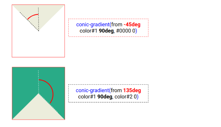
In the above, each gradient is composed of two colors. The first color is filling 90deg while the second one is filling the remaining space. The only difference between both gradients is a rotation. The first gradient is rotated by -45deg while the second one is rotated by 135deg.
Both gradients together will give us the following result.
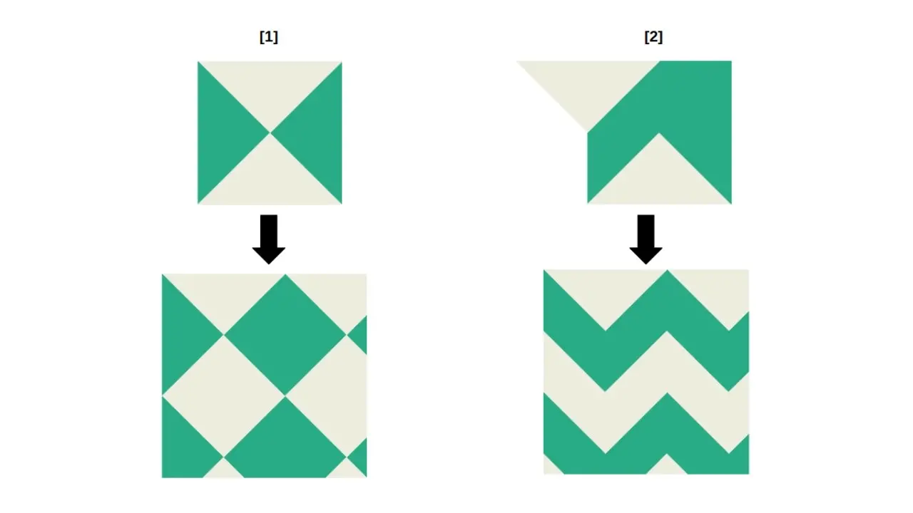
The (1) in the above illustrates the following code:
background:
  conic-gradient(from -45deg,#ECEDDC 90deg,#0000   0),
  conic-gradient(from 135deg,#ECEDDC 90deg,#29AB87 0);
background-size: 100px 100px;
Not the result we are looking for. To get what we want, we need to shift the second gradient (or the first one) as shown in (2) to have the following code:
background:
  conic-gradient(from -45deg,#ECEDDC 90deg,#0000   0),
  conic-gradient(from 135deg,#ECEDDC 90deg,#29AB87 0) 50px 0;
background-size: 100px 100px;
The 50px 0 is nothing but the background-position of the second gradient and 50px is half the background-size.
The code can be optimized by introducing CSS variables:
--s: 100px; /* control the size */

--_g: #ECEDDC /* first color */ 90deg,#0000 0;
background:
  conic-gradient(from -45deg,var(--_g)),
  conic-gradient(from 135deg,var(--_g)) calc(var(--s)/2) 0,
  #29AB87; /* second color */
background-size: var(--s) var(--s)
Note that in the previous demos, I am using 90.5deg instead of 0deg to avoid jagged edges. Gradients are known to have such issues so we always update values that way to fix them.
Paper Graph pattern
For this one, we are going to use two similar gradients but with different sizes this time. In addition to the background-position, we will see that playing with background-size can help us create patterns as well.
The first gradient is defined as follows:
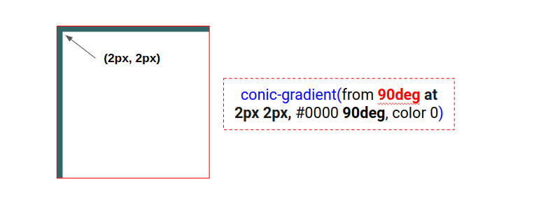
And it gives us the following result
The second gradient is the same but instead of 2px 2px we use 1px 1px to have thinner lines and we divide the size by 5. This will give us the logical result of the small squares (a 5x5 grid) inside a bigger one.
background:
 conic-gradient(from 90deg at 2px 2px,#0000 90deg,#366 0) 0 0/100px 100px,
 conic-gradient(from 90deg at 1px 1px,#0000 90deg,#366 0) 0 0/20px  20px;
And using CSS variables we can optimize like below:
--s: 100px; /* control the size */

--_g: #0000 90deg,#366 0; /* update the color here */
background:
 conic-gradient(from 90deg at 2px 2px,var(--_g)) 0 0/var(--s) var(--s),
 conic-gradient(from 90deg at 1px 1px,var(--_g)) 0 0/calc(var(--s)/5) calc(var(--s)/5);

Triangular pattern
After those three simple patterns, we can tackle more complex patterns using the same techniques. Let’s create some triangular patterns
For this one, we get the following for the gradients
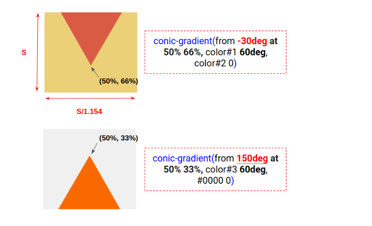
Similar to the Zig-Zag pattern, we consider an offset for the second gradient using background-position to get the following code:
--s: 120px; /* control the size */

background:
  conic-gradient(from 150deg at 50% 33%,#FA6900 60deg,#0000 0)
      calc(var(--s)/2) calc(var(--s)/1.4),
  conic-gradient(from -30deg at 50% 66%,#D95B43 60deg,#ECD078 0);
background-size: var(--s) calc(var(--s)/1.154);
Here are two more patterns with triangular shapes. For these, I will not give you a figure to illustrate each gradient. I let you dissect the code and try to understand the puzzle.
The code may look complex at first glance but if you follow simple steps you can easily understand it. First, try to isolate each gradient alone to understand the internal configuration (the colors stops and the center position) then place them above each other by disabling the repetition (set background-repeat: no-repeat) to see the pattern.
Stars pattern
Why not a pattern with stars!
Here is a step-by-step demo to illustrate the different gradients
As you can see, each gradient alone is pretty easy to understand and the combination of all gives us a good result. This is the power of gradients, we combine basic shapes to get a complex-looking pattern.
More patterns!
Before we end, I will leave you with a bunch of other examples to show you how powerful conic-gradient() is when it comes to creating fancy patterns!
Conclusion
After the different examples we saw, you should be able to create cool patterns using conic-gradient(). You may find it difficult but with some practice, you will get comfortable with the different techniques and you can easily create your patterns.
I have another article that deals with radial-gradient() if you want a follow-up on this one: https://www.freecodecamp.org/news/css-radial-gradient/
Combining different gradients is another way to get even more patterns. I have made a lot of examples that you can find at css-pattern.com where I regularly publish new patterns. it’s also a Github Repository so you can Watch it and get notified when a new pattern is added.
Frequently Asked Questions
How do I choose a design for my website?
One of the most important things when creating a website for your art is the design. Even though your pieces of art might be amazing, people will leave if your site is hard to navigate. This is why it’s important that the site is easy on the eyes and easy to navigate.
What type of design should my fitness blog have?
When you’re a beginner, don’t go crazy with the design of the site. The most important thing is to have a site that looks professional, easy to read, and fast.
What are some popular domain marketplaces?
Popular domain marketplaces include BrandBucket, Efty, Namecheap, Sed, and Flippa.
Can web hosting be changed?
Regardless of your technical knowledge, anyone can switch web hosting providers. You can find a new web hosting provider that can help you with it, or you can migrate to the new provider on your own.

Temani Afif is an expert web developer, a content creator, and a CSS addict. He is the mastermind behind CSS Challenges, CSS Generators, CSS Tip and a lot of CSS stuff.
View all posts by Temani Afif


